Box Plot (original) (raw)
Last Updated : 8 Dec, 2025
A Box Plot is also known as a Box and Whisker Plot and it is a graphical tool used to understand the distribution of numerical data. It shows the median, quartiles and possible outliers in a simple visual form. It helps compare distributions between groups with ease.
- multiple groups effectively.
- Identify outliers quickly and visually.
- Reveal data symmetry or skewness at a glance.
- Show variability clearly even for large datasets.
- Provide compact summaries of data using quartiles and range.
- Useful for comparing multiple groups or categories.
Interquartile Range (IQR)
The box in a box plot represents the Interquartile Range (IQR).
\mathbf{IQR} = Q_3 - Q_1
It covers the middle 50% of the data, making it a strong measure of spread that is resistant to extreme values.
Identifying Outliers in a Box Plot
Outliers are values that lie outside the upper and lower limits:
\text{Lower Limit} = Q_1 - 1.5 \times \text{IQR}
\text{Upper Limit} = Q_3 + 1.5 \times \text{IQR}
- Any value below the lower limit or above the upper limit is treated as an outlier and shown as a separate point.
- The minimum and maximum whiskers represent the closest values within these limits.
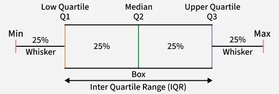
Components of a Box Plot
A Box Plot visually represents the five-number summary of a dataset:
Box Plot
The box plot shown in the above diagram is a perfect plot with no skewness. The plots can have skewness and the median might not be at the center of the box.
- **Minimum: The smallest non-outlier value shown at the lower whisker end.
- **First Quartile (Q1): The value below which 25% of the data lies.
- **Median (Q2): The middle value that splits the data into two equal halves.
- **Third Quartile (Q3): The value below which 75% of the data lies.
- **Maximum: The largest non-outlier value shown at the upper whisker end.
How to Create a Box Plot
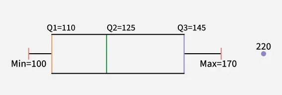
Consider the runs scored by a cricket team in 12 matches: 100, 120, 110, 150, 110, 140, 130, 170, 120, 220, 140, 110
**Step 1: Arrange Data in Ascending Order
- 100, 110, 110, 110, 120, 120, 130, 140, 140, 150, 170, 220
**Step 2: **Find Quartiles and Median
- \text{Median } (Q_2) = \frac{120 + 130}{2} = 125
- Q_1 = \text{Median of first 6 values} = \frac{110 + 110}{2} = 110
- Q_3 = \text{Median of last 6 values} = \frac{140 + 150}{2} = 145
**Step 3: Compute IQR
- \text{IQR} = 145 - 110 = 35
**Step 4: Calculate Limits
- \text{Lower Limit} = 110 - 1.5 \times 35 = 57.5
- \text{Upper Limit} = 145 + 1.5 \times 35 = 197.5
**Step 5: Identify Min, Max and Outliers
- Minimum (within limit) = 100
- Maximum (within limit) = 170
- Outlier = 220
This information is then used to draw the box plot.
Box Plot
Use-Cases of Box Plots
Common use-cases include:
- **Exploratory Data Analysis (EDA): Helps quickly detect spread, skewness and extreme values.
- **Comparing Multiple Groups: Useful for visualizing differences in distributions across categories.
- **Quality Control and Process Monitoring: Detects unusual deviations or anomalies in manufacturing and processes.
- **Statistical Reporting: Provides a compact visual summary for large datasets.
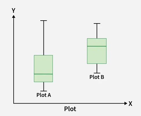
How to Compare Box Plots
Comparing multiple box plots helps understand differences between groups in terms of center, spread, skewness and outliers.
Box Plot
1. Compare the Medians
- Check if the median line of one plot lies outside the box of another.
- A median placed higher usually indicates larger overall values.
- If Group B’s median falls outside Group A’s box, the groups differ notably.
2. Compare the Dispersion (Spread)
- IQR represents the height of the box, showing spread of middle 50 percent data.
- A longer box means higher variability.
- Longer whiskers indicate greater overall spread of values.
- Plot A with a bigger box and whiskers has more variable data.
3. Compare Outliers
- Outliers appear as points beyond whiskers.
- More outliers indicate irregular or inconsistent data.
- Fewer outliers suggest more stable and predictable values.
4. Compare Skewness
- Skewness shows asymmetry in data distribution.
- Median closer to the bottom with a longer upper whisker indicates right skew.
- Median near the top with a longer lower whisker indicates left skew.
- Plot A is left-skewed and Plot B is right-skewed, showing clear distribution differences.
Difference Between Vertical and Horizontal Box Plot
Here we compare vertical and horizontal box plot
| Feature | Vertical Box Plot | Horizontal Box Plot |
|---|---|---|
| Orientation | Box is drawn vertically along the y-axis | Box is drawn horizontally along the x-axis |
| Best For | Comparing numerical values across categories. | Showing distribution when category labels are long. |
| Readability | Can become cramped with many categories. | More readable when dataset has many labels. |
| Common Use | Default plot in most statistical tools. | Useful for survey data, ratings and long text labels. |
| Space Utilization | Requires more vertical space. | Utilizes horizontal space more efficiently. |
Advantages
- **Easy Comparison: Allows quick comparison of distributions across multiple groups.
- **Outlier Detection: Clearly highlights unusual or extreme values in the data.
- **Quartile-Based Summary: Summarizes data using median and quartiles instead of raw values.
- **Resistant to Noise: Less affected by extreme values compared to mean based visuals.
- **Compact Representation: Presents a large amount of statistical information in a clean, compact format.
Limitation
- **No Distribution Shape: Does not reveal whether data is normal, uniform or multi-peaked.
- **Mean Not Visible: Shows median and quartiles but hides the average value.
- **Cannot Detect Multi-Modality: Fails to identify multiple peaks or clusters in the data.
- **Less Useful for Small Samples: Provides limited insights when dataset size is very small.