Exploring Correlation in Python (original) (raw)
Last Updated : 6 Feb, 2026
Correlation is one of the most commonly used statistical measures to understand how variables are related to each other. In Python, correlation helps identify whether two variables move together, move in opposite directions or have no relationship at all.
- Helps understand data relationships.
- Useful in feature selection for ML models.
- Detects multicollinearity.
- Supports better decision-making.
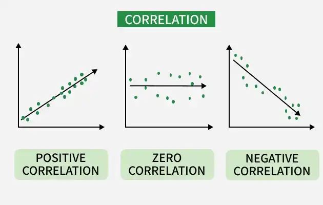
Correlation
Correlation measures the strength and direction of the relationship between two numerical variables. Value ranges from -1 to +1
- ****+1:** Perfect positive relationship. That means both variables increase or decrease together. **Example: Height and weight
- **-1: Perfect negative relationship meaning one variable increases while the other decreases. **Example: Price and demand
- **0: No relationship or no correlation means no visible relationship between variables. **Example: Shoe size and exam marks
Common Correlation Methods in Python
1. Pearson Correlation
Pearson Correlation measures linear relationship between two continuous variables.
- Range: -1 to +1
- Assumes normally distributed data
2. Spearman Correlation
Spearman Correlation measures monotonic relationship using ranks.
- Works with non-linear data
- Suitable for ordinal data
3. Kendall Correlation
Kendall Correlation measures rank consistency between variables.
- More robust for small datasets
Correlation Using Python
Python provides built-in tools through pandas and visualization libraries to compute and analyze correlation efficiently. Understanding correlation helps build better models and gain deeper insights from data.
1. Sample Dataset
Here we will create a sample dataset and use it using pandas dataframe. We will use seaborn and matplotlib to visualize the relationship.
Python `
import pandas as pd import seaborn as sns import matplotlib.pyplot as plt
data = { 'Math': [78, 85, 96, 80, 86], 'Science': [88, 90, 94, 82, 89], 'English': [72, 75, 78, 70, 74] }
df = pd.DataFrame(data) df
`
**Output:
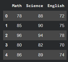
Data
2. Pearson Correlation
- Computes pairwise correlation between columns
- Default method is Pearson
- Higher values indicate stronger correlation Python `
pearson_corr = df.corr(method='pearson') print(pearson_corr)
sns.heatmap(pearson_corr, annot=True, cmap='coolwarm') plt.title("Pearson Correlation Heatmap") plt.show()
`
**Output:
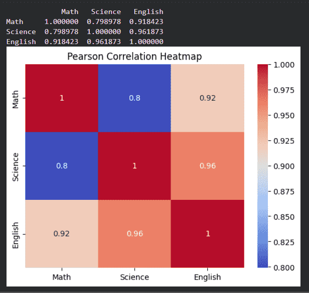
Pearson Correlation
The above output shows that the relationship between maths, science and english.
3. Spearman Correlation
- Converts values to ranks before correlation
- Suitable for non-linear but monotonic relationships
- Useful when data is not normally distributed Python `
spearman_corr = df.corr(method='spearman') print(spearman_corr)
sns.heatmap(spearman_corr, annot=True, cmap='viridis') plt.title("Spearman Correlation Heatmap") plt.show()
`
**Output:
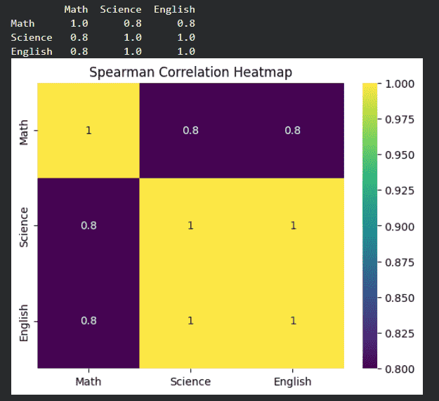
Spearman Correlation
4. Kendall Correlation
- Measures agreement between rankings
- Works well for small datasets Python `
kendall_corr = df.corr(method='kendall') print(kendall_corr)
sns.heatmap(kendall_corr, annot=True, cmap='plasma') plt.title("Kendall Correlation Heatmap") plt.show()
`
**Output:
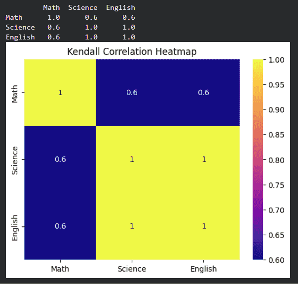
Kendall Correlation
5. Correlation Between Two Columns
- Returns correlation value between two specific columns
- Heatmap gives a visual understanding of relationships
- Darker color indicates stronger correlation Python `
corr_value = df['Math'].corr(df['Science']) print("Correlation between Math and Science:", corr_value)
two_col_corr = df[['Math', 'Science']].corr()
sns.heatmap(two_col_corr, annot=True, cmap='coolwarm') plt.title("Correlation Between Math and Science") plt.show()
`
**Output:
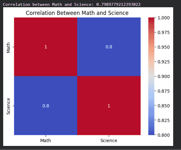
Correlation Between Two Columns
Interpreting Correlation Values
| Correlation Value | Meaning |
|---|---|
| 0.8 to 1.0 | Strong positive |
| 0.5 to 0.8 | Moderate positive |
| 0.0 to 0.5 | Weak positive |
| 0 | No correlation |
| -0.5 to 0 | Weak negative |
| -0.8 to -0.5 | Moderate negative |
| -1.0 to -0.8 | Strong negative |
Limitations of Correlation
- Only measures association
- Sensitive to outliers
Applications of Correlation
- Feature selection in machine learning
- Financial market analysis
- Medical research
- Recommendation systems