How to perform Causal Analysis? (original) (raw)
Last Updated : 2 May, 2026
Causal analysis is a technique used to understand why something happens by identifying cause–effect relationships. It helps analyze how changes in one variable affect another, supporting better decision-making across various fields. Causal analysis helps answer key questions such as:
- Why did something happen?
- What are its consequences?
- How can it be improved or prevented?
For example, Increasing the price of a product may lead to a decrease in its demand. Here, price is the cause and demand is the effect. By analyzing data, we can determine whether this relationship truly exists and how strong the impact is.
Correlation & Causation
**Correlation: Refers to a situation where two variables change together, but one does not necessarily cause the other.
- Values of both variables increase or decrease together
- The relationship may happen due to another hidden factor
- Cannot be used to confirm cause–effect
**Causation: Refers to a situation where a change in one variable directly causes a change in another.
- One variable directly affects the other
- Change in one leads to a predictable change in the other
- Can be used to explain and predict outcomes
**Key Concepts
- **Cause and Effect: Cause is the factor that leads to a change, while effect is the result of that change.
- **Confounding Variable: It is a third factor that influences both the cause and the effect, making it seem like one is affecting another.
- **Mediator Variable: This explains how or why a cause leads to an effect by acting as a link between the two.
- **Moderator Variable: It affects the strength or direction of the relationship between cause and effect under different conditions.
- **Intervention: An action taken to change a variable in order to observe its impact on the outcome.
- **Counterfactual: It represents what would have happened if a different action or condition had occurred instead of the actual one.
Steps to Perform
- **Defining the Problem: Clearly identify the issue to be analyzed, as this sets the foundation for the process.
- **Identifying Variables: Breaking the problem into key variables that can influence the outcome.
- **Collection of Data: Gathering relevant and reliable data using methods like surveys, experiments, or existing datasets.
- **Establishing Relationships: Determine how variables are related using appropriate tools or methods.
- **Distinguishing Correlation from Causation: Ensure that relationships are causal and not just coincidental.
- **Considering Confounding Variables: Identifying other factors that may influence the relationship and affect results.
- **Interpreting the Results: Analyzing the findings to draw meaningful conclusions and support decision-making.
**Common Methods
- **Experimental Method: Involves manipulating one variable and observing its effect on another under controlled conditions, for e.g., testing how a new medicine affects patients
- **Quasi-Experimental Method: Similar to experiments but uses existing groups instead of randomly created ones, for e.g., comparing performance of students from different schools
- **Observational Method: Data is studied as it is, without making any changes, to understand relationships like, analyzing real-world data trends.
- **Regression Analysis: A statistical method used to measure how much one variable affects another, for e.g., how price impacts demand
- **Causal Graphs (DAGs): Diagrams that show how different variables are connected, helping to understand cause–effect relationships and hidden factors.
Implementation
Suppose we want to understand how a customer’s total bill influences the tip amount. The goal is to analyze whether an increase in total bill leads to a higher tip using causal analysis.
The dataset used is publicly available and contains information about restaurant bills and tips. It can be downloded by clicking here.
Includes variables such as:
- **total_bill – total amount of the bill
- **tip – tip given by the customer
**1. Importing Libraries
Importing libraries likepandas, matplotliband statsmodels
Python `
Importing Libraries
import pandas as pd # for data handling import matplotlib.pyplot as plt # for plotting graphs import statsmodels.api as sm # to study relationship between variables
`
**2. Loading the Dataset
Loading the dataset directly from the URL and viewing the data.
Python `
data = pd.read_csv("https://raw.githubusercontent.com/mwaskom/seaborn-data/master/tips.csv")
selecting relevant columns
data = data[["total_bill", "tip"]]
renaming for simplicity
data.columns = ["price", "demand"]
print(data.head())
`
3. **Visualizing the Relationship
Plotting the relationship between bill amount and tip.
Python `
plt.scatter(data["price"], data["demand"])
plt.xlabel("Total Bill (Price)") plt.ylabel("Tip (Demand)") plt.title("Price vs Demand")
plt.show()
`
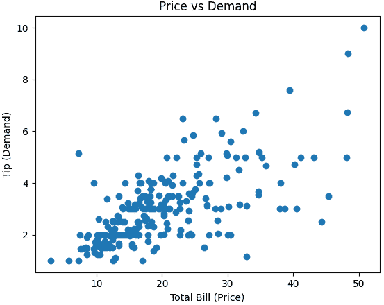
Total Bill vs Tip Scatter Plot
**4. Applying Regression Analysis
Building a regression model to analyze how one variable affects the other.
Python `
X = data["price"] # independent variable y = data["demand"] # dependent variable
X = sm.add_constant(X)
model = sm.OLS(y, X).fit()
`
**5. Understanding the Output
Ithelps interpret how strongly and significantly bill amount influences tip.
C++ `
print("Coefficient:", model.params["price"]) print("P-value:", model.pvalues["price"]) print("R-squared:", model.rsquared)
`
**Output:
Coefficient: 0.1050245173843534 P-value: 6.692470646863736e-34 R-squared: 0.45661658635167657
- coefficient shows how much the tip changes with the bill amount
- p-value indicates whether the relationship is significant
- R-squared shows how well the model explains the data
Higher total bills are usually associated with higher tips. This relationship is reliable and can be trusted based on the analysis.
**Advantages
- Identifies true cause–effect relationships between variables
- Supports better decision-making based on actual impact
- Useful in predicting outcomes when changes are made
- Reduces chances of incorrect conclusions from data
**Limitations
- Requires high-quality and sufficient data
- Can be affected by hidden factors that are not considered
- Establishing causation is often complex and time-consuming
- Results may vary if assumptions are not correct
**Applications
- **Healthcare: Understanding effects of treatments or medicines
- **Business: Analyzing impact of pricing, marketing, and strategies
- **Economics: Studying relationships like demand and supply
- **Public Policy: Evaluating effects of policies and decisions