Six Steps of Data Analysis Process (original) (raw)
Last Updated : 20 Mar, 2026
Data analysis is the process of collecting, cleaning, organizing and interpreting data to gain useful insights and support decision-making. It follows a structured approach where:
- **Step-by-Step Process: Transforms raw data into meaningful insights
- **Systematic Approach: Ensures accuracy and reliability in results
- **Better Decisions: Helps in making informed decisions based on data
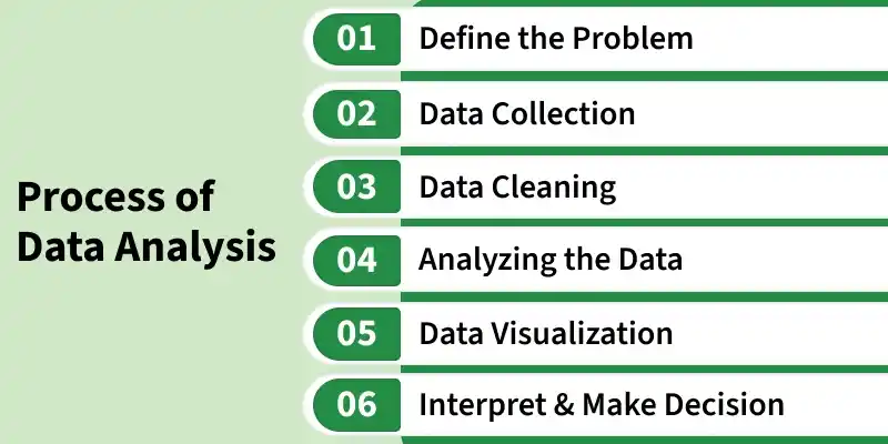
Steps in Data Analysis
1. Define the Problem
Before starting any analysis, it’s crucial to clearly understand what we are trying to solve. This involves defining the specific question, goal or problem and aligning it with stakeholder's expectations. A well-defined problem ensures that the analysis stays focused and relevant.
- Identify the core problem or opportunity.
- Set clear objectives and expected outcomes.
- Understand the context, stakeholders needs and constraints.
- Define success criteria to measure the effectiveness of the analysis.
2. Data Collection
Once the problem is defined, the next step is to gather data from relevant sources. This may include internal databases, APIs, surveys, web scraping or publicly available datasets like Kaggle. Collecting the right data ensures that the analysis is grounded in accurate and comprehensive information.
- Ensure the data collected is relevant, accurate and complete.
- Gather data from multiple sources to enrich analysis.
- Document the origin and structure of each dataset for transparency.
- Consider data frequency, format and update requirements. Python `
import seaborn as sns import pandas as pd titanic = sns.load_dataset('titanic') titanic.head()
`
**Output:
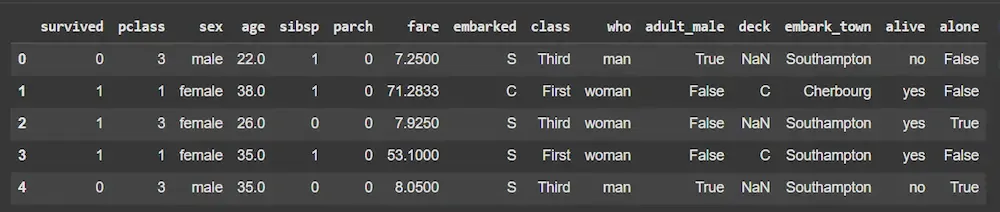
Dataset
**Note: We will be using the titanic dataset which comes inbuilt with the seaborn library.
3. Data Cleaning
Raw data is rarely ready for analysis. This step involves handling missing values, removing duplicates, standardizing formats and converting categorical variables into numerical forms. Properly prepared data improves the reliability and accuracy of our insights.
- Impute or remove missing values intelligently.
- Standardize, normalize or transform variables as needed.
- Remove irrelevant, redundant or inconsistent columns.
- Ensure data types and formats are suitable for analysis or modeling. Python `
print(titanic.isnull().sum()) titanic['age'].fillna(titanic['age'].median(), inplace=True)
titanic['embarked'].fillna(titanic['embarked'].mode()[0], inplace=True)
titanic.drop(['deck', 'embark_town', 'alive', 'class', 'who', 'adult_male'], axis=1, inplace=True) titanic['sex'] = titanic['sex'].map({'male': 0, 'female': 1}) titanic['embarked'] = titanic['embarked'].map({'C': 0, 'Q': 1, 'S': 2}) titanic.head()
`
**Output:
4. Analyze the Data
Data analysis is the core step where patterns, trends and relationships are uncovered. Depending on the objective, this may involve descriptive statistics, correlation analysis or advanced machine learning models to extract meaningful insights.
- Compute basic statistics like mean, median, mode and variance.
- Identify correlations, trends and anomalies.
- Apply models (regression, clustering, classification) to explore relationships.
- Compare findings against expectations or hypotheses. Python `
import matplotlib.pyplot as plt
plt.figure(figsize=(8, 6)) sns.heatmap(titanic.corr(), annot=True, cmap='coolwarm') plt.title("Correlation Matrix") plt.show() sns.barplot(x='pclass', y='survived', data=titanic) plt.title("Survival Rate by Passenger Class") plt.show()
`
**Output:
5. Visualize the Results
Visualizations make complex data understandable. By using charts, graphs and dashboards, we can highlight key insights, patterns and outliers. Effective visualization simplifies decision-making and communication to stakeholders.
- Use appropriate visuals like histograms, scatter plots, bar charts and heatmaps.
- Highlight important trends, patterns and anomalies clearly.
- Keep visuals simple, intuitive and actionable.
- Combine multiple charts in dashboards for comprehensive understanding. Python `
sns.countplot(x='survived', data=titanic) plt.title("Survival Count") plt.show()
sns.histplot(titanic['age'], kde=True) plt.title("Age Distribution") plt.show()
sns.scatterplot(x='age', y='fare', hue='survived', data=titanic) plt.title("Fare vs Age by Survival") plt.show()
`
**Output:
6. Interpret and Make Decisions
The final step is translating analytical results into actionable insights. Interpretation involves contextualizing findings, communicating them effectively and making data-driven decisions. Continuous monitoring ensures that the decisions remain effective over time.
- Explain results in the context of the original problem.
- Provide actionable recommendations based on insights.
- Communicate findings clearly to stakeholders.
- Monitor outcomes and iterate for continuous improvement. Python `
X = titanic.drop('survived', axis=1) y = titanic['survived']
X_train, X_val, y_train, y_val = train_test_split( X, y, test_size=0.2, random_state=42) model = RandomForestClassifier(n_estimators=100, random_state=42) model.fit(X_train, y_train)
y_pred = model.predict(X_val) accuracy = accuracy_score(y_val, y_pred) print(f"Model Accuracy: {accuracy:.4f}")
`
**Output:
Model Accuracy: 0.8101