Univariate, Bivariate and Multivariate data and its analysis (original) (raw)
Last Updated : 17 Feb, 2026
Depending on the number of variables under consideration, data analysis can be categorized into three main types: Univariate, Bivariate and Multivariate.
1. Univariate Data
Univariate data involves observations consisting of only one variable. Since there is no relationship or dependency to explore, it is the simplest and most straightforward form of statistical analysis.
- Measures central tendency (mean, median, mode) to find the typical value.
- Measures dispersion (range, variance, standard deviation) to see how data spreads.
- Detects patterns like skewness or outliers that affect data interpretation.
- Common visuals include histograms, box plots and density plots to show frequency and spread.
**Example: Heights (in cm) of seven students in a class:
[164, 167.3, 170, 174.2, 178, 180, 186]
Here the only variable is height and no relationship or interaction with other variables is being considered.
Python `
import numpy as np import pandas as pd import matplotlib.pyplot as plt import seaborn as sns
heights = np.array([164, 167.3, 170, 174.2, 178, 180, 186]) df = pd.DataFrame({'Height (cm)': heights}) print(df.describe())
sns.histplot(df['Height (cm)'], bins=5, kde=True, color='skyblue') plt.title("Univariate Analysis of Height") plt.show()
`
**Output:
**Applications:
- **Quality Control in Manufacturing: Used to analyze one feature at a time, like checking the diameter of bolts or weight of packages to ensure uniformity.
- **Healthcare Statistics: Used to study one health metric at a time, such as patient blood pressure or cholesterol levels, to identify trends.
Advantages:
- Simple and fast to compute.
- Provides clear summaries and visual representation.
Limitations:
- Doesn’t reveal cause-effect or relationships.
2. Bivariate data
Bivariate data refers to a dataset where each observation is associated with two different variables. The goal of analyzing bivariate data is to understand the relationship or association between these two variables.
- Detects whether the relationship is positive, negative or non-existent.
- Correlation measures the strength and direction of the relationship (range: -1 to +1).
- Visualization tools like scatter plots and regression lines show the pattern of change clearly.
- Often used as a foundation before moving to multivariate models.
**Example: Consider the relationship between temperature and ice cream sales during the summer season:
| Temperature | Ice Cream Sales |
|---|---|
| 20 | 2000 |
| 25 | 2500 |
| 30 | 4000 |
| 35 | 5000 |
In this case, the two variables are temperature and ice cream sales. The data suggests a positive relationship where sales increase as the temperature rises. This shows that as one variable like temperature changes then other variable like ice cream sales also changes in a predictable way.
Python `
data = {'Temperature (°C)': [20, 25, 30, 35], 'Ice Cream Sales': [2000, 2500, 4000, 5000]} df2 = pd.DataFrame(data) corr = df2.corr(numeric_only=True) print("Correlation Matrix:\n", corr)
sns.scatterplot(data=df2, x='Temperature (°C)', y='Ice Cream Sales', color='orange', s=80) sns.regplot(data=df2, x='Temperature (°C)', y='Ice Cream Sales', scatter=False, color='blue') plt.title("Bivariate Analysis: Temperature vs Ice Cream Sales") plt.xlabel("Temperature (°C)") plt.ylabel("Ice Cream Sales") plt.show()
`
**Output:
Applications:
- Sales and Advertising Relationship: Helps examine how changes in advertising budget affect sales numbers.
- Education Performance Analysis: Studies how students’ study hours relate to their exam scores.
Advantages:
- Reveals relationships and dependencies.
- Useful for preliminary hypothesis testing.
Limitations:
- Limited to only two variables at a time.
- Cannot explain multi-factor influences.
3. Multivariate data
Multivariate data contains three or more variables for each observation. The objective is to uncover how multiple variables interact or jointly affect outcomes. It’s crucial in fields like predictive analytics, econometrics and data science, where relationships are seldom limited to two variables.
- Useful when an outcome depends on several influencing factors.
- Techniques include multiple regression, PCA, MANOVA and clustering.
- Reduces data complexity using dimensionality reduction (like PCA).
- Commonly visualized using heatmaps, pair plots and 3D scatter plots for high-dimensional insight.
**Example: Consider a scenario where an advertiser wants to analyze the click rates for different advertisements on a website. The data includes multiple variables such as advertisement type, gender and click rate.
| Advertisement | Gender | Click rate |
|---|---|---|
| Ad1 | Male | 80 |
| Ad3 | Female | 55 |
| Ad2 | Female | 123 |
| Ad1 | Male | 66 |
| Ad3 | Male | 35 |
Here there are three variables: advertisement type, gender and click rate. Multivariate analysis allows us to see how these variables interact and how one variable might affect another in the context of the others.
Python `
import statsmodels.api as sm
data = { 'Ad_Type': [1, 2, 3, 1, 3], 'Gender': [0, 1, 1, 0, 0], 'Click_Rate': [80, 123, 55, 66, 35] } df3 = pd.DataFrame(data) X = df3[['Ad_Type', 'Gender']] y = df3['Click_Rate'] X = sm.add_constant(X)
model = sm.OLS(y, X).fit() print(model.summary())
`
**Output:
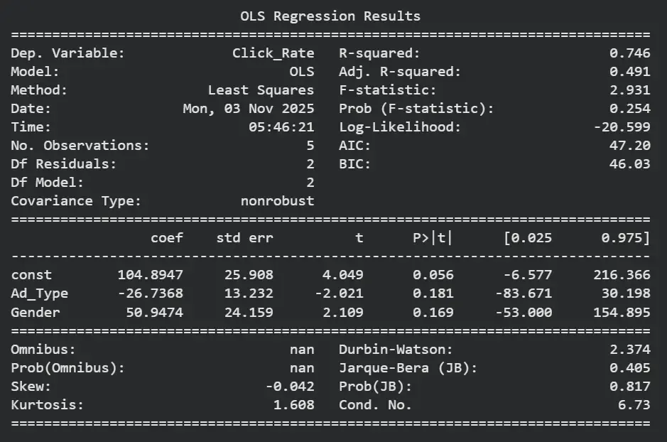
Result
Applications:
- **Customer Segmentation in Marketing: Uses multiple factors like age, income and buying habits to group customers effectively.
- **Economic Forecasting: Analyzes variables such as GDP, inflation, employment rate and exports together to predict future trends.
Advantages:
- Captures real-world complexity.
- Enables predictive modeling and deep insights.
Limitations:
- Computationally intensive and requires large datasets.
- Interpretation can be complex and may suffer from multicollinearity.
Difference between Univariate, Bivariate and Multivariate data
Lets see a tabular difference between each of them for better understanding.
| Feature | Univariate | Bivariate | Multivariate |
|---|---|---|---|
| Variables | One | Two | More than two |
| Objective | Describe a single variable | Examine relationship between two variables | Understand relationships among multiple variables |
| Dependency | No dependent variable | One dependent variable | Multiple dependent variables |
| Techniques | Descriptive statistics, histogram | Correlation, scatter plot, regression | Regression, PCA, MANOVA |
| Visualization | Histogram, Box Plot | Scatter Plot, Regression Line | Pair Plot, Heatmap, 3D Analysis |
| Example | Height of students | Temperature vs Ice Cream Sales | Ad Type, Gender & Click Rate |
| Complexity | Low | Moderate | High |