Zomato Data Analysis Using Python (original) (raw)
Last Updated : 28 Jul, 2025
Understanding customer preferences and restaurant trends is important for making informed business decisions in food industry. In this article, we will analyze Zomato’s restaurant dataset using Python to find meaningful insights. We aim to answer questions such as:
- Do more restaurants provide online delivery compared to offline services?
- Which types of restaurants are most favored by the general public?
- What price range do couples prefer for dining out?
Implementation for Zomato Data Analysis using Python.
Below steps are followed for its implementation.
Step 1: Importing necessary Python libraries.
We will be using Pandas, Numpy, Matplotlib and Seaborn libraries.
Python `
import pandas as pd import numpy as np import matplotlib.pyplot as plt import seaborn as sns
`
Step 2: Creating the data frame.
You can download the dataset from here.
Python `
dataframe = pd.read_csv("/content/Zomato-data-.csv") print(dataframe.head())
`
**Output:
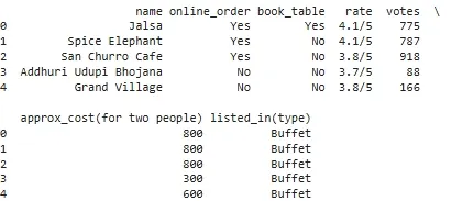
Dataset
Step 3: Data Cleaning and Preparation
Before moving further we need to clean and process the data.
1. Convert the rate column to a float by removing denominator characters.
- **dataframe['rate']=dataframe['rate'].apply(handleRate): Applies the **handleRate function to clean and convert each rating value in the 'rate' column. Python `
def handleRate(value): value=str(value).split('/') value=value[0]; return float(value)
dataframe['rate']=dataframe['rate'].apply(handleRate) print(dataframe.head())
`
**Output:
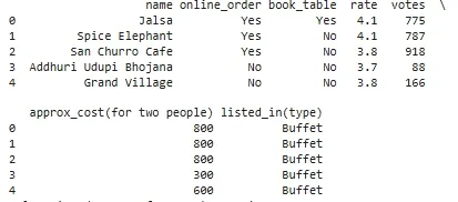
Converting rate column to float
2. Getting summary of the dataframe use df.info().
Python `
dataframe.info()
`
**Output:
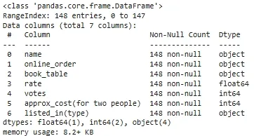
Summary of dataset
3. Checking for missing or null values to identify any data gaps.
Python `
print(dataframe.isnull().sum())
`
**Output:
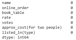
null values
There is no NULL value in dataframe.
Step 4: Exploring Restaurant Types
1. Let's see the **listed_in (type) column to identify popular restaurant categories.
Python `
sns.countplot(x=dataframe['listed_in(type)']) plt.xlabel("Type of restaurant")
`
**Output:
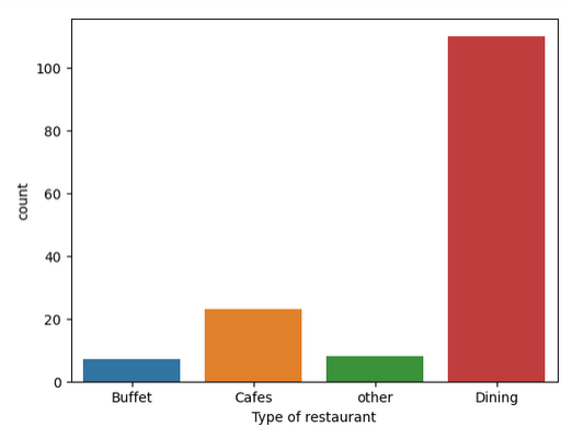
**Conclusion: The majority of the restaurants fall into the dining category.
2. Votes by Restaurant Type
Here we get the count of votes for each category.
Python `
grouped_data = dataframe.groupby('listed_in(type)')['votes'].sum() result = pd.DataFrame({'votes': grouped_data}) plt.plot(result, c='green', marker='o') plt.xlabel('Type of restaurant') plt.ylabel('Votes')
`
**Output:
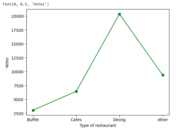
**Conclusion: Dining restaurants are preferred by a larger number of individuals.
Step 5: Identify the Most Voted Restaurant
Find the restaurant with the highest number of votes.
Python `
max_votes = dataframe['votes'].max() restaurant_with_max_votes = dataframe.loc[dataframe['votes'] == max_votes, 'name']
print('Restaurant(s) with the maximum votes:') print(restaurant_with_max_votes)
`
**Output:
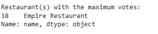
Highest number of votes
Step 6: Online Order Availability
Exploring the **online_order column to see how many restaurants accept online orders.
Python `
sns.countplot(x=dataframe['online_order'])
`
**Output:
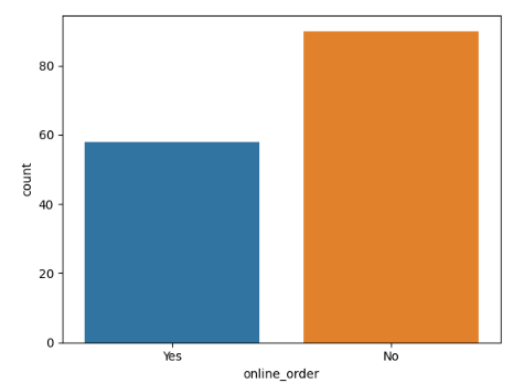
**Conclusion: This suggests that a majority of the restaurants do not accept online orders.
Step 7: Analyze Ratings
Checking the distribution of ratings from the **rate column.
Python `
plt.hist(dataframe['rate'],bins=5) plt.title('Ratings Distribution') plt.show()
`
**Output:
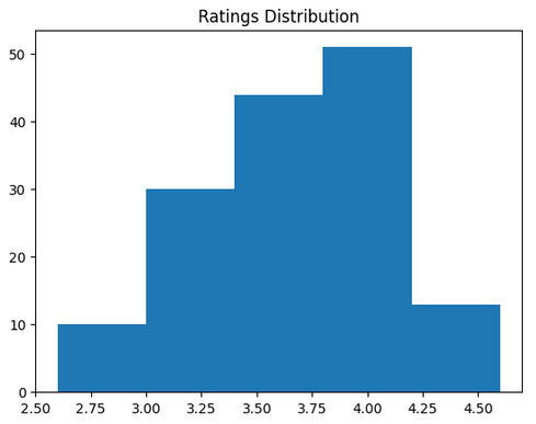
**Conclusion: The majority of restaurants received ratings ranging from 3.5 to 4.
Step 8: Approximate Cost for Couples
Analyze the **approx_cost(for two people) column to find the preferred price range.
Python `
couple_data=dataframe['approx_cost(for two people)'] sns.countplot(x=couple_data)
`
**Output:
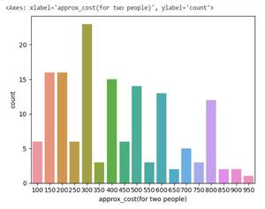
**Conclusion: The majority of couples prefer restaurants with an approximate cost of 300 rupees.
Step 9: Ratings Comparison - Online vs Offline Orders
Compare ratings between restaurants that accept online orders and those that don't.
Python `
plt.figure(figsize = (6,6)) sns.boxplot(x = 'online_order', y = 'rate', data = dataframe)
`
**Output:
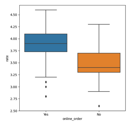
**Conclusion: Offline orders received lower ratings in comparison to online orders which obtained excellent ratings.
Step 10: Order Mode Preferences by Restaurant Type
Find the relationship between order **mode (online_order) and **restaurant type (listed_in(type)).
- **pivot_table = dataframe.pivot_table(index='listed_in(type)', columns='online_order', aggfunc='size', fill_value=0): Creates a pivot table counting restaurants by type and online order availability. Python `
pivot_table = dataframe.pivot_table(index='listed_in(type)', columns='online_order', aggfunc='size', fill_value=0) sns.heatmap(pivot_table, annot=True, cmap='YlGnBu', fmt='d') plt.title('Heatmap') plt.xlabel('Online Order') plt.ylabel('Listed In (Type)') plt.show()
`
**Output:
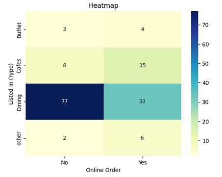
With this we can say that dining restaurants primarily accept offline orders whereas cafes primarily receive online orders. This suggests that clients prefer to place orders in person at restaurants but prefer online ordering at cafes.
You can download the source code from here****:** Zomato Data Analysis
Which library is primarily used for creating high-quality statistical visualizations in Zomato data analysis?
- NumPy
- Matplotlib
- Seaborn
- Pandas
Explanation:
Seaborn provides a high-level interface for creating visually appealing statistical graphs, making it useful for data analysis.
What is the purpose of converting the “rate” column to a float type in the dataset?
- To change the column name
- To remove unnecessary text and perform numerical operations
- To make it easier to read
- To reduce the dataset size
Explanation:
The "rate" column initially contains values like "4.1/5," which need to be converted to float for proper numerical analysis
What insight is gained by analyzing the "listed_in(type)" column in the dataset?
- The most preferred types of restaurants
- The most expensive restaurant in the dataset
- The number of restaurants in the city
- The percentage of restaurants accepting online orders
Explanation:
By analyzing the "listed_in(type)" column, we can determine which restaurant type (e.g., dining, cafes, buffet) is most popular.
Which visualization technique is used to examine the distribution of restaurant ratings?
- Scatter plot
- Histogram
- Line plot
- Bar chart
Explanation:
A histogram is used to visualize the distribution of restaurant ratings, showing the frequency of different rating ranges.
What conclusion is drawn from analyzing online vs. offline orders?
- Most restaurants accept online orders
- Most restaurants do not accept online orders
- Offline orders are always rated higher than online orders
- Online orders are more expensive than offline orders
Explanation:
The count plot analysis of the "online_order" column shows that a majority of restaurants operate offline.
What does the heatmap of the dataset reveal about online and offline orders?
- Online orders are only accepted by fine-dining restaurants
- Cafes primarily receive online orders, while dining restaurants rely on offline orders
- Online orders are the least preferred method of ordering
- All restaurants equally accept online and offline orders
Explanation:
The heatmap analysis shows that cafes prefer online orders while traditional dining restaurants focus on offline service

Quiz Completed Successfully
Your Score : 2/6
Accuracy : 0%
Login to View Explanation
1/6
1/6 < Previous Next >