Data Visualization using Matplotlib in Python (original) (raw)
Matplotlib is a powerful and widely-used Python library for creating static, animated and interactive data visualizations. In this article, we will provide a guide on Matplotlib and how to use it for data visualization with practical implementation.
Data Visualization using Matplotlib
Matplotlib offers a wide variety of plots such as line charts, bar charts, scatter plot and histograms making it versatile for different data analysis tasks. The library is built on top of NumPy making it efficient for handling large datasets. It provides a lot of flexibility in code.
Installing **Matplotlib for Data Visualization
We will use the pip command to install this module. If you do not have pip installed then refer to the article, **Download and install pip Latest Version.
To install Matplotlib type the below command in the terminal.
pip install matplotlib
If you are using Jupyter Notebook, you can install it within a notebook cell by using:
!pip install matplotlib
Data Visualization with Pyplot using Matplotlib
Matplotlib provides a module called pyplot which offers a **MATLAB-like interface for creating plots and charts. It simplifies the process of generating various types of visualizations by providing a collection of functions that handle common plotting tasks.
Matplotlib supports a variety of plots including line charts, bar charts, histograms, scatter plots, etc. Let’s understand them with implementation using pyplot.
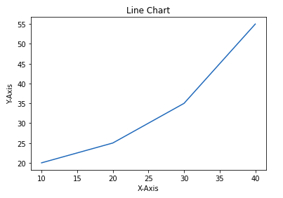
1. Line Chart
**Line chart is one of the basic plots and can be created using the **plot() function. It is used to represent a relationship between two data X and Y on a different axis.
**Example:
Python `
import matplotlib.pyplot as plt
x = [10, 20, 30, 40] y = [20, 25, 35, 55]
plt.plot(x, y)
plt.title("Line Chart")
plt.ylabel('Y-Axis')
plt.xlabel('X-Axis') plt.show()
`
**Output:
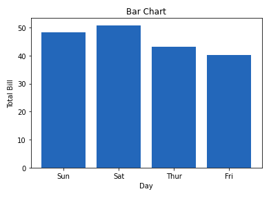
2. Bar Chart
**A **bar chart is a graph that represents the category of data with rectangular bars with lengths and heights that is proportional to the values which they represent. The bar plots can be plotted horizontally or vertically. A bar chart describes the comparisons between the different categories. It can be created using the bar() method.
In the below example we will use the tips dataset. Tips database is the record of the tip given by the customers in a restaurant for two and a half months in the early 1990s. It contains 6 columns as total_bill, tip, sex, smoker, day, time, size.
**Example:
Python `
import matplotlib.pyplot as plt import pandas as pd
data = pd.read_csv('tips.csv')
x = data['day'] y = data['total_bill']
plt.bar(x, y)
plt.title("Tips Dataset")
plt.ylabel('Total Bill')
plt.xlabel('Day')
plt.show()
`
**Output:
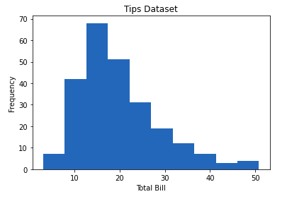
3. Histogram
A **histogram is basically used to represent data provided in a form of some groups. It is a type of bar plot where the X-axis represents the bin ranges while the Y-axis gives information about frequency. The **hist() function is used to compute and create histogram of x.
**Example:
Python `
import matplotlib.pyplot as plt import pandas as pd
data = pd.read_csv('tips.csv')
x = data['total_bill']
plt.hist(x)
plt.title("Tips Dataset")
plt.ylabel('Frequency')
plt.xlabel('Total Bill')
plt.show()
`
**Output:
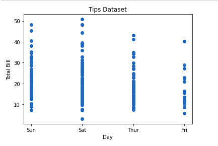
4. Scatter Plot
**Scatter plots are used to observe relationships between variables. The **scatter() method in the matplotlib library is used to draw a scatter plot.
**Example:
Python `
import matplotlib.pyplot as plt import pandas as pd
data = pd.read_csv('tips.csv')
x = data['day'] y = data['total_bill']
plt.scatter(x, y)
plt.title("Tips Dataset")
plt.ylabel('Total Bill')
plt.xlabel('Day')
plt.show()
`
**Output:
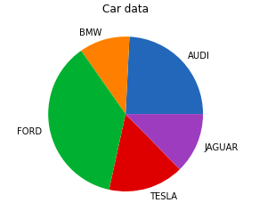
5. Pie Chart
**Pie chartis a circular chart used to display only one series of data. The area of slices of the pie represents the percentage of the parts of the data. The slices of pie are called wedges. It can be created using the pie() method.
**Syntax:
matplotlib.pyplot.pie(data, explode=None, labels=None, colors=None, autopct=None, shadow=False)
**Example:
Python `
import matplotlib.pyplot as plt import pandas as pd
data = pd.read_csv('tips.csv')
cars = ['AUDI', 'BMW', 'FORD', 'TESLA', 'JAGUAR',] data = [23, 10, 35, 15, 12]
plt.pie(data, labels=cars)
plt.title("Car data")
plt.show()
`
**Output:
6. Box Plot
A Box Plot is also known as a Whisker Plot and is a standardized way of displaying the distribution of data based on a five-number summary: minimum, first quartile (Q1), median (Q2), third quartile (Q3) and maximum. It can also show outliers.Let’s see an example of how to create a Box Plot using Matplotlib in Python:
Python `
import matplotlib.pyplot as plt import numpy as np
np.random.seed(10) data = [np.random.normal(0, std, 100) for std in range(1, 4)]
Create a box plot
plt.boxplot(data, vert=True, patch_artist=True, boxprops=dict(facecolor='skyblue'), medianprops=dict(color='red'))
plt.xlabel('Data Set') plt.ylabel('Values') plt.title('Example of Box Plot') plt.show()
`
Output:

Box Plot in Python using Matplotlib
**Explanation:
plt.boxplot(data): Creates the box plot****.** Thevert=Trueargument makes the plot vertical, andpatch_artist=Truefills the box with color.boxpropsandmedianprops: Customize the appearance of the boxes and median lines respectively.
The box shows the **interquartile range (IQR) the line inside the box shows the median and the “whiskers” extend to the minimum and maximum values within 1.5 * IQR from the first and third quartiles. Any points outside this range are considered outliers and are plotted as individual points.
7. Heatmap
A Heatmap is a data visualization technique that represents data in a matrix form where individual values are represented as colors. Heatmaps are particularly useful for visualizing the magnitude of multiple features in a two-dimensional surface and identifying patterns, correlations and concentrations. Let’s see an example of how to create a Heatmap using Matplotlib in Python:
Python `
import matplotlib.pyplot as plt import numpy as np
np.random.seed(0) data = np.random.rand(10, 10)
plt.imshow(data, cmap='viridis', interpolation='nearest')
plt.colorbar()
plt.xlabel('X-axis Label') plt.ylabel('Y-axis Label') plt.title('Example of Heatmap')
plt.show()
`
Output:
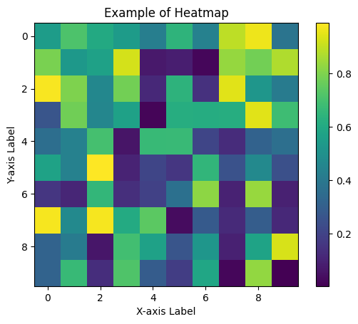
Heatmap with matplotlib
**Explanation:
plt.imshow(data, cmap='viridis'): Displays the data as an image (heatmap). Thecmap='viridis'argument specifies the color map used for the heatmap.interpolation='nearest': Ensures that each data point is shown as a block of color without smoothing.
The color bar on the side provides a scale to interpret the colors with darker colors representing lower values and lighter colors representing higher values. This type of plot is often used in fields like data analysis, bioinformatics and finance to visualize data correlations and distributions across a matrix.
Matplotlib Customization and Styling
Matplotlib allows extensive customization and styling of plots including changing colors, adding labels and modifying plot styles.
Let’s apply the customization techniques we’ve learned to the basic plots we created earlier. This will involve enhancing each plot with titles, axis labels, limits, tick labels, and legends to make them more informative and visually appealing.
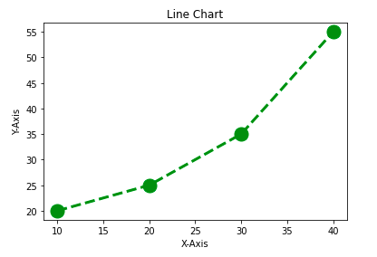
**1. Customizing Line Chart
Let’s see how to customize the line chart. We will be using the following properties:
- **color: Changing the color of the line
- **linewidth: Customizing the width of the line
- **marker: For changing the style of actual plotted point
- **markersize: For changing the size of the markers
- **linestyle: For defining the style of the plotted line
**Example:
Python `
import matplotlib.pyplot as plt
x = [10, 20, 30, 40] y = [20, 25, 35, 55]
plt.plot(x, y, color='green', linewidth=3, marker='o', markersize=15, linestyle='--')
plt.title("Line Chart")
plt.ylabel('Y-Axis')
plt.xlabel('X-Axis')
plt.show()
`
**Output:
**2. Customizing Bar Chart
To make bar charts more informative and visually appealing various customization options are available. Customization that is available for the Bar Chart are:
- **color: For the bar faces
- **edgecolor: Color of edges of the bar
- **linewidth: Width of the bar edges
- **width: Width of the bar
**Example:
Python `
import matplotlib.pyplot as plt import pandas as pd
data = pd.read_csv('tips.csv')
x = data['day'] y = data['total_bill']
plt.bar(x, y, color='green', edgecolor='blue', linewidth=2)
plt.title("Tips Dataset")
plt.ylabel('Total Bill')
plt.xlabel('Day')
plt.show()
`
**Output:
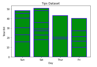
**The lines in between the bars refer to the different values in the Y-axis of the particular value of the X-axis.
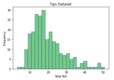
**3. Customizing Histogram Plot
To make histogram plots more effective and tailored to your data, you can apply various customizations:
- **bins: Number of equal-width bins
- **color: For changing the face color
- **edgecolor: Color of the edges
- **linestyle: For the edgelines
- **alpha: blending value, between 0 (transparent) and 1 (opaque)
**Example:
Python `
import matplotlib.pyplot as plt import pandas as pd
data = pd.read_csv('tips.csv')
x = data['total_bill']
plt.hist(x, bins=25, color='green', edgecolor='blue', linestyle='--', alpha=0.5)
plt.title("Tips Dataset")
plt.ylabel('Frequency')
plt.xlabel('Total Bill')
plt.show()
`
**Output:
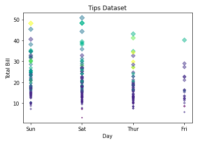
**4. Customizing Scatter Plot
Scatter plots are versatile tools for visualizing relationships between two variables. Customizations that are available for the scatter plot are to enhance their clarity and effectiveness:
- **s: marker size (can be scalar or array of size equal to size of x or y)
- **c: color of sequence of colors for markers
- **marker: marker style
- **linewidths: width of marker border
- **edgecolor: marker border color
- **alpha: blending value, between 0 (transparent) and 1 (opaque) Python `
import matplotlib.pyplot as plt import pandas as pd
data = pd.read_csv('tips.csv')
x = data['day'] y = data['total_bill']
plt.scatter(x, y, c=data['size'], s=data['total_bill'], marker='D', alpha=0.5)
plt.title("Tips Dataset")
plt.ylabel('Total Bill')
plt.xlabel('Day')
plt.show()
`
**Output:
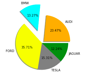
**5. Customizing Pie Chart
Pie charts are a great way to visualize proportions and parts of a whole. To make your pie charts more effective and visually appealing, consider the following customization techniques:
- **explode: Moving the wedges of the plot
- **autopct: Label the wedge with their numerical value.
- **color: Attribute is used to provide color to the wedges.
- **shadow: Used to create shadow of wedge.
**Example:
Python `
import matplotlib.pyplot as plt import pandas as pd
data = pd.read_csv('tips.csv')
cars = ['AUDI', 'BMW', 'FORD', 'TESLA', 'JAGUAR',] data = [23, 13, 35, 15, 12]
explode = [0.1, 0.5, 0, 0, 0]
colors = ( "orange", "cyan", "yellow", "grey", "green",)
plt.pie(data, labels=cars, explode=explode, autopct='%1.2f%%', colors=colors, shadow=True)
plt.show()
`
**Output:
Matplotlib’s Core Components: Figures and Axes
Before moving any further with Matplotlib let’s discuss some important classes that will be used further in the tutorial. These classes are:
- **Figure
- **Axes
1. Figure class
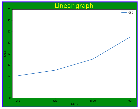
Consider the figure class as the overall window or page on which everything is drawn. It is a top-level container that contains one or more axes. A figure can be created using the **figure() method.
**Syntax:
class matplotlib.figure.Figure(figsize=None, dpi=None, facecolor=None, edgecolor=None, linewidth=0.0, frameon=None, subplotpars=None, tight_layout=None, constrained_layout=None)
**Example:
Python `
import matplotlib.pyplot as plt from matplotlib.figure import Figure
x = [10, 20, 30, 40] y = [20, 25, 35, 55]
Creating a new figure with width = 7 inches
and height = 5 inches with face color as
green, edgecolor as red and the line width
of the edge as 7
fig = plt.figure(figsize =(7, 5), facecolor='g', edgecolor='b', linewidth=7)
ax = fig.add_axes([1, 1, 1, 1])
ax.plot(x, y)
plt.title("Linear graph", fontsize=25, color="yellow")
plt.ylabel('Y-Axis') plt.xlabel('X-Axis')
plt.ylim(0, 80)
plt.xticks(x, labels=["one", "two", "three", "four"])
plt.legend(["GFG"])
plt.show()
`
**Output:
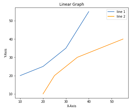
2. Axes Class
**Axes class is the most basic and flexible unit for creating sub-plots. A given figure may contain many axes, but a given axes can only be present in one figure. The **axes() function creates the axes object.
**Syntax:
axes([left, bottom, width, height])
Just like pyplot class, axes class also provides methods for adding titles, legends, limits, labels, etc. Let’s see a few of them –
- ax.set_title() is used to add title.
- To Adding X Label and Y label **– ax.set_xlabel(), ax.set_ylabel()
- To set the limits we use ax.set_xlim(), ax.set_ylim()
- ax.set_xticklabels(), ax.set_yticklabels() are used to tick labels.
- To add legend we use ax.legend()
**Example:
Python `
import matplotlib.pyplot as plt from matplotlib.figure import Figure
x = [10, 20, 30, 40] y = [20, 25, 35, 55]
fig = plt.figure(figsize = (5, 4)) ax = fig.add_axes([1, 1, 1, 1])
ax1 = ax.plot(x, y) ax2 = ax.plot(y, x)
ax.set_title("Linear Graph")
ax.set_xlabel("X-Axis") ax.set_ylabel("Y-Axis")
ax.legend(labels = ('line 1', 'line 2'))
plt.show()
`
**Output:
Advanced Plotting: Techniques for Visualizing Subplots
We have learned about the basic components of a graph that can be added so that it can convey more information. One method can be by calling the plot function again and again with a different set of values as shown in the above example. Now let’s see how to plot multiple graphs using some functions and also how to plot subplots.
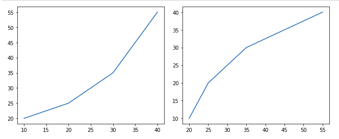
**Method 1: Using the add_axes() method
The add_axes() method method allows you to manually add axes to a figure in Matplotlib. It takes a list of four values [left, bottom, width, height] to specify the position and size of the axes.
**Example:
Python `
import matplotlib.pyplot as plt from matplotlib.figure import Figure
x = [10, 20, 30, 40] y = [20, 25, 35, 55]
Creating a new figure with width = 5 inches
and height = 4 inches
fig = plt.figure(figsize =(5, 4))
ax1 = fig.add_axes([0.1, 0.1, 0.8, 0.8])
ax2 = fig.add_axes([1, 0.1, 0.8, 0.8])
ax1.plot(x, y) ax2.plot(y, x)
plt.show()
`
**Output:
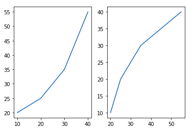
**Method 2: Using subplot() method
subplot() method adds a plot to a specified grid position within the current figure. It takes three arguments: the number of rows, columns, and the plot index. Now Let’s understand it with the help of example:
**Example:
Python `
import matplotlib.pyplot as plt
x = [10, 20, 30, 40] y = [20, 25, 35, 55]
plt.figure()
plt.subplot(121) plt.plot(x, y)
plt.subplot(122) plt.plot(y, x)
`
**Output:
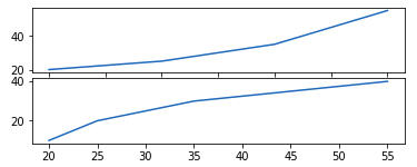
**Method 4: Using subplot2grid() method
The subplot2grid() creates axes object at a specified location inside a grid and also helps in spanning the axes object across multiple rows or columns. In simpler words, this function is used to create multiple charts within the same figure.
**Example:
Python `
import matplotlib.pyplot as plt
x = [10, 20, 30, 40] y = [20, 25, 35, 55]
axes1 = plt.subplot2grid ( (7, 1), (0, 0), rowspan = 2, colspan = 1)
axes2 = plt.subplot2grid ( (7, 1), (2, 0), rowspan = 2, colspan = 1)
axes1.plot(x, y) axes2.plot(y, x)
`
**Output:
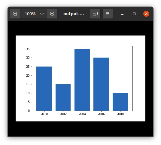
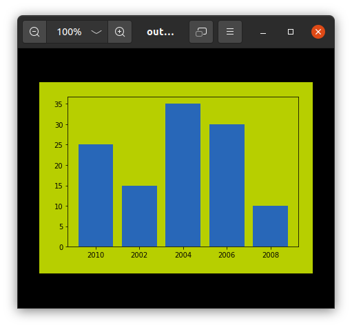
Saving the Matplotlib Plots Using savefig()
For saving a plot in a file on storage disk, savefig() method is used. A file can be saved in many formats like .png, .jpg, .pdf, etc.
**Example:
Python `
import matplotlib.pyplot as plt
year = ['2010', '2002', '2004', '2006', '2008'] production = [25, 15, 35, 30, 10]
plt.bar(year, production)
plt.savefig("output.jpg")
plt.savefig("output1", facecolor='y', bbox_inches="tight", pad_inches=0.3, transparent=True)
`
**Output:
In this guide, we have explored the fundamentals of Matplotlib, from installation to advanced plotting techniques. By mastering these concepts, Whether you are working with simple line charts or complex heatmaps you can create and customize a wide range of visualizations to effectively communicate data insights.