5 Best Practices for Effective and Good Data Visualizations (original) (raw)
Last Updated : 24 Jul, 2025
In today's data-driven world, the ability to visualize information effectively is more important than ever. Data visualization simplifies complex statistics and reveals patterns, trends, and insights that might otherwise remain hidden within large datasets. As data continues to grow exponentially, mastering visualization skills has become essential across industries for effective communication and informed decision-making. Here are five best practices to follow when creating impactful visualizations.
1. Selecting the Appropriate Visualization Type
Selecting the appropriate chart depends on your data and the story you want to tell. Use bar charts for comparisons, line graphs for trends over time, scatter plots for relationships and pie charts for proportions. Before designing, define the purpose of your visualization:
- What message are you conveying?
- What should viewers take away?
A clear goal guides chart selection and design. For example, to show monthly sales trends, a line graph effectively highlights peaks, dips and seasonal patterns.
.webp)
2. Simplify and Declutter Data for Effective Visualization
A cluttered chart can confuse viewers and obscure key insights. Simplify your visuals by removing non-essential elements while keeping the core message clear and easy to interpret. Tips for decluttering:
- Lighten or remove grid lines if they don’t aid comprehension.
- Limit colors to a simple, cohesive palette that directs attention without overwhelming.
- Avoid unnecessary decorations like borders, background fills, or 3D effects.
- Use clear, concise labels that support understanding without overcrowding.
- Clean up axes by removing excessive ticks or labels.
**Example: In a bar chart comparing country populations, use a single color for bars, keep labels minimal yet informative, and eliminate heavy grid lines to maintain focus on the data itself.
.webp)
3. Use Proper Highlights and Color Codes
Color enhances understanding but must be used thoughtfully to avoid confusion. Use it to highlight key data points or group related items, ensuring colors are distinct and accessible.
**Examples:
- **Highlighting Key Data: To show the highest sales for products A–D over Q1–Q4, use a standout color (e.g., green) for the top values to make them easily noticeable.
- **Grouping Items: Assign different colors to categories (e.g., electronics, clothing) to help viewers spot trends within each group.
- **Accessibility: Use patterns or labels alongside color to support users with color vision deficiencies, ensuring the chart is readable for all.
**4. Choose the Right Chart Type
There are many chart types available, each suited for different purposes. Here are some common ones:
- **Bar Charts: Effective for comparing categories (e.g., comparing sales figures across regions).
- **Line Charts: Ideal for showing trends over time (e.g., tracking website traffic over months).
- **Pie Charts: Useful for depicting proportions of a whole (e.g., customer satisfaction survey results).
- **Scatter Plots: Used to reveal relationships between two variables (e.g., correlation between advertising spend and customer acquisition).
- **Histograms: Used to represent the distribution of a continuous variable. Helpful in understanding the frequency or density distribution of data.
- **Box Plots (Box-and-Whisker Plots): Box plots are useful for summarizing the distribution of a dataset and identifying outliers.
- **Area Charts: Area charts are similar to line charts but with the area below the lines filled with color. They are effective for showing changes in quantities over time while also emphasizing the magnitude of those changes.
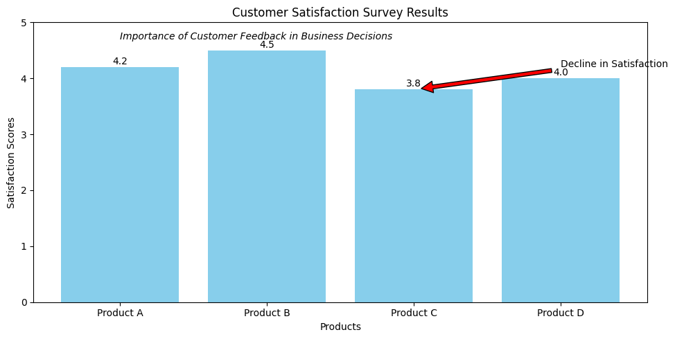
5. Tell a Story
Effective visualizations guide viewers through the data by telling a story. Use titles, labels, and annotations to provide context and highlight key insights, making the data more relatable.
**Example:
Instead of just showing a bar chart of customer satisfaction, add context about its business impact. Use annotations to highlight declines (e.g., in a specific product line) and explain causes like changes in product quality or service. This helps viewers focus on what truly matters.
Why Good Data Visualization is Important?
There are several reasons why data visualization is crucial.
- **Better Comprehension: By converting difficult-to-understand numerical data into consumable representations, visualizations may facilitate viewers' understanding and interpretation of the information.
- **Finding Hidden Patterns and Trends: With huge datasets, data visualizations may assist users in finding hidden patterns, outliers, and trends that may be difficult to find in raw data alone.
- **Effective Communication: Succinct and captivating representations of important thoughts and discoveries may facilitate improved decision-making and teamwork.
- **Storytelling: Complex information may be made more interesting and memorable for the audience by using data visualizations to tell tales and construct narratives.
- **Informed Decision-Making: Visualizations may assist data-driven decision-making and strategic planning by presenting facts in an aesthetically pleasing and understandable manner.
Common Mistakes to Avoid for a Good Data Visualization?
- **Typical Errors to Prevent Overwhelming the Audience: Refrain from overloading a single visualization with data or visual clutter.
- **Data Misrepresentation: Make that the visualization correctly depicts the underlying data, free from any information manipulation or distortion.
- **Lack of Accessibility: Certain audience members may be excluded if accessibility characteristics like color blindness and screen reader compatibility are ignored.
- **Inconsistent or Inappropriate Styling: An unprofessional visualization may be created by using inconsistent typefaces, colors, and visual components.
- **Failure to Provide Context: If crucial contextual details like labels, units, and explanations are missing, the viewer may get perplexed.