Bad Data Visualization Examples Explained (original) (raw)
Last Updated : 17 Jul, 2025
**Data visualization plays an important role in simplifying complex data. But when done poorly, it can mislead, distort information and result in incorrect interpretations. This article explores common examples of bad data visualization and provides tips to avoid them.
Example of Bad Data Visualizations
1. Misleading Graphs
Misleading graphs are one of the most deceptive forms of bad data visualization. They distort the viewer’s perception, leading to incorrect interpretations. Common tactics include:
- **Truncated Y-Axis: Starting the Y-axis at a value other than zero exaggerates differences, making minor variations appear more significant than they are.
- **Improper Scaling: Using inconsistent or unexplained scales (e.g., a logarithmic scale without clarification) can mislead viewers into seeing patterns that don't reflect the actual data.
- **Cherry-Picked Data: Selecting only a subset of data that supports a specific narrative while ignoring the full context misrepresents the true picture, especially in time series graphs.
2. Inappropriate Chart Types
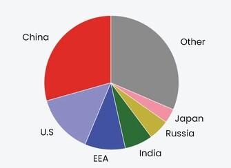
Overloaded Pie Chart
Using the wrong chart type can mislead viewers and obscure the data’s true meaning. Common mistakes include:
- Pie Charts with Too Many Categories: Pie charts work best with fewer than five categories. Too many slices make it cluttered and hard to interpret.
- 3D Charts: Although visually appealing, 3D effects often distort data. They make it hard to read values accurately and add unnecessary complexity.
- Line Charts for Categorical Data: Line charts imply continuity or trends over time. Using them for unrelated categories (e.g., survey results by department) can falsely suggest a relationship between the values.
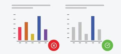
3. Overcomplicated Visuals

Visual Overload → Clean Layout
Data is best understood when presented clearly and simply. Overly complex visuals can confuse rather than clarify. Common issues include:
- Excessive Graphics: Decorative icons or images may look appealing but often distract from the actual data, reducing clarity.
- Crowded Charts: Overloading charts with too many lines, bars, or variables makes them hard to read and interpret.
- Complex Color Schemes: Using too many or poorly chosen colors can overwhelm viewers and make patterns difficult to identify.
4. Lack of context
Without proper context, visualizations can lead to incorrect assumptions and misunderstandings. Key missing elements often include:
- No Labels or Titles: Charts without clear titles, axis labels, or legends leave viewers guessing about what the data represents.
- Missing Axes or Scales: Omitting axes or scales prevents viewers from understanding the magnitude or relationship between data points.
- No Data Sources: Failing to cite data sources reduces credibility and raises doubts about the accuracy and validity of the information.
5. Poor use of colors
Distracting Colors → Consistent Tones
Bad color choices can make charts confusing or inaccessible. Common mistakes include:
- Inconsistent Color Use: Using different colors for the same category across visuals can mislead viewers and reduce clarity.
- Color Blindness Ignorance: Ignoring color accessibility excludes viewers with color vision deficiency, especially red-green blindness, which affects a significant portion of the population.
- Overly Bright or Clashing Colors: Extremely vibrant or clashing colors can cause visual fatigue and make data hard to interpret.
Common Mistakes in Data Visualization
**1. Wrong Chart Type: Using the wrong chart misrepresents data. For example, pie charts become ineffective with too many categories. Line charts work best for showing trends over time.
**2. Information Overload: Cramming too much data into one graphic overwhelms viewers. Break complex information into multiple, focused visuals with clear labels.
**3. Dishonest Scales: Starting axes at non-zero values or using inconsistent scales can distort the data. Always begin axes at zero and maintain uniform scales for fair comparison.
**4. Color Chaos: Using too many colors or low contrast combinations confuses viewers and excludes those with color blindness. Stick to a limited, accessible, and visually clear color palette.
**5. Missing Context: Charts without titles, labels, legends, or data sources leave viewers guessing. Always include these elements to ensure clarity and credibility.
Why they don't work?
- Confusing or cluttered visuals can make it difficult for viewers to extract meaningful insights from the data.
- Misleading scales or axes can distort the data and lead to incorrect interpretations.
- Lack of context or labeling makes it hard for viewers to understand the significance of the data points.
- Poor color choices can make it challenging for viewers to differentiate between data categories.
Tips for Avoiding Bad Data Visualization
Here's a breakdown of the "Better Alternatives" section with some additional details:
- **Choose the Right Chart: Match your chart type to the data and the story—use line charts for trends, bar charts for comparisons, and scatter plots for relationships.
- **Understand the Data's Story: Clearly identify what you’re trying to show—temporal change, category grouping, or correlation.
- **Limit Variables Per Chart: Use pie charts only for a few categories. For more data points, use bar or stacked bar charts to keep visuals readable.
- **Focus on Clarity: Avoid clutter. Use multiple simple charts instead of one overloaded graphic.
- **Highlight Key Insights: Use color, size, or positioning to draw attention to the most important data.
- **Use Honest Scales: Always start axes at zero and avoid manipulating scale ranges.
- **Keep Scales Consistent: Use the same scale across similar charts for accurate comparison.
- **Use Color Strategically: Stick to 3–5 harmonious colors. Avoid excessive brightness or clashing tones.
- **Prioritize Accessibility: Choose colorblind-friendly palettes and check contrast with tools like WebAIM Contrast Checker.
Here are some additional tips for effective data visualization:
- **Use white space effectively: Never overload your work with multiple features and data points; charts should not be filled with elements. There are several reasons why leading Space is used, and possibly the most obvious is that your visuals will not appear cluttered.
- **Consider interactivity: They enable the viewers to follow data through the visualization without necessarily requiring interpretation by a third party, hence making the visualizations more interesting.
- **Test and refine: Consult others about your visualizations, including co-workers and, possibly, target consumers. This is especially useful if you want to do some polishing on your charts before submitting the final version.