Bar Graph (original) (raw)
Last Updated : 6 Feb, 2026
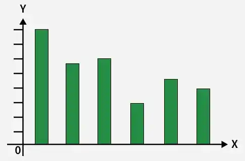
A bar graph is a pictorial representation of data using rectangular bars of equal width, where the length or height of each bar shows the value or frequency of the data. It helps in comparing different categories easily and clearly. The bars may be drawn vertically or horizontally, making data simple to understand and interpret.
Properties of a Bar Graph
• All the bars start from a common base line.
• Each bar has the same width.
• The height or length of each bar shows the value of the data.
• The distance between every two bars is equal.
• Bars can be drawn either vertically or horizontally.
Types of Bar Graphs or Bar Diagrams
The different types of Bar Graphs are as follows:
- Simple Bar Graph
- Multiple Bar Graph
- Sub-Divided Bar Graph or Component Bar Graph
- Percentage Bar Graph
- Broken-Scale Bar Graph
- Deviation Bar Graph
1. Simple Bar Graph
A simple bar graph is a graphical representation of data in which only one variable is represented by rectangular bars of equal width, and the height or length of each bar is proportional to the value of that variable.
- **Vertical Bar Graph: The diagram in which the magnitude of the data is presented vertically, i.e., along the Y-axis, is a Vertical Bar Diagram.
- **Horizontal Bar Graph: The diagram in which the magnitude of the data is presented horizontally; i.e., along the X-axis is a Horizontal Bar Diagram
The following table shows the percentage of monthly salary saved by each employee in a 100-person company. Create a vertical and a horizontal bar diagram to represent it.
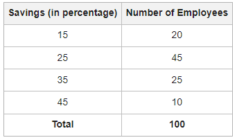
**Solution:
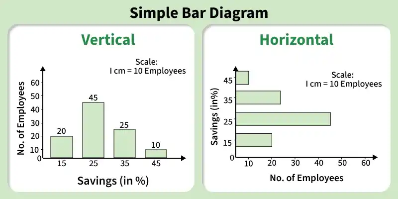
Simple Bar - vertical and horizontal
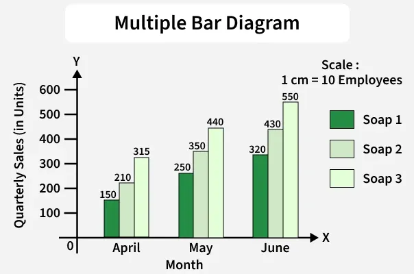
2. Multiple Bar Graph
A multiple bar diagram is used to compare two or more related variables at the same time, such as income and expenditure or marks in different subjects over the years. It is also called a compound bar diagram. It is drawn in the same way as a simple bar diagram, but different colours or shades are used to clearly identify and compare each variable.
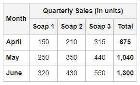
A company manufactures three varieties of soap. Represent the following information showing the quarterly sales (three months) using a multiple-bar diagram.

**Solution:
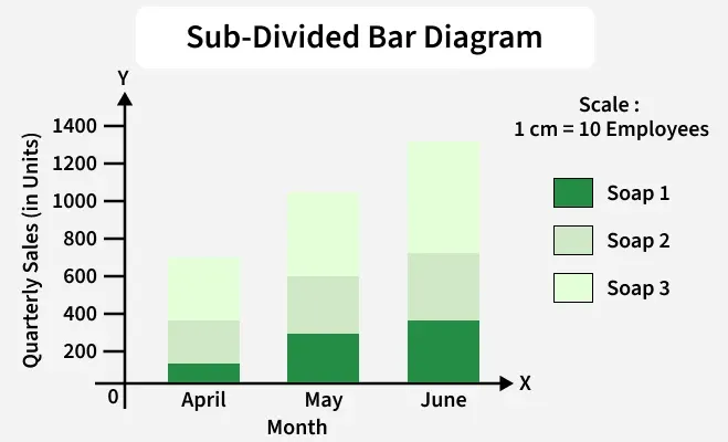
3. Sub-Divided Bar Graph
A sub-divided bar graph is used to show how a whole is divided into different parts. In this diagram, each bar represents the total value and is further divided into smaller sections according to the share of each component. Different colours or shades are used to represent each part, with a key to explain them. This type of graph helps students easily understand and compare the parts of a whole, such as boys and girls in a class or different types of expenses in a family.
Represent the following information using a sub-divided bar diagram, showing the quarterly sales of three varieties of soap manufactured by a company.
**Solution:
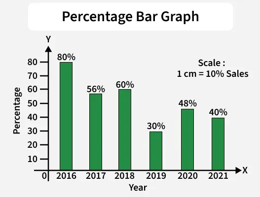
4. Percentage Bar Graph
A percentage bar graph is used to represent data in the form of percentages. In this graph, each bar represents a total of 100% and is divided into parts according to the percentage of each component. It helps in comparing the relative contribution of different parts to the whole and can be drawn vertically or horizontally using different colours or shades for clarity.
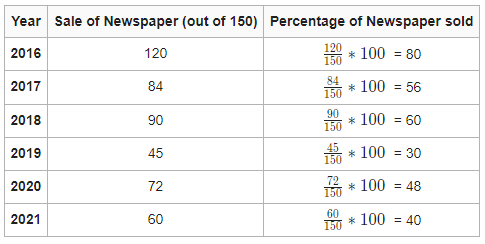
The table below displays the number of newspapers sold out by the company, out of the total printed newspaper from 2016 to 2021.

**Solution:
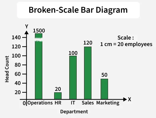
5. Broken-Scale Bar Graph
A broken scale graph is a graph in which the scale on an axis is intentionally broken to show both very large and small values clearly. It is used when data values vary widely so that large values are compressed and the graph is easier to read.
Prepare an appropriate diagram using the following data.

**Solution:
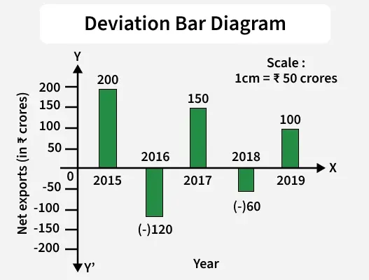
6. Deviation Bar Graph
A deviation bar diagram is a bar graph in which bars are drawn on both sides of a baseline (usually zero) to show positive and negative values. Bars above the baseline represent positive deviations, while bars below represent negative deviations from a standard or average value.
The following table shows the data relating to the net exports of a company in different years. Use a deviation bar diagram to represent the profit/loss made by the firm.

**Solution:
**Steps to Draw a Bar Graph
- **Collecting Data: Gather the data to be represented. Make sure the data is categorical and each category has a value.
- **Choosing the Type of Bar Graph: Select the suitable bar graph according to the data and comparison needed.
- **Drawing the Axes: Draw the x-axis (horizontal) and y-axis (vertical) and label them properly.
- **Plotting the Bars: Draw bars of equal width and equal spacing. The height or length of each bar should represent its value.
- **Adding Labels and Title: Label the categories and values clearly and give a suitable title to the bar graph.
**Key Points of Bar Graph
• Bars should have equal width and equal spacing between them.
• Always read the x-axis and y-axis carefully to understand what the data represents.
• The height or length of each bar shows the value or frequency of the data.
• A proper scale should be chosen so that the data is shown clearly.
• Bar graphs are useful for large data because they are easier and quicker to draw than pictographs.
**Related Articles: