Box and Whisker Plot | Meaning, Uses and Example (original) (raw)
Last Updated : 19 Jan, 2026
A Box and Whisker Plot is also called as a Box Plot which is a graphical representation of a dataset based on its five-point summary. It displays the distribution of data using a rectangular box and two whiskers making it easy to understand the spread, central tendency and presence of extreme values in a dataset. The box plot is made up of the following components:
- **Box: The box extends from the first quartile (Q1) to the third quartile (Q3). It represents the middle 50% of the data, also known as the Interquartile Range (IQR).
- **Whiskers: The whiskers extend from Q1 to the minimum value and from Q3 to the maximum value, showing the range of most of the data.
- **Median Line: A line inside the box represents the median (Q2), dividing the dataset into two equal halves.
- **Outliers: Data points that lie beyond the whiskers are treated as outliers and are usually shown as individual points.
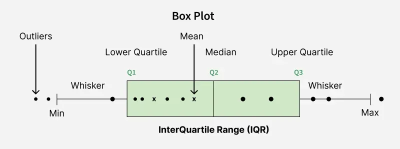
Plot
How to Create a Box and Whisker Plot
The following steps are used to construct a box and whisker plot:
- **Collect the Data: Gather the dataset you want to visualise.
- **Calculate Quartiles: Find Q1, Q2 (median) and Q3 from the ordered data.
- **Determine Whiskers: Identify the minimum and maximum values, excluding outliers if required.
- **Draw the Box and Whiskers: Draw a box from Q1 to Q3, place a line at Q2 and extend whiskers to the minimum and maximum values.
- **Identify Outliers: Plot any values that lie beyond the whiskers as individual points.
Example
**Example: Suppose we have a dataset representing the test scores of a group of students:
Data (test scores): 78, 85, 90, 92, 95, 96, 97, 98, 99, 100, 105, 110, 120.
**Step 1: Calculate Quartiles
To create a Box and Whisker Plot, we need to calculate the quartiles (Q1 and Q3) and the median (Q2).
- Q1 (the first quartile) is the median of the lower half of the data (78, 85, 90, 92, 95, 96) = 91
- Q2 (the median) is the median of the entire dataset = 97
- Q3 (the third quartile) is the median of the upper half of the data: (98, 99, 100, 105, 110, 120) = 102.5
**Step 2: Determine Whiskers
To find the whiskers, calculate the minimum and maximum values within the dataset, excluding potential outliers.
- Minimum = 78, Maximum = 120
- The required five-number summary is 78, 91, 97, 102.5, 120.
**Step 3: Plot the Box and Whiskers
Now, we can create the Box and Whisker Plot:
- Draw a box from Q1 (91) to Q3 (102.5).
- Draw a line inside the box at Q2 (97).
- Extend the left whisker from the minimum (78) to Q1 (91).
- Extend the right whisker from Q3 (102.5) to the maximum (120).
**Step 4: Identify Outliers
Any data points that fall outside the whiskers are considered outliers. In this case, we do not have any outliers.
- This Box and Whisker Plot gives a visual rundown of the grades, showing the middle (Q2) at 97
- The interquartile range (IQR) from Q1 to Q3 (91 to 102.5) and the shortfall of exceptions.
- It successfully outlines the focal propensity, spread and dissemination of the dataset.
Uses of Box and Whisker Plot
- **Visualizing Data Distribution: Box plots provide a clear picture of how data is spread, showing the center, range and overall distribution in a compact visual form.
- **Comparing Multiple Groups: They are useful for comparing different datasets side by side, such as student scores across classes or sales across regions.
- **Detecting Outliers: Box plots make it easy to spot unusual or extreme values that lie far from the rest of the data.
- **Understanding Skewness: By observing the position of the median and the length of whiskers, one can determine whether data is symmetric or skewed.
- **Supporting Statistical **Analysis: They provide a quick summary of key statistics, helping analysts decide which statistical methods or tests to apply.
- **Quality Control and Monitoring: In manufacturing and business processes, box plots help track variations and identify when results fall outside acceptable limits.