Data Visualisation in Python using Matplotlib and Seaborn (original) (raw)
Last Updated : 9 Nov, 2022
It may sometimes seem easier to go through a set of data points and build insights from it but usually this process may not yield good results. There could be a lot of things left undiscovered as a result of this process. Additionally, most of the data sets used in real life are too big to do any analysis manually. This is essentially where data visualization steps in.
Data visualization is an easier way of presenting the data, however complex it is, to analyze trends and relationships amongst variables with the help of pictorial representation.
The following are the advantages of Data Visualization
- Easier representation of compels data
- Highlights good and bad performing areas
- Explores relationship between data points
- Identifies data patterns even for larger data points
While building visualization, it is always a good practice to keep some below mentioned points in mind
- Ensure appropriate usage of shapes, colors, and size while building visualization
- Plots/graphs using a co-ordinate system are more pronounced
- Knowledge of suitable plot with respect to the data types brings more clarity to the information
- Usage of labels, titles, legends and pointers passes seamless information the wider audience
Python Libraries
There are a lot of python libraries which could be used to build visualization like matplotlib, vispy, bokeh, seaborn, pygal, folium, plotly, cufflinks, and networkx. Of the many, matplotlib and seaborn seems to be very widely used for basic to intermediate level of visualizations.
Matplotlib
It is an amazing visualization library in Python for 2D plots of arrays, It is a multi-platform data visualization library built on NumPy arrays and designed to work with the broader SciPy stack. It was introduced by John Hunter in the year 2002. Let's try to understand some of the benefits and features of matplotlib
- It's fast, efficient as it is based on numpy and also easier to build
- Has undergone a lot of improvements from the open source community since inception and hence a better library having advanced features as well
- Well maintained visualization output with high quality graphics draws a lot of users to it
- Basic as well as advanced charts could be very easily built
- From the users/developers point of view, since it has a large community support, resolving issues and debugging becomes much easier
Seaborn
Conceptualized and built originally at the Stanford University, this library sits on top of matplotlib. In a sense, it has some flavors of matplotlib while from the visualization point, it is much better than matplotlib and has added features as well. Below are its advantages
- Built-in themes aid better visualization
- Statistical functions aiding better data insights
- Better aesthetics and built-in plots
- Helpful documentation with effective examples
Nature of Visualization
Depending on the number of variables used for plotting the visualization and the type of variables, there could be different types of charts which we could use to understand the relationship. Based on the count of variables, we could have
- Univariate plot(involves only one variable)
- Bivariate plot(more than one variable in required)
A Univariate plot could be for a continuous variable to understand the spread and distribution of the variable while for a discrete variable it could tell us the count
Similarly, a Bivariate plot for continuous variable could display essential statistic like correlation, for a continuous versus discrete variable could lead us to very important conclusions like understanding data distribution across different levels of a categorical variable. A bivariate plot between two discrete variables could also be developed.
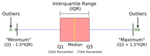
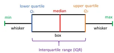
Box plot
A boxplot, also known as a box and whisker plot, the box and the whisker are clearly displayed in the below image. It is a very good visual representation when it comes to measuring the data distribution. Clearly plots the median values, outliers and the quartiles. Understanding data distribution is another important factor which leads to better model building. If data has outliers, box plot is a recommended way to identify them and take necessary actions.
Syntax: seaborn.boxplot(x=None, y=None, hue=None, data=None, order=None, hue_order=None, orient=None, color=None, palette=None, saturation=0.75, width=0.8, dodge=True, fliersize=5, linewidth=None, whis=1.5, ax=None, **kwargs)
Parameters:
x, y, hue: Inputs for plotting long-form data.
data: Dataset for plotting. If x and y are absent, this is interpreted as wide-form.
color: Color for all of the elements.Returns: It returns the Axes object with the plot drawn onto it.
The box and whiskers chart shows how data is spread out. Five pieces of information are generally included in the chart
- The minimum is shown at the far left of the chart, at the end of the left ‘whisker’
- First quartile, Q1, is the far left of the box (left whisker)
- The median is shown as a line in the center of the box
- Third quartile, Q3, shown at the far right of the box (right whisker)
- The maximum is at the far right of the box
As could be seen in the below representations and charts, a box plot could be plotted for one or more than one variable providing very good insights to our data.
Representation of box plot.
Box plot representing multi-variate categorical variables
Box plot representing multi-variate categorical variables
Python3 `
import required modules
import matplotlib as plt import seaborn as sns
Box plot and violin plot for Outcome vs BloodPressure
_, axes = plt.subplots(1, 2, sharey=True, figsize=(10, 4))
box plot illustration
sns.boxplot(x='Outcome', y='BloodPressure', data=diabetes, ax=axes[0])
violin plot illustration
sns.violinplot(x='Outcome', y='BloodPressure', data=diabetes, ax=axes[1])
`
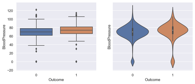
Output for Box Plot and Violin Plot
Python3 `
Box plot for all the numerical variables
sns.set(rc={'figure.figsize': (16, 5)})
multiple box plot illustration
sns.boxplot(data=diabetes.select_dtypes(include='number'))
`
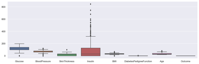
Output Multiple Box PLot
Scatter Plot
Scatter plots or scatter graphs is a bivariate plot having greater resemblance to line graphs in the way they are built. A line graph uses a line on an X-Y axis to plot a continuous function, while a scatter plot relies on dots to represent individual pieces of data. These plots are very useful to see if two variables are correlated. Scatter plot could be 2 dimensional or 3 dimensional.
Syntax: seaborn.scatterplot(x=None, y=None, hue=None, style=None, size=None, data=None, palette=None, hue_order=None, hue_norm=None, sizes=None, size_order=None, size_norm=None, markers=True, style_order=None, x_bins=None, y_bins=None, units=None, estimator=None, ci=95, n_boot=1000, alpha=’auto’, x_jitter=None, y_jitter=None, legend=’brief’, ax=None, **kwargs)
Parameters:
x, y: Input data variables that should be numeric.data: Dataframe where each column is a variable and each row is an observation.
size: Grouping variable that will produce points with different sizes.
style: Grouping variable that will produce points with different markers.
palette: Grouping variable that will produce points with different markers.
markers: Object determining how to draw the markers for different levels.
alpha: Proportional opacity of the points.
Returns: This method returns the Axes object with the plot drawn onto it.
Advantages of a scatter plot
- Displays correlation between variables
- Suitable for large data sets
- Easier to find data clusters
- Better representation of each data point Python3 `
import module
import matplotlib.pyplot as plt
scatter plot illustration
plt.scatter(diabetes['DiabetesPedigreeFunction'], diabetes['BMI'])
`
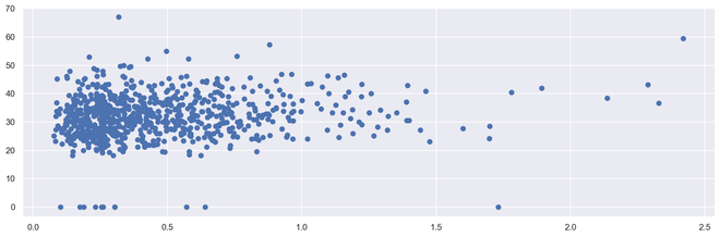
Output 2D Scattered Plot
Python3 `
import required modules
from mpl_toolkits.mplot3d import Axes3D
assign axis values
x = [1, 2, 3, 4, 5, 6, 7, 8, 9, 10] y = [5, 6, 2, 3, 13, 4, 1, 2, 4, 8] z = [2, 3, 3, 3, 5, 7, 9, 11, 9, 10]
adjust size of plot
sns.set(rc={'figure.figsize': (8, 5)}) fig = plt.figure() ax = fig.add_subplot(111, projection='3d') ax.scatter(x, y, z, c='r', marker='o')
assign labels
ax.set_xlabel('X Label'), ax.set_ylabel('Y Label'), ax.set_zlabel('Z Label')
display illustration
plt.show()
`
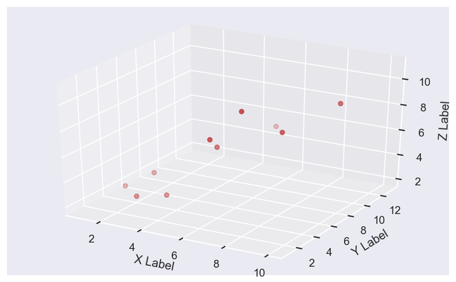
Output 3D Scattered Plot
Histogram
Histograms display counts of data and are hence similar to a bar chart. A histogram plot can also tell us how close a data distribution is to a normal curve. While working out statistical method, it is very important that we have a data which is normally or close to a normal distribution. However, histograms are univariate in nature and bar charts bivariate.
A bar graph charts actual counts against categories e.g. height of the bar indicates the number of items in that category whereas a histogram displays the same categorical variables in bins.
Bins are integral part while building a histogram they control the data points which are within a range. As a widely accepted choice we usually limit bin to a size of 5-20, however this is totally governed by the data points which is present.
Python3 `
illustrate histogram
features = ['BloodPressure', 'SkinThickness'] diabetes[features].hist(figsize=(10, 4))
`
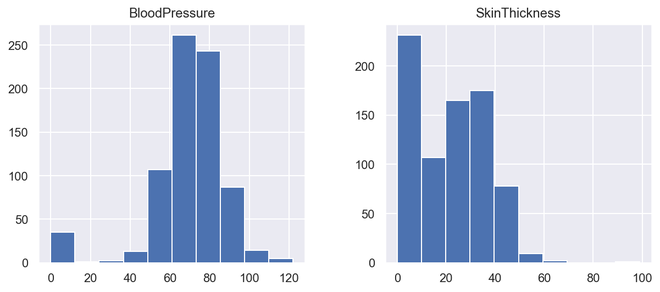
Output Histogram
Countplot
A countplot is a plot between a categorical and a continuous variable. The continuous variable in this case being the number of times the categorical is present or simply the frequency. In a sense, count plot can be said to be closely linked to a histogram or a bar graph.
Syntax : seaborn.countplot(x=None, y=None, hue=None, data=None, order=None, hue_order=None, orient=None, color=None, palette=None, saturation=0.75, dodge=True, ax=None, **kwargs)
Parameters : This method is accepting the following parameters that are described below:
- x, y: This parameter take names of variables in data or vector data, optional, Inputs for plotting long-form data.
- hue : (optional) This parameter take column name for colour encoding.
- data : (optional) This parameter take DataFrame, array, or list of arrays, Dataset for plotting. If x and y are absent, this is interpreted as wide-form. Otherwise it is expected to be long-form.
- order, hue_order : (optional) This parameter take lists of strings. Order to plot the categorical levels in, otherwise the levels are inferred from the data objects.
- orient : (optional)This parameter take “v” | “h”, Orientation of the plot (vertical or horizontal). This is usually inferred from the dtype of the input variables but can be used to specify when the “categorical” variable is a numeric or when plotting wide-form data.
- color : (optional) This parameter take matplotlib color, Color for all of the elements, or seed for a gradient palette.
- palette : (optional) This parameter take palette name, list, or dict, Colors to use for the different levels of the hue variable. Should be something that can be interpreted by color_palette(), or a dictionary mapping hue levels to matplotlib colors.
- saturation : (optional) This parameter take float value, Proportion of the original saturation to draw colors at. Large patches often look better with slightly desaturated colors, but set this to 1 if you want the plot colors to perfectly match the input color spec.
- dodge : (optional) This parameter take bool value, When hue nesting is used, whether elements should be shifted along the categorical axis.
- ax : (optional) This parameter take matplotlib Axes, Axes object to draw the plot onto, otherwise uses the current Axes.
- kwargs : This parameter take key, value mappings, Other keyword arguments are passed through to matplotlib.axes.Axes.bar().
Returns: Returns the Axes object with the plot drawn onto it.
It simply shows the number of occurrences of an item based on a certain type of category.In python, we can create a count plot using the seaborn library. Seaborn is a module in Python that is built on top of matplotlib and used for visually appealing statistical plots.
Python3 `
import required module
import seaborn as sns
assign required values
_, axes = plt.subplots(nrows=1, ncols=2, figsize=(12, 4))
illustrate count plots
sns.countplot(x='Outcome', data=diabetes, ax=axes[0]) sns.countplot(x='BloodPressure', data=diabetes, ax=axes[1])
`
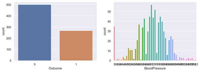
Output Countplot
Correlation plot
Correlation plot is a multi-variate analysis which comes very handy to have a look at relationship with data points. Scatter plots helps to understand the affect of one variable over the other. Correlation could be defined as the affect which one variable has over the other.
Correlation could be calculated between two variables or it could be one versus many correlations as well which we could see the below plot. Correlation could be positive, negative or neutral and the mathematical range of correlations is from -1 to 1. Understanding the correlation could have a very significant effect on the model building stage and also understanding the model outputs.
Python3 `
Finding and plotting the correlation for
the independent variables
import required module
import seaborn as sns
adjust plot
sns.set(rc={'figure.figsize': (14, 5)})
assign data
ind_var = ['CRIM', 'ZN', 'INDUS', 'CHAS', 'NOX', 'RM', 'AGE', 'DIS', 'RAD', 'TAX', 'PTRATIO', 'B', 'LSTAT']
illustrate heat map.
sns.heatmap(diabetes.select_dtypes(include='number').corr(), cmap=sns.cubehelix_palette(20, light=0.95, dark=0.15))
`
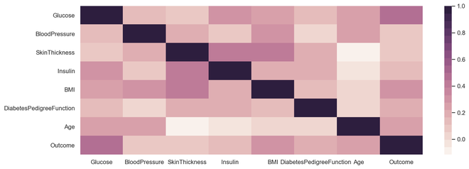
Output Correlation Plot
Heat Maps
Heat map is a multi-variate data representation. The color intensity in a heat map displays becomes an important factor to understand the affect of data points. Heat maps are easier to understand and easier to explain as well. When it comes to data analysis using visualization, its very important that the desired message gets conveyed with the help of plots.
Syntax:
seaborn.heatmap(data, *, vmin=None, vmax=None, cmap=None, center=None, robust=False, annot=None, fmt='.2g', annot_kws=None, linewidths=0, linecolor='white', cbar=True, cbar_kws=None, cbar_ax=None, square=False, xticklabels='auto', yticklabels='auto', mask=None, ax=None, **kwargs)
Parameters : This method is accepting the following parameters that are described below:
- x, y: This parameter take names of variables in data or vector data, optional, Inputs for plotting long-form data.
- hue : (optional) This parameter take column name for colour encoding.
- data : (optional) This parameter take DataFrame, array, or list of arrays, Dataset for plotting. If x and y are absent, this is interpreted as wide-form. Otherwise it is expected to be long-form.
- color : (optional) This parameter take matplotlib color, Color for all of the elements, or seed for a gradient palette.
- palette : (optional) This parameter take palette name, list, or dict, Colors to use for the different levels of the hue variable. Should be something that can be interpreted by color_palette(), or a dictionary mapping hue levels to matplotlib colors.
- ax : (optional) This parameter take matplotlib Axes, Axes object to draw the plot onto, otherwise uses the current Axes.
- kwargs : This parameter take key, value mappings, Other keyword arguments are passed through to matplotlib.axes.Axes.bar().
Returns: Returns the Axes object with the plot drawn onto it.
Python3 `
import required module
import seaborn as sns import numpy as np
assign data
data = np.random.randn(50, 20)
illustrate heat map
ax = sns.heatmap(data, xticklabels=2, yticklabels=False)
`
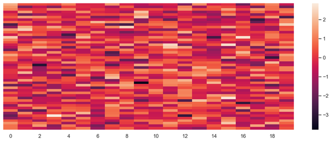
Output Heat Map
Pie Chart
Pie chart is a univariate analysis and are typically used to show percentage or proportional data. The percentage distribution of each class in a variable is provided next to the corresponding slice of the pie. The python libraries which could be used to build a pie chart is matplotlib and seaborn.
Syntax: matplotlib.pyplot.pie(data, explode=None, labels=None, colors=None, autopct=None, shadow=False)
Parameters:
data represents the array of data values to be plotted, the fractional area of each slice is represented by data/sum(data). If sum(data)<1, then the data values returns the fractional area directly, thus resulting pie will have empty wedge of size 1-sum(data).
labels is a list of sequence of strings which sets the label of each wedge.
color attribute is used to provide color to the wedges.
autopct is a string used to label the wedge with their numerical value.
shadow is used to create shadow of wedge.
Below are the advantages of a pie chart
- Easier visual summarization of large data points
- Effect and size of different classes can be easily understood
- Percentage points are used to represent the classes in the data points Python3 `
import required module
import matplotlib.pyplot as plt
Creating dataset
cars = ['AUDI', 'BMW', 'FORD', 'TESLA', 'JAGUAR', 'MERCEDES'] data = [23, 17, 35, 29, 12, 41]
Creating plot
fig = plt.figure(figsize=(10, 7)) plt.pie(data, labels=cars)
Show plot
plt.show()
`
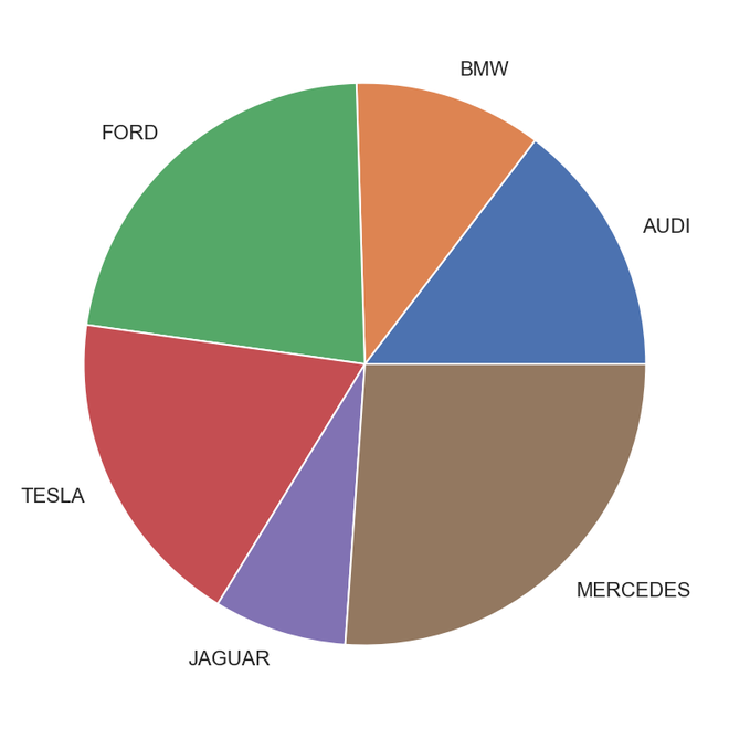
Output Pie Chart
Python3 `
Import required module
import matplotlib.pyplot as plt import numpy as np
Creating dataset
cars = ['AUDI', 'BMW', 'FORD', 'TESLA', 'JAGUAR', 'MERCEDES'] data = [23, 17, 35, 29, 12, 41]
Creating explode data
explode = (0.1, 0.0, 0.2, 0.3, 0.0, 0.0)
Creating color parameters
colors = ("orange", "cyan", "brown", "grey", "indigo", "beige")
Wedge properties
wp = {'linewidth': 1, 'edgecolor': "green"}
Creating autocpt arguments
def func(pct, allvalues): absolute = int(pct / 100.*np.sum(allvalues)) return "{:.1f}%\n({:d} g)".format(pct, absolute)
Creating plot
fig, ax = plt.subplots(figsize=(10, 7)) wedges, texts, autotexts = ax.pie(data, autopct=lambda pct: func(pct, data), explode=explode, labels=cars, shadow=True, colors=colors, startangle=90, wedgeprops=wp, textprops=dict(color="magenta"))
Adding legend
ax.legend(wedges, cars, title="Cars", loc="center left", bbox_to_anchor=(1, 0, 0.5, 1)) plt.setp(autotexts, size=8, weight="bold") ax.set_title("Customizing pie chart")
Show plot
plt.show()
`
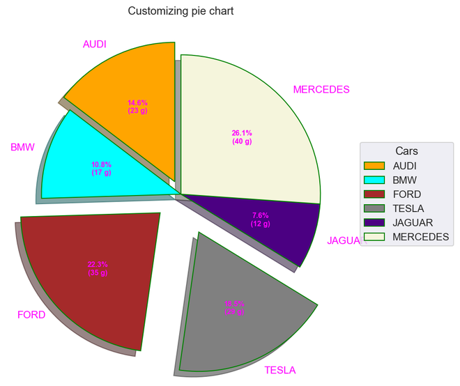
Output
Error Bars
Error bars could be defined as a line through a point on a graph, parallel to one of the axes, which represents the uncertainty or error of the corresponding coordinate of the point. These types of plots are very handy to understand and analyze the deviations from the target. Once errors are identified, it could easily lead to deeper analysis of the factors causing them.
- Deviation of data points from the threshold could be easily captured
- Easily captures deviations from a larger set of data points
- It defines the underlying data Python3 `
Import required module
import matplotlib.pyplot as plt import numpy as np
Assign axes
x = np.linspace(0,5.5,10) y = 10*np.exp(-x)
Assign errors regarding each axis
xerr = np.random.random_sample(10) yerr = np.random.random_sample(10)
Adjust plot
fig, ax = plt.subplots() ax.errorbar(x, y, xerr=xerr, yerr=yerr, fmt='-o')
Assign labels
ax.set_xlabel('x-axis'), ax.set_ylabel('y-axis') ax.set_title('Line plot with error bars')
Illustrate error bars
plt.show()
`
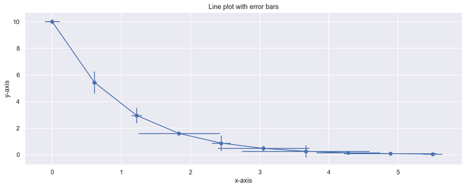
Output Error Plot