Data Visualization with Seaborn Line Plot (original) (raw)
Last Updated : 24 Jul, 2025
**Data visualization helps uncover patterns and insights in data and line plots are ideal for showing trends and relationships between two continuous variables over time or sequence. Seaborn, a Python library built on Matplotlib, provides a simple yet powerful lineplot() function for creating attractive line plots. It supports customization through parameters like hue for color grouping, style for line patterns, and size for line thickness, making it easy to enhance clarity and comparison in visual data analysis.Prerequisites
Before you get started, make sure the following libraries are installed in your Python environment:
Installation
Using pip:
pip install seaborn
Using conda (Anaconda Distribution):
conda install seaborn
If you're using an IDE like Jupyter or Spyder under Anaconda, Seaborn might already be installed.
Single Line Plot
A line plot displays data along the X and Y axes connected by a line, making it easy to observe trends over a continuous range such as time.
**Syntax:
seaborn.lineplot(x, y, data)
**Parameters:
- **x: Variable to be plotted along the x-axis
- **y: Variable to be plotted along the y-axis
- **data: The DataFrame containing the data
**Example:
Python `
import seaborn as sn import matplotlib.pyplot as plt import pandas as pd
data = pd.read_csv("C:\Users\Vanshi\Desktop\gfg\bestsellers.csv") data = data.iloc[2:10, :] sn.lineplot(x="Year", y="User Rating", data=data) plt.show()
`
**Output:
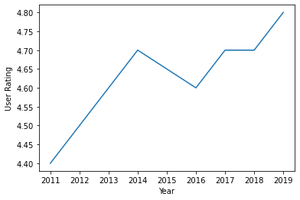
**Explanation: This code loads bestseller data from a CSV, selects rows 2 to 9 and plots "Year" vs "User Rating" using **Seaborn's lineplot, then displays it with **plt.show().
Customizing Line Plot Styles
Seaborn provides the set() function to customize the background, context, and palette of your plots.
**Syntax:
seaborn.set(style="darkgrid", context="notebook", palette="deep")
**Parameters:
- **style: Background style — "white", "dark", "whitegrid", "darkgrid", "ticks".
- **context: Plot scaling — "paper", "notebook", "talk", "poster".
- **palette: Color theme — "deep", "muted", "bright", "pastel", "dark", "colorblind".
- **font (optional): Font family.
- **font_scale (optional): Font size scaling.
- **color_codes (optional): Enables shorthand colors from the palette.
- **rc (optional): Overrides default settings via a dictionary.
**Example:
Python `
import seaborn as sn import matplotlib.pyplot as plt import pandas as pd
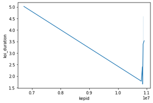
data = pd.read_csv("C:\Users\Vanshi\Desktop\gfg\cumulative.csv") data = data.iloc[2:10, :]
sn.lineplot(x="kepid", y="koi_duration", data=data, hue="koi_score") sn.set(style="darkgrid")
plt.show()
`
**Output:
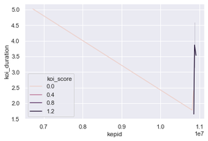
**Explanation: This code reads data from a CSV file, selects rows 2 to 9 and plots a line graph of "kepid" vs "koi_duration" using Seaborn, with line color based on "koi_score". It sets a dark grid style and displays the plot using plt.show().
Multiple Line Plot
A multiple line plot is ideal for this purpose as it allows differentiation between datasets using attributes such as color, line style or size. Each line in the plot is essentially a regular line plot, but visually distinguished based on a category or variable.
Differentiation by Color
To distinguish lines by color, use the hue parameter:
sns.lineplot(x, y, data=data, hue="column_name")
**Parameter: hue maps the lines to a categorical variable and displays each with a different color.
**Example:
Python `
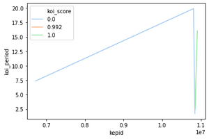
import seaborn as sns import matplotlib.pyplot as plt import pandas as pd
data = pd.read_csv("C:\Users\Vanshi\Desktop\gfg\cumulative.csv") data = data.iloc[2:10, :] sns.lineplot(x="kepid", y="koi_period", data=data, hue="koi_score")
plt.show()
`
**Output
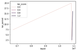
**Explanation: Loads the CSV file and selects rows 2 to 9. Plots a line graph of "kepid" vs "koi_period", with each line colored based on its "koi_score" value using the hue parameter.
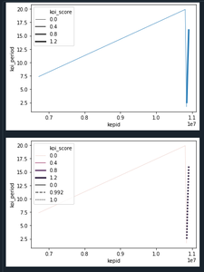
Differentiation by Line Style
To distinguish lines by style (e.g., dashed, dotted), use the style parameter:
sns.lineplot(x, y, data=data, style="column_name")
**Example:
Python `
import seaborn as sn import matplotlib.pyplot as plt import pandas as pd
data = pd.read_csv("C:\Users\Vanshi\Desktop\gfg\cumulative.csv")
data = data.iloc[2:10, :] sn.lineplot(x="kepid", y="koi_period", data=data, style="koi_score") plt.show() sn.lineplot(x="kepid", y="koi_period", data=data, hue="koi_score", style="koi_score")
plt.show()
`
**Output:
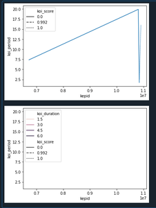
**Explanation: The first plot differentiates lines by line style only (e.g., dashed, dotted) based on "koi_score". The second plot combines color (hue) and line style (style) to make each line visually distinct by both attributes.
Differentiation by Line Size
You can also vary the thickness of each line using the size parameter:
sns.lineplot(x, y, data=data, size="column_name")
**Example:
Python `
import seaborn as sn import matplotlib.pyplot as plt import pandas as pd
data = pd.read_csv("C:\Users\Vanshi\Desktop\gfg\cumulative.csv") data = data.iloc[2:10, :]
sn.lineplot(x="kepid", y="koi_period", data=data, size="koi_score") plt.show()
sn.lineplot(x="kepid", y="koi_period", data=data, size="koi_score", hue="koi_score", style="koi_score") plt.show()
`
**Output:
**Explanation: The first plot uses size to vary the line thickness based on "koi_score". The second plot combines size, color and style to provide more differentiation between lines.
Error Bars in Line Plot
Error bars represent variability or uncertainty in data. Seaborn supports two error bar styles using the err_style parameter: "band" (default) or "bars".
sns.lineplot(x, y, data=data, err_style="band" or "bars")
**Example:
Python `
import seaborn as sn import matplotlib.pyplot as plt import pandas as pd
data = pd.read_csv("C:\Users\Vanshi\Desktop\gfg\cumulative.csv") data = data.iloc[2:10, :] sn.lineplot(x="kepid", y="koi_duration", data=data, err_style="band") plt.show()
`
**Output:
**Explanation: This plot adds a shaded band around each line to represent variability (e.g., confidence intervals or error margins) using "band" style. The default error bars are computed from the data and shown as shaded regions.
Custom Color Palettes
The color scheme depicted by lines can be changed using a palette attribute along with hue. Different colors supported using palette can be chosen from- SEABORN COLOR PALETTE
**Syntax:
lineplot(x,y,data,hue,palette)
**Example:
Dataset used- (Data shows an exoplanet space research dataset compiled by nasa.)
Python `
import seaborn as sn import matplotlib.pyplot as plt import pandas as pd
data = pd.read_csv("C:\Users\Vanshi\Desktop\gfg\cumulative.csv") data = data.iloc[2:10,:] sn.lineplot(x = "kepid", y = "koi_period",data=data, hue="koi_score", palette="pastel") plt.show()
`
**Output:
**Explanation: This plot uses the palette="pastel" to apply a soft color palette to lines distinguished by "koi_score".