Plotting Histogram in Python using Matplotlib (original) (raw)
Last Updated : 14 Oct, 2025
Histograms are one of the most fundamental tools in data visualization. They provide a graphical representation of data distribution, showing how frequently each value or range of values occurs. Histograms are especially useful for analyzing continuous numerical data, such as measurements, sensor readings, or experimental results.
A histogram is a type of bar plot where:
- The X-axis represents intervals (called bins) of the data.
- The Y-axis represents the frequency of values within each bin.
Unlike regular bar plots, histograms group data into bins to summarize data distribution effectively.
Creating a Matplotlib Histogram
- Divide the data range into consecutive, non-overlapping intervals called bins.
- Count how many values fall into each bin.
- Use the matplotlib.pyplot.hist() function to plot the histogram.
The following table shows the parameters accepted by matplotlib.pyplot.hist() function :
| Attribute | Parameter |
|---|---|
| x | Array or sequence of numerical data. |
| bins | Number of bins (int) or specific intervals (array). |
| density | If True, normalizes histogram to show probability instead of frequency. |
| range | Tuple specifying lower and upper limits of bins. |
| histtype | Type of histogram: bar, barstacked, step, stepfilled. Default: bar. |
| align | Bin alignment: left, right, mid. |
| weights | Array of weights for each data point. |
| bottom | Baseline for bins. |
| rwidth | Relative width of bars (0–1). |
| color | Color of bars. Can be a single color or sequence. |
| label | Label for legend. |
| log | If True, uses logarithmic scale on Y-axis. |
Plotting Histogram in Python using Matplotlib
Here we will see different methods of Plotting Histogram in Matplotlib in Python:
- Basic Histogram
- Customized Histogram with Density Plot
- Customized Histogram with Watermark
- Multiple Histograms with Subplots
- Stacked Histogram
- 2D Histogram (Hexbin Plot)
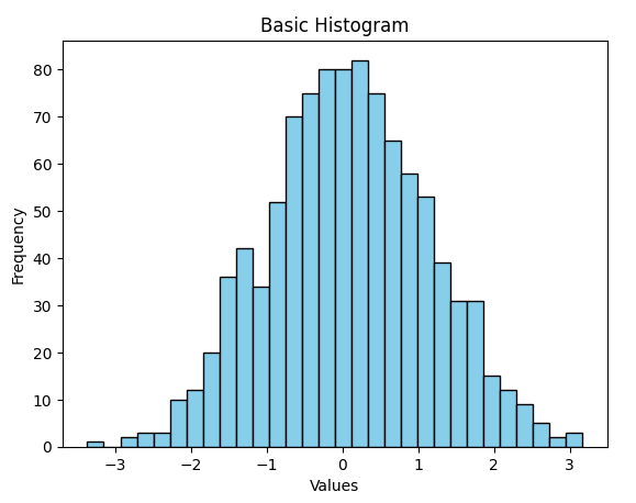
1. Basic Histogram
Python `
import matplotlib.pyplot as plt import numpy as np
Generate random data for the histogram
data = np.random.randn(1000)
Plotting a basic histogram
plt.hist(data, bins=30, color='skyblue', edgecolor='black')
Adding labels and title
plt.xlabel('Values') plt.ylabel('Frequency') plt.title('Basic Histogram')
Display the plot
plt.show()
`
**Output
**Explanation:
- Generates 1000 random numbers from a standard normal distribution.
- Plots a histogram with 30 bins, sky-blue bars, and black edges.
- Adds X and Y axis labels and a title.
- Displays the histogram plot.
This is the simplest way to visualize data distribution.
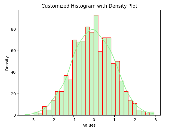
2. Customized Histogram with Density Plot
Python `
import matplotlib.pyplot as plt import seaborn as sns import numpy as np
Generate random data for the histogram
data = np.random.randn(1000)
Creating a customized histogram with a density plot
sns.histplot(data, bins=30, kde=True, color='lightgreen', edgecolor='red')
Adding labels and title
plt.xlabel('Values') plt.ylabel('Density') plt.title('Customized Histogram with Density Plot')
Display the plot
plt.show()
`
**Output
**Explanation:
- Generates 1000 random numbers.
- Plots a histogram with 30 bins and a smooth density curve (KDE) using Seaborn.
- Colors bars light green with red edges.
- Adds axis labels and a title.
- Displays the plot showing data distribution and density.
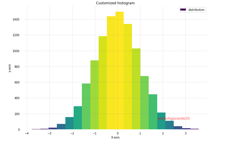
3. Customized Histogram with Watermark
Python `
import matplotlib.pyplot as plt import numpy as np from matplotlib import colors from matplotlib.ticker import PercentFormatter
Creating dataset
np.random.seed(23685752) N_points = 10000 n_bins = 20
Creating distribution
x = np.random.randn(N_points) y = 0.8 ** x + np.random.randn(N_points) + 25 legend = ['distribution']
Creating figure and axes
fig, axs = plt.subplots(1, 1, figsize=(10, 7), tight_layout=True)
Remove axes splines
for s in ['top', 'bottom', 'left', 'right']: axs.spines[s].set_visible(False)
Remove x, y ticks
axs.xaxis.set_ticks_position('none') axs.yaxis.set_ticks_position('none')
Add padding between axes and labels
axs.xaxis.set_tick_params(pad=5) axs.yaxis.set_tick_params(pad=10)
Add x, y gridlines (updated syntax)
axs.grid(visible=True, color='grey', linestyle='-.', linewidth=0.5, alpha=0.6)
Add text watermark
fig.text(0.9, 0.15, 'Jeeteshgavande30', fontsize=12, color='red', ha='right', va='bottom', alpha=0.7)
Creating histogram
N, bins, patches = axs.hist(x, bins=n_bins)
Setting color gradient
fracs = ((N ** (1 / 5)) / N.max()) norm = colors.Normalize(fracs.min(), fracs.max())
for thisfrac, thispatch in zip(fracs, patches): color = plt.cm.viridis(norm(thisfrac)) thispatch.set_facecolor(color)
Adding extra features
plt.xlabel("X-axis") plt.ylabel("Y-axis") plt.legend(legend) plt.title('Customized Histogram with Watermark')
Show plot
plt.show()
`
**Output
**Explanation:
- Sets the random seed for reproducibility.
- Generates 10,000 random numbers (x) from a standard normal distribution.
- Plots a histogram with 20 bins and applies a color gradient to the bars.
- Removes axis spines and ticks, adds gridlines, and includes a watermark.
- Adds axis labels, a legend, and a title.
- Displays a visually enhanced, customized histogram.
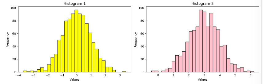
4. Multiple Histograms with Subplots
Python `
import matplotlib.pyplot as plt import numpy as np
Generate random data for multiple histograms
data1 = np.random.randn(1000) data2 = np.random.normal(loc=3, scale=1, size=1000)
Creating subplots with multiple histograms
fig, axes = plt.subplots(nrows=1, ncols=2, figsize=(12, 4))
axes[0].hist(data1, bins=30, color='Yellow', edgecolor='black') axes[0].set_title('Histogram 1')
axes[1].hist(data2, bins=30, color='Pink', edgecolor='black') axes[1].set_title('Histogram 2')
Adding labels and title
for ax in axes: ax.set_xlabel('Values') ax.set_ylabel('Frequency')
Adjusting layout for better spacing
plt.tight_layout()
Display the figure
plt.show()
`
**Output
**Explanation:
- Generates two datasets of 1,000 random numbers each.
- Creates side-by-side histograms using subplots.
- Plots data1 in yellow and data2 in pink with 30 bins.
- Adds axis labels and titles, adjusts layout, and displays the figure.
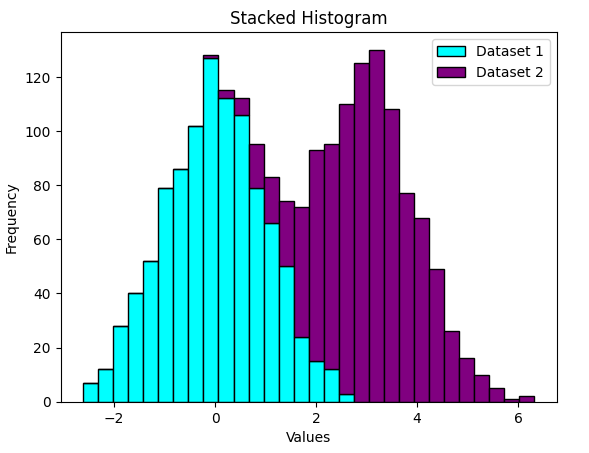
5. Stacked Histogram
Python `
import matplotlib.pyplot as plt import numpy as np
Generate random data for stacked histograms
data1 = np.random.randn(1000) data2 = np.random.normal(loc=3, scale=1, size=1000)
Creating a stacked histogram
plt.hist([data1, data2], bins=30, stacked=True, color=['cyan', 'Purple'], edgecolor='black')
Adding labels and title
plt.xlabel('Values') plt.ylabel('Frequency') plt.title('Stacked Histogram')
Adding legend
plt.legend(['Dataset 1', 'Dataset 2'])
Display the plot
plt.show()
`
**Output
**Explanation:
- Generates two datasets of 1,000 random numbers each.
- Creates a stacked histogram showing both datasets combined.
- Uses cyan and purple bars with black edges.
- Adds axis labels, a title, and a legend.
- Displays the histogram showing combined data distribution.
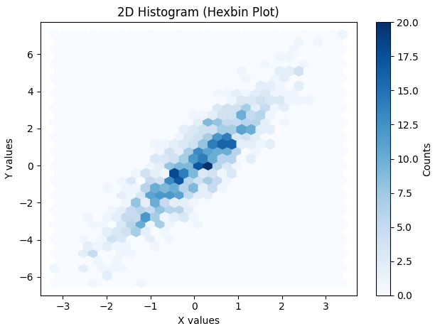
6. 2D Histogram (Hexbin Plot)
Python `
import matplotlib.pyplot as plt import numpy as np
Generate random 2D data for hexbin plot
x = np.random.randn(1000) y = 2 * x + np.random.normal(size=1000)
Creating a 2D histogram (hexbin plot)
plt.hexbin(x, y, gridsize=30, cmap='Blues')
Adding labels and title
plt.xlabel('X values') plt.ylabel('Y values') plt.title('2D Histogram (Hexbin Plot)')
Adding colorbar
plt.colorbar(label='Counts')
plt.show()
`
**Output
Output
**Explanation:
- Generates two sets of 1,000 random numbers (x and y).
- Creates a 2D histogram (hexbin plot) showing data density with hexagons.
- Uses a blue color map to represent density intensity.
- Adds axis labels, a title, and a colorbar to interpret density.
- Displays the 2D histogram showing the relationship between x and y.
Related Articles
Plotting Histogram Chart in Python using Matplotlib