Python Data visualization using Bokeh (original) (raw)
Last Updated : 22 May, 2024
Bokeh is a data visualization library in Python that provides high-performance interactive charts and plots. Bokeh output can be obtained in various mediums like notebook, html and server. It is possible to embed bokeh plots in Django and flask apps.
Bokeh provides two visualization interfaces to users:
bokeh.models : A low level interface that provides high flexibility to application developers.bokeh.plotting : A high level interface for creating visual glyphs.
To install bokeh package, run the following command in the terminal:
pip install bokeh
The dataset used for generating bokeh graphs is collected from Kaggle.Code #1: Scatter Markers To create scatter circle markers, circle() method is used.
Python 1== `
import modules
from bokeh.plotting import figure, output_notebook, show
output to notebook
output_notebook()
create figure
p = figure(plot_width = 400, plot_height = 400)
add a circle renderer with
size, color and alpha
p.circle([1, 2, 3, 4, 5], [4, 7, 1, 6, 3], size = 10, color = "navy", alpha = 0.5)
show the results
show(p)
`
Output :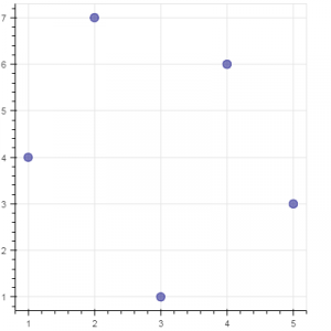 Code #2: Single line To create a single line, line() method is used.
Python 1== `
import modules
from bokeh.plotting import figure, output_notebook, show
output to notebook
output_notebook()
create figure
p = figure(plot_width = 400, plot_height = 400)
add a line renderer
p.line([1, 2, 3, 4, 5], [3, 1, 2, 6, 5], line_width = 2, color = "green")
show the results
show(p)
`
Output : 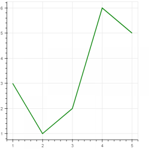 Code #3: Bar Chart Bar chart presents categorical data with rectangular bars. The length of the bar is proportional to the values that are represented.
Python 1== `
import necessary modules
import pandas as pd from bokeh.charts import Bar, output_notebook, show
output to notebook
output_notebook()
read data in dataframe
df = pd.read_csv(r"D:/kaggle/mcdonald/menu.csv")
create bar
p = Bar(df, "Category", values = "Calories", title = "Total Calories by Category", legend = "top_right")
show the results
show(p)
`
Output : 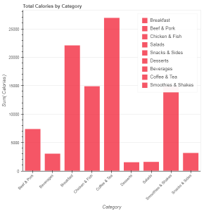 Code #4: Box Plot Box plot is used to represent statistical data on a plot. It helps to summarize statistical properties of various data groups present in the data.
Python 1== `
import necessary modules
from bokeh.charts import BoxPlot, output_notebook, show import pandas as pd
output to notebook
output_notebook()
read data in dataframe
df = pd.read_csv(r"D:/kaggle / mcdonald / menu.csv")
create bar
p = BoxPlot(df, values = "Protein", label = "Category", color = "yellow", title = "Protein Summary (grouped by category)", legend = "top_right")
show the results
show(p)
`
Output : 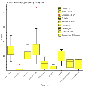 Code #5: Histogram Histogram is used to represent distribution of numerical data. The height of a rectangle in a histogram is proportional to the frequency of values in a class interval.
Python 1== `
import necessary modules
from bokeh.charts import Histogram, output_notebook, show import pandas as pd
output to notebook
output_notebook()
read data in dataframe
df = pd.read_csv(r"D:/kaggle / mcdonald / menu.csv")
create histogram
p = Histogram(df, values = "Total Fat", title = "Total Fat Distribution", color = "navy")
show the results
show(p)
`
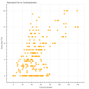
Output : 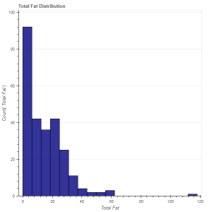 Code #6: Scatter plot Scatter plot is used to plot values of two variables in a dataset. It helps to find correlation among the two variables that are selected.
Python 1== `
import necessary modules
from bokeh.charts import Scatter, output_notebook, show import pandas as pd
output to notebook
output_notebook()
read data in dataframe
df = pd.read_csv(r"D:/kaggle / mcdonald / menu.csv")
create scatter plot
p = Scatter(df, x = "Carbohydrates", y = "Saturated Fat", title = "Saturated Fat vs Carbohydrates", xlabel = "Carbohydrates", ylabel = "Saturated Fat", color = "orange")
show the results
show(p)
`
Output :