Python seaborn.pairplot() method (original) (raw)
Last Updated : 15 Jul, 2025
**seaborn.pairplot()**method is used for visualizing relationships between multiple variables in a dataset. By creating a grid of scatter plots it helps to identify how different features interact with each other to identify patterns, correlations and trends in data. In this article, we will see how to implement seaborn.pairplot() in python.
**Syntax: seaborn.pairplot(data, **kwargs)
Here **data refers to the dataset we want to visualize and **kwargs represent additional optional parameters that can be customized for different visualizations.
Below are the most commonly used parameters:
| **Arguments | **Description | **Value |
|---|---|---|
| data | Dataframe where each column is a variable and each row is an observation. | DataFrame |
| hue | Variable in **data to map plot aspects to different colors. | string (variable name), optional |
| palette | Set of colors for mapping the **hue variable. Can be a dictionary for custom color mapping | dict or seaborn color palette |
| {x, y}_vars | Allows you to specify which variables to use for the rows and columns of the plot to create a custom layout. | lists of variable names, optional |
| dropna | Drop missing values from the data before plotting. | boolean, optional |
Now we will implement this using the **tips dataset. This dataset contains information about restaurant tips, total bill amount, tip amount, customer details like sex and day of the week, etc. Also we will be using Seaborn and Matplotlib libraries to it.
Example 1: Pairplot with Hue by Day
We will use **hue**parameter to color-code points based on the **day**column. This helps to distinguish between different days of the week.
Python `
import seaborn import matplotlib.pyplot as plt df = seaborn.load_dataset('tips') seaborn.pairplot(df, hue ='day') plt.show()
`
Output :

Pairplot by Hue
A grid of scatter plots showing the relationships between the numerical features in the **tips dataset with color coding based on the **day**column is formed.
Example 2: Pairplot with C**ustom Palette by Sex
We will use the hue and palette parameter to color-code points based on the **sex**column helps in distinguishing between male and female customers. Here we defined colour palette as blue and pink using **custom_palette.
Python `
import seaborn import matplotlib.pyplot as plt df = seaborn.load_dataset('tips') custom_palette = {'Male': 'lightblue', 'Female': 'pink'} seaborn.pairplot(df, hue='sex', palette=custom_palette) plt.show()
`
**Output :
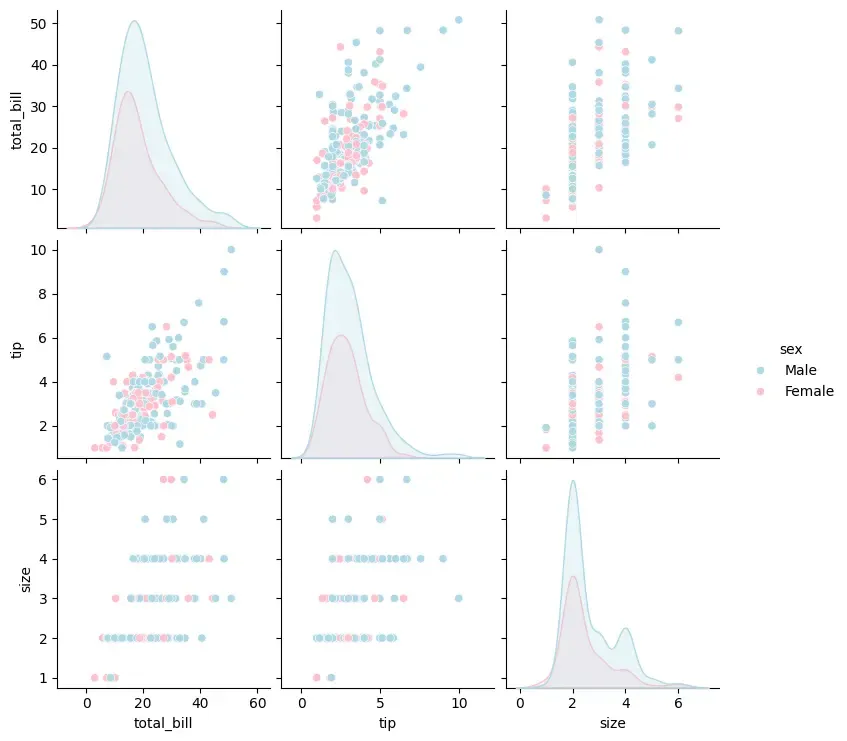
Pairplot using Custom Palette
Scatter plots will be color-coded based on the **sex**column which allows us to distinguish between male and female customers.
Example 3: Pairplot with Specific Variables
We can focus on specific variables in the **tips dataset. Here we visualize only the total_bill, tip and size features using ****{x, y}_vars parameter.**
Python `
import seaborn import matplotlib.pyplot as plt df = seaborn.load_dataset('tips') seaborn.pairplot(df[['total_bill', 'tip', 'size']]) plt.show()
`
**Output :

Specific variables
This will display a pairplot for the selected columns (total_bill, tip and size) excluding other features from the visualization.