Weather and Climate Change Trends Visualization in R (original) (raw)
Last Updated : 23 Jul, 2025
Weather and climate change are critical issues that affect weather patterns worldwide. Visualizing climate data helps to understand these changes and their impacts. Here we show how to visualize climate change trends using a weather dataset in R Programming Language. The dataset contains daily weather data for the year 2020, with various columns providing detailed weather information.
Dataset Overview of Weather and Climate Change Trends
This dataset has daily weather information for 2020.
- Where the weather data was recorded (country and region).
- When the data was recorded (specific times like sunrise and sunset).
- What the weather was like (a brief description).
- Detailed weather measurements (like temperature, humidity, wind speed, and precipitation).
- Other details like cloud cover, UV index, and visibility.
- The exact location (latitude and longitude).
Dataset Link: Climate Change Trends
Step 1: Load the required Libaries and Dataset
First, install and load the necessary packages.
R `
install.packages("tidyverse") install.packages("lubridate") library(tidyverse) library(lubridate) weather_data <- read_csv("C:\Users\Tonmoy\Downloads\Dataset\daily_weather_2020.csv")
head(weather_data)
`
**Output:
X Country.Region Province.State time 1 0 Afghanistan 2019-12-31 2 1 Afghanistan 2020-01-01 3 2 Afghanistan 2020-01-02 4 3 Afghanistan 2020-01-03 5 4 Afghanistan 2020-01-04 6 5 Afghanistan 2020-01-05 summary 1 Rain (with a chance of 1–3 in. of snow) until night, starting again in the afternoon. 2 Light rain throughout the day. 3 Clear throughout the day. 4 Partly cloudy throughout the day. 5 Light rain throughout the day. 6 Light rain until afternoon. icon sunriseTime sunsetTime moonPhase precipIntensity precipIntensityMax 1 rain 1577846640 1577882700 0.20 0.0156 0.1515 2 rain 1577933040 1577969160 0.23 0.0235 0.0985 3 rain 1578019440 1578055560 0.26 0.0016 0.0062 4 partly-cloudy-day 1578105900 1578142020 0.30 0.0003 0.0012 5 rain 1578192300 1578228480 0.33 0.0145 0.0310 6 rain 1578278700 1578314940 0.36 0.0196 0.0442 precipIntensityMaxTime precipProbability precipType temperatureHigh 1 1577902320 0.71 rain 48.36 2 1577907000 0.95 rain 40.42 3 1578009780 0.25 rain 46.53 4 1578157740 0.14 rain 45.77 5 1578200340 0.83 rain 40.84 6 1578260520 0.91 rain 44.54 temperatureHighTime temperatureLow temperatureLowTime apparentTemperatureHigh 1 1577864700 32.13 1577922180 47.86 2 1577951460 28.90 1578020400 40.08 3 1578038340 28.80 1578106320 46.03 4 1578124500 32.84 1578193080 45.35 5 1578222000 37.25 1578279840 40.34 6 1578297660 28.10 1578366180 44.07 apparentTemperatureHighTime apparentTemperatureLow apparentTemperatureLowTime dewPoint 1 1577864700 29.04 1577921940 23.88 2 1577951220 26.27 1578020400 33.61 3 1578038340 26.96 1578093240 29.86 4 1578124260 33.33 1578193080 26.61 5 1578222000 37.74 1578279840 33.14 6 1578297360 22.90 1578366240 34.56 humidity pressure windSpeed windGust windGustTime windBearing cloudCover uvIndex 1 0.60 1019.1 2.56 6.60 1577891880 39 0.99 2 2 0.90 1021.2 2.06 7.08 1577961240 163 0.99 2 3 0.76 1022.7 2.45 4.78 1578042840 20 0.22 3 4 0.69 1021.9 2.95 5.83 1578139740 19 0.32 3 5 0.88 1016.1 1.98 6.14 1578226200 75 1.00 2 6 0.85 1016.7 2.60 7.68 1578309480 105 0.74 3 uvIndexTime visibility ozone temperatureMin temperatureMinTime temperatureMax 1 1577864880 5.534 372.6 32.96 1577827140 48.36 2 1577951280 1.192 330.2 32.33 1577918820 40.42 3 1578037860 9.957 320.3 28.90 1578020400 46.53 4 1578122520 10.000 309.6 28.80 1578106320 45.77 5 1578210360 4.142 308.2 32.84 1578193080 40.84 6 1578297960 5.383 323.1 34.89 1578335400 44.54 temperatureMaxTime apparentTemperatureMin apparentTemperatureMinTime 1 1577864700 30.51 1577835720 2 1577951460 29.84 1577919420 3 1578038340 26.27 1578020400 4 1578124500 26.96 1578093240 5 1578222000 33.33 1578193080 6 1578297660 32.83 1578335400 apparentTemperatureMax apparentTemperatureMaxTime Lat Long precipAccumulation 1 47.86 1577864700 33 65 NA 2 40.08 1577951220 33 65 NA 3 46.03 1578038340 33 65 NA 4 45.35 1578124260 33 65 NA 5 40.34 1578222000 33 65 NA 6 44.07 1578297360 33 65 NA
Step 2: Data Exploration and Visualization
Exploring climate data using visualizations helps uncover underlying patterns and trends.
Temperature Trends of the data
Notice the peaks and troughs in the temperature lines. Peaks typically correspond to summer months, while troughs correspond to winter months.
R `
ggplot(weather_data, aes(x = time)) + geom_line(aes(y = temperatureHigh, color = "High Temperature")) + geom_line(aes(y = temperatureLow, color = "Low Temperature")) + labs(title = "Daily High and Low Temperatures in 2020", x = "Date", y = "Temperature (°F)", color = "Legend") + theme_minimal()
`
**Output:

visualize Temperature Trends
Consistent high precipitation values indicate prolonged rainy periods, while low values indicate dry spells. Sudden high peaks in precipitation intensity can highlight days with heavy rain or storms.
Visualizing Precipitation Trends
Bar charts are useful for showing the amount of precipitation over time.
R `
ggplot(weather_data, aes(x = time, y = precipIntensity)) + geom_bar(stat = "identity", fill = "blue") + labs(title = "Daily Precipitation Intensity in 2020", x = "Date", y = "Precipitation Intensity (in/hr)") + theme_minimal()
`
**Output:
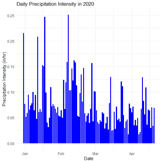
Daily Precipitation Intensity in 2020
Spatial Map for Country.Region
Used sf and ggplot2 to create a spatial map of precipitation intensity without requiring a Google Maps API key. Creates a spatial map visualizing precipitation intensity.
R `
Install and load required packages
install.packages("sf") install.packages("rnaturalearth") install.packages("rnaturalearthdata")
library(sf) library(rnaturalearth) library(rnaturalearthdata)
Convert the data to an sf object
weather_data_sf <- st_as_sf(weather_data, coords = c("Long", "Lat"), crs = 4326)
Get the world map data
world <- ne_countries(scale = "medium", returnclass = "sf")
Plot the spatial data
ggplot(data = world) + geom_sf() + geom_sf(data = weather_data_sf, aes(color = precipIntensity, size = precipIntensity), alpha = 0.7) + scale_color_viridis_c() + labs(title = "Spatial Map of Precipitation Intensity in 2020", x = "Longitude", y = "Latitude", color = "Precipitation Intensity", size = "Precipitation Intensity") + theme_minimal()
`
**Output:
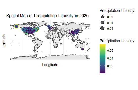
Spatial Map of Precipitation Intensity in 2020
Extreme Weather Events
Highlighting extreme weather events such as hurricanes, droughts, and floods demonstrates the impacts of climate change.
R `
Example: Highlighting days with extreme wind gusts
ggplot(weather_data, aes(x = time, y = windGust)) + geom_line(color = "red") + geom_point(data = weather_data %>% filter(windGust > quantile(windGust, 0.95)), color = "darkred", size = 2) + labs(title = "Extreme Wind Gusts in 2020", x = "Date", y = "Wind Gust (mph)") + theme_minimal()
`
Output:
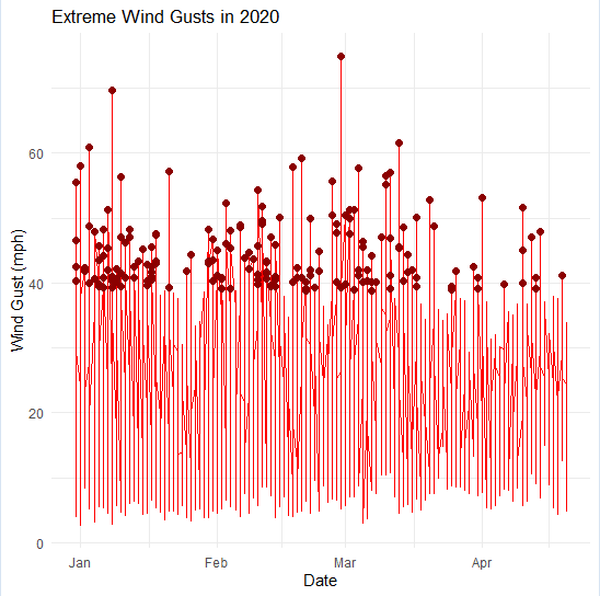
Visualize Extreme Wind Gust
Histogram of Temperature Distribution
Understanding data distribution and relationships between variables.
R `
ggplot(weather_data, aes(x = temperatureHigh)) + geom_histogram(binwidth = 2, fill = "orange", color = "black") + labs(title = "Distribution of High Temperatures in 2020", x = "Temperature (°F)", y = "Frequency") + theme_minimal()
`
**Output:

Check the distribution
Scatter Plot of Temperature vs. Humidity
Creating a scatter plot is a fundamental way to visualize the relationship between two continuous variables. In this case, we'll focus on visualizing the relationship between temperature and humidity using R.
R `
ggplot(weather_data, aes(x = temperatureHigh, y = humidity)) + geom_point(alpha = 0.5, color = "blue") + labs(title = "Temperature vs. Humidity", x = "High Temperature (°F)", y = "Humidity (%)") + theme_minimal()
`
**Output:

Scatter Plot of Temperature vs. Humidity
Conclusion
By visualizing the weather data for 2020, we can see how different climate elements change over time. These visualizations show seasonal patterns, extreme weather events, and trends essential for addressing climate change. Understanding these trends helps policymakers, researchers, and the public make informed decisions and take actions to reduce the impacts of climate change, ultimately protecting our environment for future generations.