What is Heatmap Data Visualization and How to Use It? (original) (raw)
Last Updated : 12 Jun, 2024
Heatmap data visualization is a powerful tool used to represent numerical data graphically, where values are depicted using colors. This method is particularly effective for identifying patterns, trends, and anomalies within large datasets. This article will explore what heatmap data visualization is, its types, benefits, and best practices for using it effectively.

Heatmap Data Visualization
Table of Content
- What is Heatmap Data Visualization?
- Why Heatmap Data Visualization?
- Types of Heatmaps
- Benefits of Heatmap Visualization
- When to Use Heatmap Visualization
- Best Practices for Using Heatmaps for Data Visualization
- Different Tools for Generating Heatmaps
What is Heatmap Data Visualization?
Heatmap data visualization is a technique that uses color to represent data values. The most common color schemes range from warm colors (such as red) to cool colors (such as blue), with warm colors typically representing higher values and cool colors representing lower values. This visual representation allows for quick and intuitive understanding of complex data sets.
At its core, a heatmap is a graphical representation of data where values are depicted using colors. The data is typically arranged in a grid or matrix format, with each cell assigned a color based on its value. The intensity of the color corresponds to the magnitude of the data, allowing viewers to discern patterns and trends at a glance. Heatmaps are particularly useful for visualizing large datasets and identifying areas of interest or concentration.
Why Heatmap Data Visualization?
Heatmaps offer a powerful way to visualize and analyze data, providing several advantages that make them a popular choice for data visualization:
- **Identifying Patterns and Trends: Heatmaps allow for quick identification of patterns, trends, and correlations within datasets. By visually representing data with color gradients, heatmaps make it easier to discern areas of high or low concentration, enabling analysts to uncover insights that might not be apparent from raw data alone.
- **Handling Large Datasets: Heatmaps are particularly effective for visualizing large datasets. They condense complex information into a compact, easily interpretable format, making it feasible to analyze and extract meaningful information from extensive data sets.
- **Intuitive Interpretation: Heatmaps provide a visual representation of data that is intuitive and easy to interpret. The color gradients used in heatmaps offer a straightforward way to understand data density, intensity, and distribution, allowing viewers to grasp trends and patterns at a glance.
- **Comparing Data Sets: Heatmaps enable side-by-side comparison of multiple datasets, facilitating the identification of similarities, differences, and relationships between variables. By overlaying or displaying multiple heatmaps simultaneously, analysts can gain insights into how different factors interact and influence each other.
- **Facilitating Decision Making: Heatmaps help decision-makers make informed decisions by presenting complex data in a visually compelling format. Whether it's identifying areas of opportunity, allocating resources, or optimizing processes, heatmaps provide a clear and concise way to communicate insights and drive action.
- **Versatility: Heatmaps can be applied across various domains and disciplines, including finance, healthcare, marketing, and science. From analyzing financial trends to tracking user behavior on websites, heatmaps offer a versatile tool for data visualization and analysis in diverse contexts.
- **Enhancing Communication: Heatmaps are effective tools for communicating insights and findings to stakeholders, colleagues, and clients. Whether it's presenting research findings, reporting on key performance indicators, or visualizing spatial data, heatmaps help convey complex information in a visually appealing and accessible manner.
Types of Heatmaps
Heatmaps can be categorized based on the type of data they visualize and the specific use case. Here are some common types:
1. **Website Heatmaps
Imagine you have a website, and you want to understand how visitors interact with it. A heatmap is like a map that shows you where visitors are spending the most time and where they're not. Think of it like this: the more time visitors spend on a particular section of your site, the "hotter" it gets on the heatmap. This is usually shown with warm colors like red or orange. So, if a section is red, it means it's getting a lot of attention.
Conversely, if a section is blue or green, it's "cooler," meaning visitors aren't spending much time there. So, blue or green areas indicate lower interaction.
Website heatmaps are used to visualize user behavior on web pages. They help identify which parts of a webpage receive the most interaction, such as clicks, scrolls, and mouse movements.
- **Click Maps: Show where users click on a webpage, helping to identify popular links and buttons.
- **Scroll Maps: Indicate how far users scroll down a page, revealing which sections are most engaging.
- **Mouse Tracking Heatmaps: Track mouse movements to understand which areas of a page attract the most attention.
- **Eye-Tracking Heatmaps: Visualize where users' eyes focus on a page, providing insights into visual engagement.
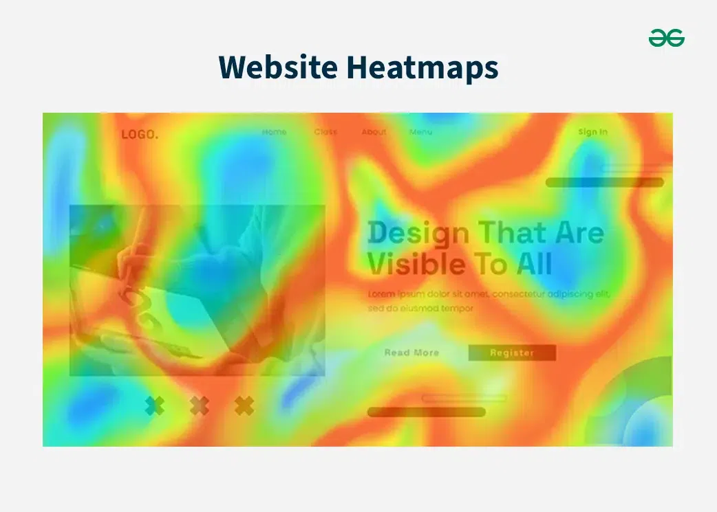
Website Heatmaps
2. Grid Heatmaps
Grid heatmaps are a powerful visualization tool used to represent data in a tabular format where each cell's color indicates the value of the data point it represents. This method is particularly effective for comparing multiple variables and identifying patterns, trends, and correlations within the data.
**Key Characteristics:
- **Color Encoding: The primary feature of a heatmap is its use of color to represent data values. Colors are typically chosen from a gradient, with the intensity or hue indicating the magnitude of the values. For example, in a common color scheme, darker colors might represent higher values, while lighter colors represent lower values.
- **Grid Layout: The data is displayed in a grid, where each cell corresponds to a specific data point. The position of each cell is determined by its row and column, which often correspond to specific variables or categories.
- **Data Density: Heatmaps can handle large datasets effectively, making it easy to spot anomalies, trends, and clusters within the data. This is particularly useful in fields such as biology, where gene expression levels across different conditions can be visualized, or in finance, where stock price movements across different time periods are compared.
- **Comparative Analysis: By visualizing data in a grid format, heatmaps facilitate the comparison of multiple variables simultaneously. This can help identify correlations or relationships between different data points.

Grid Heatmaps
3. Clustered Heatmaps
Clustered heatmaps extend the functionality of standard grid heatmaps by incorporating hierarchical clustering to show relationships between rows and columns. This added dimension of information makes clustered heatmaps particularly valuable in fields like biology, where they are commonly used to visualize genetic data.
**Key Characteristics:
- **Hierarchical Clustering: Clustered heatmaps use hierarchical clustering algorithms to group similar rows and columns together. This clustering is often displayed as dendrograms (tree-like diagrams) alongside the heatmap, indicating the similarity between different rows or columns.
- **Color Encoding: As with standard heatmaps, the cell color represents the value of the data point. The color intensity or hue typically indicates the magnitude of the values, allowing for easy visual differentiation.
- **Enhanced Patterns and Relationships: By clustering similar rows and columns together, clustered heatmaps make it easier to identify patterns, correlations, and relationships within the data. This can reveal underlying structures that might not be immediately apparent in a standard heatmap.
- **Interactive Exploration: Many software tools and libraries allow users to interact with clustered heatmaps, enabling them to zoom in on specific clusters, reorder rows and columns, and explore the data in greater detail.

Clustered Heatmaps
Benefits of Heatmap Visualization
Heatmaps offer several advantages over traditional data visualization methods:
- **Intuitive Understanding: Colors make it easy to grasp complex data at a glance.
- **Pattern Recognition: Heatmaps help identify patterns and trends that might be missed in numerical data.
- **Engagement: The use of color makes heatmaps visually appealing and engaging.
- **Granularity: Heatmaps provide detailed insights into data, allowing for more granular analysis.
When to Use Heatmap Visualization
Heatmaps are versatile and can be used in various scenarios:
- **Website Optimization: To understand user behavior and optimize webpage design.
- **Financial Analysis: To visualize performance metrics and identify areas needing improvement.
- **Marketing: To track campaign performance and customer engagement.
- **Scientific Research: To analyze genetic data and other complex datasets.
- **Geographic Analysis: Visualizing spatial data such as population density, crime rates, or weather patterns.
- **Sports Analytics: Analyzing player movements, game strategies, or performance metrics.
Best Practices for Using Heatmaps for Data Visualization
To effectively use heatmaps, consider the following best practices:
- **Choose the Right Color Scale: Selecting an appropriate color scale is crucial. Sequential scales are ideal for data that progresses in one direction, while diverging scales are suitable for data with a central neutral point and values that can be both positive and negative.
- **Ensure Sufficient Data: Heatmaps require a large amount of data to be accurate. Analyzing heatmaps with insufficient data can lead to misleading conclusions.
- **Combine with Other Analytics: Heatmaps should be used in conjunction with other analytics tools to provide a comprehensive understanding of the data. For example, combining heatmaps with form analytics can offer deeper insights into user behavior.
- **Use Legends: Always include a legend to help interpret the color scale used in the heatmap. This ensures that viewers can accurately understand the data being presented.
- **Highlight Key Areas: Use heatmaps to draw attention to important areas of the data. For example, in a website heatmap, highlight areas with the most user interaction to focus on optimizing those sections.
When it comes to generating heatmaps, several tools stand out for their features, ease of use, and effectiveness. Here are some of the best tools for generating heatmaps:
- **VWO Insights: VWO Insights is a comprehensive tool that offers advanced heatmap features. It provides predictive attention heatmaps, click maps, and scroll maps. VWO Insights is particularly useful for identifying user bottlenecks and optimizing website design. It integrates well with other tools for a holistic approach to user experience and conversion rate optimization.
- **Hotjar: Hotjar is a popular tool for creating website heatmaps. It supports click maps, scroll maps, and movement heatmaps. Hotjar also offers additional features like session recordings, feedback, surveys, and interviews, making it a robust tool for understanding user behavior and improving user experience. The free plan allows up to 35 daily sessions, and there are paid plans with more advanced features.
- **SmartLook: SmartLook provides three types of heatmaps: click maps, movement heatmaps, and scroll maps. It also offers session recordings, events, funnels, and crash reports. SmartLook is known for its cross-device viewing capabilities and integration with third-party testing solutions. However, the free version has limitations on sharing and downloading heatmaps.
- **Microsoft Clarity: Microsoft Clarity is a free tool that offers heatmaps along with session recordings and other analytics features. It is designed to help users understand how visitors interact with their website and identify areas for improvement.
- **Google Analytics (Page Analytics): Google Analytics offers a heatmap feature through its Chrome extension, Page Analytics. This tool provides a visual representation of where visitors click on a webpage, helping to identify popular and underperforming elements.
Conclusion
Heatmap data visualization is a powerful tool for representing complex data in an intuitive and engaging way. By using color to depict data values, heatmaps make it easier to identify patterns, trends, and anomalies. Whether used for website optimization, financial analysis, or scientific research, heatmaps provide valuable insights that can drive better decision-making.