Drawer Widget in Flutter (original) (raw)
Last Updated : 28 Feb, 2025
**Drawer widget is used to provide access to different destinations and functionalities provided in your application. It is represented by three horizontal parallel lines on the upper end of the scaffold. It has a horizontal movement from the edge of the Scaffold that navigates the link to different routes in the flutter app.
In order to use the app drawer you need to import the material component package that is "package: flutter/material.dart". The Navigating AppDrawer is divided into three sections namely header, body, and footer. The idea is about having a navigator with a couple of items as the drawer's child that will be navigated to different destinations on getting tapped. All children of a Drawer widget are usually in ListView and initially, only the DrawerHeader is present in the UI which when tapped extends horizontally.
**Constructor:
Drawer Drawer({
Key? key,
Color? backgroundColor,
double? elevation,
Color? shadowColor,
Color? surfaceTintColor,
ShapeBorder? shape,
double? width,
Widget? child,
String? semanticLabel,
Clip? clipBehavior,
})
Properties:
| Property | Description |
|---|---|
| **child | The widgets below this widget in the tree |
| **hashCode | The hash code for this object |
| **key | Controls how one widget replaces another widget in the tree |
| **runtimeType | A representation of the runtime type of the object |
| backgroundColor | This property sets the background color of the drawer |
| **elevation | The z-coordinate at which to place this drawer relative to its parent |
| shadowColor | This property is used to paint a drop shadow under the drawer, which reflects the drawer's elevation |
| surfaceTintColor | The property is used as a surface tint overlay on the drawer's background color, which reflects the drawer's elevation. |
| **semanticLabel | The semantic label of the dialogue used by accessibility frameworks to announce screen transitions when the drawer is opened and closed |
| shape | This property is used to define shape of the drawer |
| width | This property is used to define width of the drawer |
| clipBehavior | It uses _Clip Enum and defines how to clip |
**Important Function:
- **build(BuildContext context) → Widget: This method specifies the part of the UI rendered by the widget. This method is called when the _Drawer widget is inserted into the tree in a given _BuildContext and when the dependencies of the _Drawer widget change.
To know more about build Widget refer this article : Dart - Builder Class
**Why Drawers?
Drawers are very easy to implement as well as handy to balance different functionalities of your mobile application at the same time. Creating a drawer makes visiting different destinations in your app quite easy and manageable to a large extent, especially in the case of a complex application with many screens.
You can easily switch between different screens and perform tasks.
**Steps to Create a Drawer
A drawer can be set using 4 simple steps:
Step 1: Create a flutter project
Open the terminal and navigate to the desired location in which you want to create your project. Using the "flutter create project_name" command creates your flutter project.
flutter create file_name
To create a new flutter project refer this article : Creating a Simple Application in Flutter
Step 2: Create a scaffold widget
Inside the MyApp Class of your stateless/stateful widget return a scaffold widget. A Scaffold Widget provides a framework for implementing the basic visual layout structure of the flutter app.
Scaffold(
drawer:
);
Step 3: Add Drawer inside the scaffold
Set the scaffold's drawer property to Drawer with ListView as its child or you can add a Container with a ListView as its child as well. Various ListViews contain desired items that needed to be displayed inside the drawer.
Scaffold(
drawer: Drawer(
//...
),);
Step 4:Add a closing functionality
Navigator is used for implementing closing functionality on the drawer when the user wants to close it after tapping on some item. This can be done using a Navigator State.
Navigator.of(context).pop();
To know more about navigation in flutter refer this article : Flutter – Navigate From One Screen to Another
**Types of Navigation Drawer
An app drawer is divided into three categories:
- Standard Navigation Drawer : They provide user interaction with the screen content and drawer at the same time.
- **Modal Navigation Drawer : These drawers block the user interaction with the rest of the screen and allow only the user to interact with the drawer only.
- **Bottom Navigation Drawer : These are similar to modal navigation drawers except the orientation of the drawer is towards the bottom section of the screen.
Let us check them with an Example.
**Main.dart:
Dart `
import 'package:flutter/material.dart';
// Function to trigger app build void main() => runApp(const MyApp());
class MyApp extends StatelessWidget { final appTitle = 'Flutter Drawer Demo';
const MyApp({Key? key}) : super(key: key);
@override Widget build(BuildContext context) { return MaterialApp( title: appTitle, home: MyHomePage(title: appTitle), ); // MaterialApp } }
class MyHomePage extends StatelessWidget { final String title;
const MyHomePage({Key? key, required this.title}) : super(key: key);
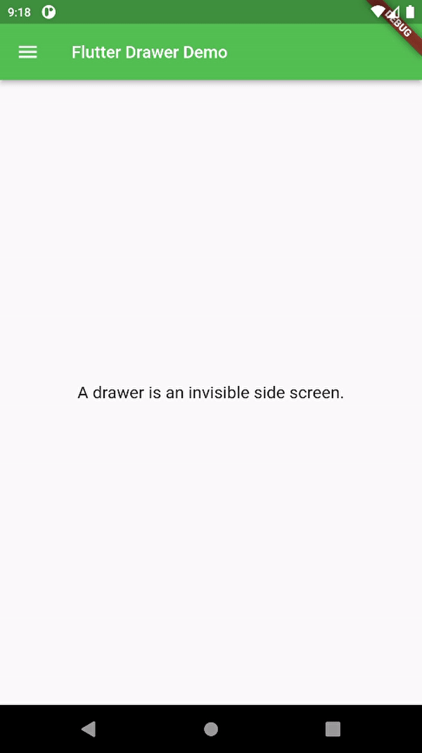
@override Widget build(BuildContext context) { return Scaffold( appBar: AppBar( title: Text(title), foregroundColor: Colors.white, backgroundColor: Colors.green, ), body: const Center( child: Text( 'A drawer is an invisible side screen.', style: TextStyle(fontSize: 20.0), ), ), drawer: Drawer( child: ListView( padding: const EdgeInsets.all(0), children: [ const DrawerHeader( decoration: BoxDecoration( color: Colors.green, ), // BoxDecoration child: UserAccountsDrawerHeader( decoration: BoxDecoration(color: Colors.green), accountName: Text( "Abhishek Mishra", style: TextStyle(fontSize: 18), ), accountEmail: Text("abhishekm977@gmail.com"), currentAccountPictureSize: Size.square(50), currentAccountPicture: CircleAvatar( backgroundColor: Color.fromARGB(255, 165, 255, 137), child: Text( "A", style: TextStyle(fontSize: 30.0, color: Colors.blue), ), // Text ), // CircleAvatar ), // UserAccountDrawerHeader ), // DrawerHeader ListTile( leading: const Icon(Icons.person), title: const Text(' My Profile '), onTap: () { Navigator.pop(context); }, ), ListTile( leading: const Icon(Icons.book), title: const Text(' My Course '), onTap: () { Navigator.pop(context); }, ), ListTile( leading: const Icon(Icons.workspace_premium), title: const Text(' Go Premium '), onTap: () { Navigator.pop(context); }, ), ListTile( leading: const Icon(Icons.video_label), title: const Text(' Saved Videos '), onTap: () { Navigator.pop(context); }, ), ListTile( leading: const Icon(Icons.edit), title: const Text(' Edit Profile '), onTap: () { Navigator.pop(context); }, ), ListTile( leading: const Icon(Icons.logout), title: const Text('LogOut'), onTap: () { Navigator.pop(context); }, ), ], ), ), // Drawer ); } }
`
**Output: