Errorbar graph in Python using Matplotlib (original) (raw)
Last Updated : 11 Apr, 2025
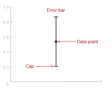
Error bars are a graphical overlay used to display the variability or uncertainty of points plotted on a Cartesian graph. They provide a further level of information to data shown, giving an indication of the accuracy of measurements and making a more accurate representation of variability in the data. They are drawn as lines that extend from the center of a data point, either vertically or horizontally, depending on the axis. The length of an error bar indicates how precise the measurement is:
- **Short error bars indicate that the values are tightly clustered around the data point, suggesting high reliability.
- **Long error bars indicate more spread-out values, signaling lower precision and greater uncertainty.
In most cases, the length of the error bars is the same on both sides of the data point. However, if the data distribution is skewed, the lengths of the error bars may differ.
Types of Error Bars
Error bars can be applied in two main orientations:
- **Vertical Error Bars: Applied when the uncertainty is along the y-axis (dependent variable).
- **Horizontal Error Bars: Used when the uncertainty lies along the x-axis (independent variable).
If both axes have uncertainty, error bars can be applied to both axes simultaneously.
Visualizing Error Bars: Examples
Let see an example of error bar how it works.
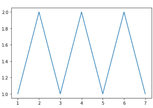
**Creating a Simple Graph
Python `
import matplotlib.pyplot as plt
x =[1, 2, 3, 4, 5, 6, 7] y =[1, 2, 1, 2, 1, 2, 1]
plt.plot(x, y)
`
**Output
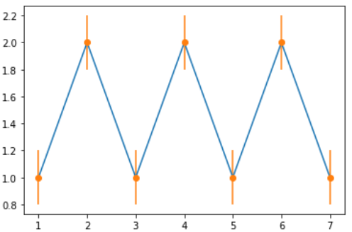
Example 1: Adding Error to the y-values
This example demonstrates how to apply error bars to the y-axis, showing the uncertainty in the dependent variable.
Python `
import matplotlib.pyplot as plt
x =[1, 2, 3, 4, 5, 6, 7] y =[1, 2, 1, 2, 1, 2, 1]
creating error
y_error = 0.2
plotting graph
plt.plot(x, y)
plt.errorbar(x, y, yerr = y_error, fmt ='o')
`
**Output:
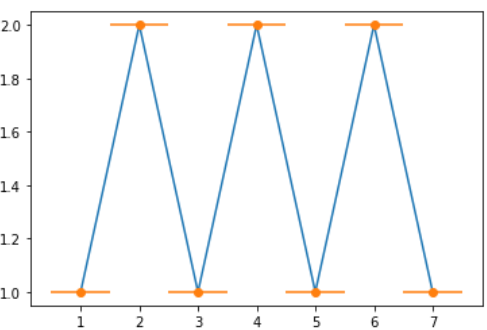
**Example 2: Adding Error to the x-values
Here, error bars are applied to the x-axis, indicating uncertainty in the independent variable.
Python `
import matplotlib.pyplot as plt
x =[1, 2, 3, 4, 5, 6, 7] y =[1, 2, 1, 2, 1, 2, 1]
creating error
x_error = 0.5
plotting graph
plt.plot(x, y) plt.errorbar(x, y, xerr = x_error, fmt ='o')
`
**Output
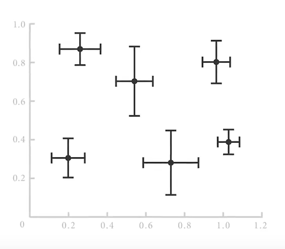
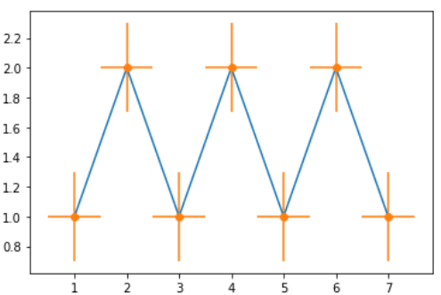
**Example 3: Adding Error to Both x and y
This example shows how to apply error bars to both axes simultaneously, giving a more complete view of the data's variability.
Python `
import matplotlib.pyplot as plt
x =[1, 2, 3, 4, 5, 6, 7] y =[1, 2, 1, 2, 1, 2, 1]
creating error
x_error = 0.5 y_error = 0.3
plotting graph
plt.plot(x, y) plt.errorbar(x, y, yerr = y_error, xerr = x_error, fmt ='o')
`
**Output
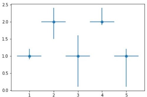
**Example 4: Variable Error in x and y
This demonstrates how error bars can vary in length depending on the data, reflecting different levels of uncertainty for each data point.
Python `
import matplotlib.pyplot as plt
x =[1, 2, 3, 4, 5] y =[1, 2, 1, 2, 1]
creating error
y_errormin =[0.1, 0.5, 0.9, 0.1, 0.9] y_errormax =[0.2, 0.4, 0.6, 0.4, 0.2]
x_error = 0.5 y_error =[y_errormin, y_errormax]
plotting graph
plt.plot(x, y)
plt.errorbar(x, y, yerr = y_error, xerr = x_error, fmt ='o')
`
**Output:
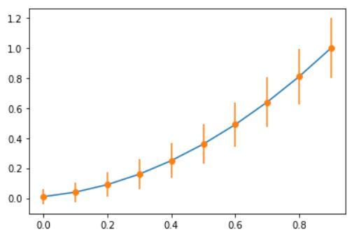
**Example 5
A more complex example, illustrating how error bars can be used in different contexts to represent data with varying degrees of precision.
Python `
import numpy as np import matplotlib.pyplot as plt
defining our function
x = np.arange(10)/10 y = (x + 0.1)**2
defining our error
y_error = np.linspace(0.05, 0.2, 10)
error bar
plt.plot(x, y)
plt.errorbar(x, y, yerr = y_error, fmt ='o')
`
**Output