Flutter FloatingActionButton (original) (raw)
Last Updated : 17 Mar, 2025
A FloatingActionButton is a circular icon button that hovers over content to promote a primary action in the application. Floating action buttons are most commonly used in the Scaffold.floatingActionButton field.
**Constructor
FloatingActionButton FloatingActionButton({
Key? key,
Widget? child,
String? tooltip,
Color? foregroundColor,
Color? backgroundColor,
Color? focusColor,
Color? hoverColor,
Color? splashColor,
Object? heroTag = const _DefaultHeroTag(),
double? elevation,
double? focusElevation,
double? hoverElevation,
double? highlightElevation,
double? disabledElevation,
required void Function()? onPressed,
MouseCursor? mouseCursor,
bool mini = false,
ShapeBorder? shape,
Clip clipBehavior = Clip.none,
FocusNode? focusNode,
bool autofocus = false,
MaterialTapTargetSize? materialTapTargetSize,
bool isExtended = false,
bool? enableFeedback,
})
**Properties
| **Property | **Description |
|---|---|
| autofocus | This property takes a booleanvalue as an object (final) to decide whether the button will be selected on the initial focus. |
| backgroundColor | Background color of FloatingActionButton. |
| child | The widget below this widget in the tree. |
| disabledElevation | With a doublevalue as the object this property decides the location of the button on the z-coordinate when the button is disabled. |
| elevation | Again this property takes in a double as the object. And it controls the location on the z-coordinate on which the button will be placed. |
| focusColor | This property decided the color to be filled in the button at the time of input focus. It takes in _Color class as the object. |
| focusNode | It provides an optional focus node to use as the focus node for this widget. |
| foregroundColor | It controls the default color of the text and icon inside the button. |
| heroTag | This is to add a hero tag to one of the widgets in the button |
| highlightElevation | This property controls the location of the z-axis on which to place the button while the user interacts with it. |
| hoverColor | This property holds the Color class as the object. It controls the color to be painted in the button at the event of hover. |
| hoverElevation | This property takes in a double value as the parameter to decide the height of the button on the z-axis on which the button should be place t the time of hover. |
| isExtended | This property takes in a boolean value as the object. If it is set to true then the button becomes an extended floating action button. |
| materialTapTargetSize | This property is there to control the tap target size of the button. |
| mini | It controls the size of the button. |
| mouseCursor | This property takes in MouseCursor property as the object. It controls the cursor for the mouse pointer when it interacts with the button. |
| onPressed | The callback that is called when the button is tapped or otherwise activated. |
| splashColor | Splash color of FloatingActionButton. |
| shape | the shape of the FloatingActionButton. |
| floatingActionButtonLocation | Responsible for determining where the floatingActionButton should go. |
**Example of FloatingActionButton in Flutter
**main.dart
Dart `
import 'package:flutter/material.dart';
void main() { runApp(MyApp()); }
class MyApp extends StatelessWidget {
// This widget is the root of your application. @override Widget build(BuildContext context) { return MaterialApp( title: 'FAB', theme: ThemeData( primarySwatch: Colors.blue, ), home: MyHomePage(), debugShowCheckedModeBanner: false, ); } }
class MyHomePage extends StatefulWidget { @override _MyHomePageState createState() => _MyHomePageState(); }
class _MyHomePageState extends State { int i = 0;
@override Widget build(BuildContext context) { return Scaffold( appBar: AppBar( title: Text( "FloatingActionButton", ), backgroundColor: Colors.green, foregroundColor: Colors.white, ),
body: Center(
child: Column(
mainAxisAlignment: MainAxisAlignment.center,
children: <Widget>[
Text("Floating action button pressed this many times"),
Text(
"$i",
textScaleFactor: 3,
)
],
),
),
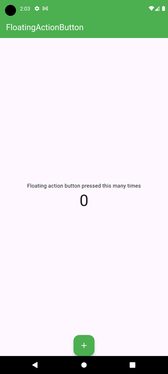
floatingActionButtonLocation: FloatingActionButtonLocation.endFloat,
floatingActionButton: FloatingActionButton(
child: Icon(Icons.add),
backgroundColor: Colors.green,
foregroundColor: Colors.white,
onPressed: () {
setState(() {
i++;
});
},
),
);} }
`
**Output:
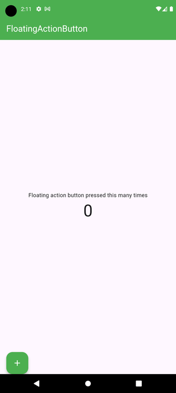
If the properties are defined as below:
floatingActionButtonLocation: FloatingActionButtonLocation.centerDocked,
floatingActionButton: FloatingActionButton(
child: Icon(Icons.add),
backgroundColor: Colors.green,
foregroundColor: Colors.white,
onPressed: () {
setState(() {
i++;
});
},
),
The following design changes can be observed:

If the properties are defined as below:
floatingActionButtonLocation: FloatingActionButtonLocation.endDocked,
floatingActionButton: FloatingActionButton(
child: Icon(Icons.add),
backgroundColor: Colors.green,
foregroundColor: Colors.white,
onPressed: () {
setState(() {
i++;
});
},
),
The following design changes can be observed:
If the properties are defined as below:
floatingActionButtonLocation: FloatingActionButtonLocation.startDocked,
floatingActionButton: FloatingActionButton(
child: Icon(Icons.add),
backgroundColor: Colors.green,
foregroundColor: Colors.white,
onPressed: () {
setState(() {
i++;
});
},
),
The following design changes can be observed:
Final Output:
Complete code is available on Click here to access it.