Flutter AppBar Widget (original) (raw)
Last Updated : 28 Feb, 2025
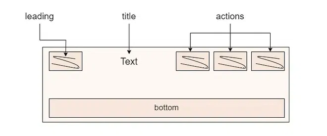
**AppBar is usually the topmost component of the app (or sometimes the bottom-most), it contains the toolbar and some other common action buttons. As all the components in a Flutter application are a widget or a combination of widgets. So _AppBar is also a built-in class or widget in Flutter which gives the functionality of the _AppBar out of the box. The **AppBar widget is based on _Material Design and much of the information is already provided by other classes like _MediaQuery, and Scaffold as to where the content of the AppBar should be placed. Though the _AppBar class is very flexible and can be easily customized, we can also use the _SliverAppBar widget which gives scrollable functionality to the app bar or we can create our own custom app bar from scratch.
The Constructor of the AppBar Class
AppBar AppBar({
Key? key,
Widget? leading,
bool automaticallyImplyLeading = true,
Widget? title,
List? actions,
Widget? flexibleSpace,
PreferredSizeWidget? bottom,
double? elevation,
double? scrolledUnderElevation,
bool Function(ScrollNotification) notificationPredicate = defaultScrollNotificationPredicate,
Color? shadowColor,
Color? surfaceTintColor,
ShapeBorder? shape,
Color? backgroundColor,
Color? foregroundColor,
IconThemeData? iconTheme,
IconThemeData? actionsIconTheme,
bool primary = true,
bool? centerTitle,
bool excludeHeaderSemantics = false,
double? titleSpacing,
double toolbarOpacity = 1.0,
double bottomOpacity = 1.0,
double? toolbarHeight,
double? leadingWidth,
TextStyle? toolbarTextStyle,
TextStyle? titleTextStyle,
SystemUiOverlayStyle? systemOverlayStyle,
bool forceMaterialTransparency = false,
Clip? clipBehavior,
})
Key Properties of Appbar Widget
| Property | Description |
|---|---|
| actions | This property takes in a list of widgets as a parameter to be displayed after the title if the _AppBar is a row |
| title | This property usually takes in the main widget as a parameter to be displayed in the AppBar |
| backgroundColor | This property is used to add colors to the background of the _Appbar |
| elevation | This property is used to set the z-coordinate at which to place this app bar relative to its parent |
| shape | This property is used to give shape to the _Appbar and manage its shadow |
Example Demonstration of AppBar in Flutter Application
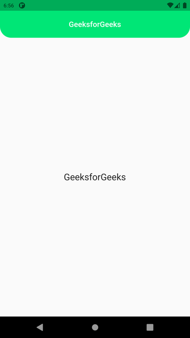
**Example 1:
Dart `
import 'package:flutter/material.dart';
void main() { //MaterialApp runApp(gfgApp()); }
MaterialApp gfgApp() {
return MaterialApp(
//Scaffold
home: Scaffold(

  //AppBar
  appBar: AppBar(
    backgroundColor: Colors.blue,
    foregroundColor: Colors.white,
    title: const Text('GeeksforGeeks'),
  ),

  // center
  body: const Center(

    //Text
    child: Text(
      'GeeksforGeeks',
      style: TextStyle(fontSize: 24),
    ),
  ),
),

//Removing Debug Banner
debugShowCheckedModeBanner: false,
); }
`
**Output:

**Explanation of the above Program:
First, we have imported the _material.dart file as the _AppBar widget need it, we will also do the same in the following two examples. Then we have our main function calling _runApp.
- At top, we have _MaterialApp widget followed by _Scaffold.
- The _MaterialApp widget provided Style to _AppBar and the _Scaffold widget by default places the _AppBar widget at the top of the screen.
- This is just the bare basic out of the box _AppBar provided by _flutter.
- This _AppBar is utilizing only the _title property of the _AppBar class, which takes in the main widget to be displayed in the _AppBar.
- In this case, it is a _Text widget.
In the body, we have a _child _text widget inside the _center widget displaying the text '_GeeksforGeeks', with a font size of 24. In the end, the debug banner has been disabled. This will be followed by the next two examples below.
**Example 2:
Dart `
import "package:flutter/material.dart";
// function to trigger the build process void main() { //MaterialApp runApp(MyApp()); }
// ignore: non_constant_identifier_names MaterialApp MyApp() { return MaterialApp(
//Scaffold
home: Scaffold(

  //AppBar
  appBar: AppBar(
    title: const Text("GeeksforGeeks"),
    titleSpacing: 00.0,
    centerTitle: true,
    toolbarHeight: 60.2,
    toolbarOpacity: 0.8,
    shape: const RoundedRectangleBorder(
      borderRadius: BorderRadius.only(
          bottomRight: Radius.circular(25),
          bottomLeft: Radius.circular(25)),
    ),
    elevation: 0.00,
    backgroundColor: Colors.greenAccent[400],
    foregroundColor: Colors.white,
  ),

  //Center
  body: const Center(
    child: Text(
      'GeeksforGeeks',
      style: TextStyle(fontSize: 24),
    ),
  ),
),

//Removing Debug Banner
debugShowCheckedModeBanner: false,
); }
`
**Output:
**Explanation of the above Program:
Here the _AppBar widget is utilizing seven properties in total.
- It starts with the _title 'GeeksforGeeks'.
- The second is the _titlespacing which takes in double as a parameter and in this case, it is set to 00.0 to keep text close together.
- The third property is _centerTitle which takes in boolean as a parameter and is set to true here.
- The fourth property is _toolbarHeight which also takes in double as a parameter. This property provides a shadow underneath the _AppBar which in turn makes it look elevated. _toolBarOpacity is responsible for controlling the opacity of the toolbar portion of the _appBar. It takes a double value as the parameter where 1.0 is the maximum opacity and 0.0 is full transparency.
- The fifth property is _shape it is utilized to give a different shape to the _AppBar by modifying the border of the AppBar. Inside the _shape property we have used the _borderRadius to make the bottom edges of the AppBar rounded by an angle of 25 degrees.
- The sixth property is _elevation, it defines the z-coordinates at which the AppBar is to be placed with respect to its parent. It also takes in double as a parameter.
- And the last is the _backgroundColor and foregroundColor which controls the background color of the AppBar and foreground color defines default color of elements in appbar , in this case, we have the signature geeksforgeeks in white color and background in _greenAccect color.
**Example 3:
Dart `
import "package:flutter/material.dart"; import 'package:flutter/services.dart';
void main() { //MaterialApp runApp(gfgApp()); }
MaterialApp gfgApp() { return MaterialApp(
//Scaffold
home: Scaffold(

  //AppBar
  appBar: AppBar(
    title: const Text("GeeksforGeeks"),

    //<Widget>[]
    actions: <Widget>[

      //IconButton
      IconButton(
        icon: const Icon(Icons.comment),
        tooltip: 'Comment Icon',
        onPressed: () {},
      ),

      //IconButton
      IconButton(
        icon: const Icon(Icons.settings),
        tooltip: 'Setting Icon',
        onPressed: () {},
      ),
    ],
    backgroundColor: Colors.greenAccent[400],
    foregroundColor: Colors.white,
    elevation: 50.0,
    leading: IconButton(
      icon: const Icon(Icons.menu),
      tooltip: 'Menu Icon',
      onPressed: () {},
    ),
    systemOverlayStyle: SystemUiOverlayStyle.light,
  ),

  //Center
  body: const Center(

    //Text
    child: Text(
      "Geeksforgeeks",
      style: TextStyle(fontSize: 24),
    ),
  ),
),

//Removing Debug Banner
debugShowCheckedModeBanner: false,
); }
`
**Output:

**Explanation of the above Program:
Here we can see that in addition to the title on the app Bar we have three more icons on the AppBar, one on the left and two on the right of the title.
- This AppBar widget starts with the usual _title property which is taking _Text widget as a parameter.
- The _title is followed by the _action property which takes in a list of widgets as a parameter to be displayed after the title if the AppBar is a row.
- In this case, we can see the two icons namely the comment and setting.
- These two icons are _IconsButton widgets, utilizing three properties namely _icon, _tooltip, and _onPressed function.
- The _onPressed function is not specified in any of the IconButton so it is null.
- The _icon property takes in a _string as a parameter which is the name of the specific icon.
- The tooltip property also takes in a string as the parameter which is displayed in a floating label, while hovering with the mouse or on the long-press.
- In the first _IconButton we have _Icons.comment & _Comment Icon and in the second _IconButton we have _Icons.settin_g & _Setting Icon as the parameter for the icon and tooltip respectively.
- Now, all this is followed by the _backgroundColor and _foregroundColor which controls the background color of the AppBar and foreground color defines default color of elements in appbar , in this case, we have the signature _geeksforgeeks, icons, ..etc in white color and background in _greenAccect color followed by _elevation 50.0 respectively.
- After that, we have the _leading property which takes in a widget as a parameter, to be displayed before the _title in the _AppBar.
- In this case, the leading is also an _IconButton, which displays a menu icon. The _onPressed property is not mentioned and the tooltip property is given a parameter of string 'Menu Icon'. And the body is similar to the first and second examples.