Flutter Card Widget (original) (raw)
Last Updated : 09 Sep, 2024
**Card is a built-in widget in Flutter which derives its design from Google's Material Design Library. The functionality of this widget on screen is, that it is a bland space or panel with round corners and a slight elevation on the lower side. It comes with many properties like color, shape, shadow colour, etc which lets developers customize it the way they like. Below we will go through all its properties and an example to see its implementation.
**Constructor of Card class:
const Card( { Key key, Color color, Color shadowColor, double elevation, ShapeBorder shape, bool borderOnForeground: true, EdgeInsetsGeometry margin, Clip clipBehavior, Widget child, bool semanticContainer: true} )
**Properties of Card Widget:
| Properties | Description |
|---|---|
| **borderOnForeground: | This property takes in a _boolean value as an object to decide whether to print a border or not. |
| **child: | This property takes in a widget as an object to show inside the _Card widget. |
| **clipBehavior: | This property decides whether the content inside the Card will be clipped or not. It takes the _Clip enum as an object. |
| **color: | This property assigns background color to the card by taking in the _Color class as the object. |
| **elevation: | This property takes in a _double value as the object to decide the z-coordinate where the card should be placed. |
| **margin: | This property takes in _EdgeInsetsGeometry as the object to add empty space around the _Card. |
| **semanticContainer: | This property takes in a _boolean as the object. This controls whether the Card widget with all its child widget will be seen as a single widget or not. |
| **shadowColor: | This property takes in Color class as the object to assign a color to the shadow, which appears beneath the card. By default, the color is set to black. |
| **shape: | This property takes _ShapeBorder class as the object to decide the shape of the _Card widget. |
**Example:
Dart `
import 'package:flutter/material.dart';
//imported google's material design library void main() { runApp( /Our App Widget Tree Starts Here/ MaterialApp( home: Scaffold( appBar: AppBar( title: const Text('GeeksforGeeks'), backgroundColor: Colors.greenAccent[400], centerTitle: true, ), //AppBar body: Center( /** Card Widget **/ child: Card( elevation: 50, shadowColor: Colors.black, color: Colors.greenAccent[100], child: SizedBox( width: 300, height: 500, child: Padding( padding: const EdgeInsets.all(20.0), child: Column( children: [ CircleAvatar( backgroundColor: Colors.green[500], radius: 108, child: const CircleAvatar( backgroundImage: NetworkImage( "https://media.geeksforgeeks.org/wp-content/uploads/20210101144014/gfglogo.png"), //NetworkImage radius: 100, ), //CircleAvatar ), //CircleAvatar const SizedBox( height: 10, ), //SizedBox Text( 'GeeksforGeeks', style: TextStyle( fontSize: 30, color: Colors.green[900], fontWeight: FontWeight.w500, ), //Textstyle ), //Text const SizedBox( height: 10, ), //SizedBox const Text( 'GeeksforGeeks is a computer science portal for geeks at geeksforgeeks.org. It contains well written, well thought and well explained computer science and programming articles, quizzes, projects, interview experiences and much more!!', style: TextStyle( fontSize: 15, color: Colors.green, ), //Textstyle ), //Text const SizedBox( height: 10, ), //SizedBox SizedBox( width: 100,
                child: ElevatedButton(
                  onPressed: () => 'Null',
                  style: ButtonStyle(
                      backgroundColor:
                          MaterialStateProperty.all(Colors.green)),
                  child: Padding(
                    padding: const EdgeInsets.all(4),
                    child: Row(
                      children: const [
                        Icon(Icons.touch_app),
                        Text('Visit')
                      ],
                    ),
                  ),
                ),
                // RaisedButton is deprecated and should not be used
                // Use ElevatedButton instead

                // child: RaisedButton(
                //   onPressed: () => null,
                //   color: Colors.green,
                //   child: Padding(
                //     padding: const EdgeInsets.all(4.0),
                //     child: Row(
                //       children: const [
                //         Icon(Icons.touch_app),
                //         Text('Visit'),
                //       ],
                //     ), //Row
                //   ), //Padding
                // ), //RaisedButton
              ) //SizedBox
            ],
          ), //Column
        ), //Padding
      ), //SizedBox
    ), //Card
  ), //Center
), //Scaffold
) //MaterialApp ); }
`
**Output:
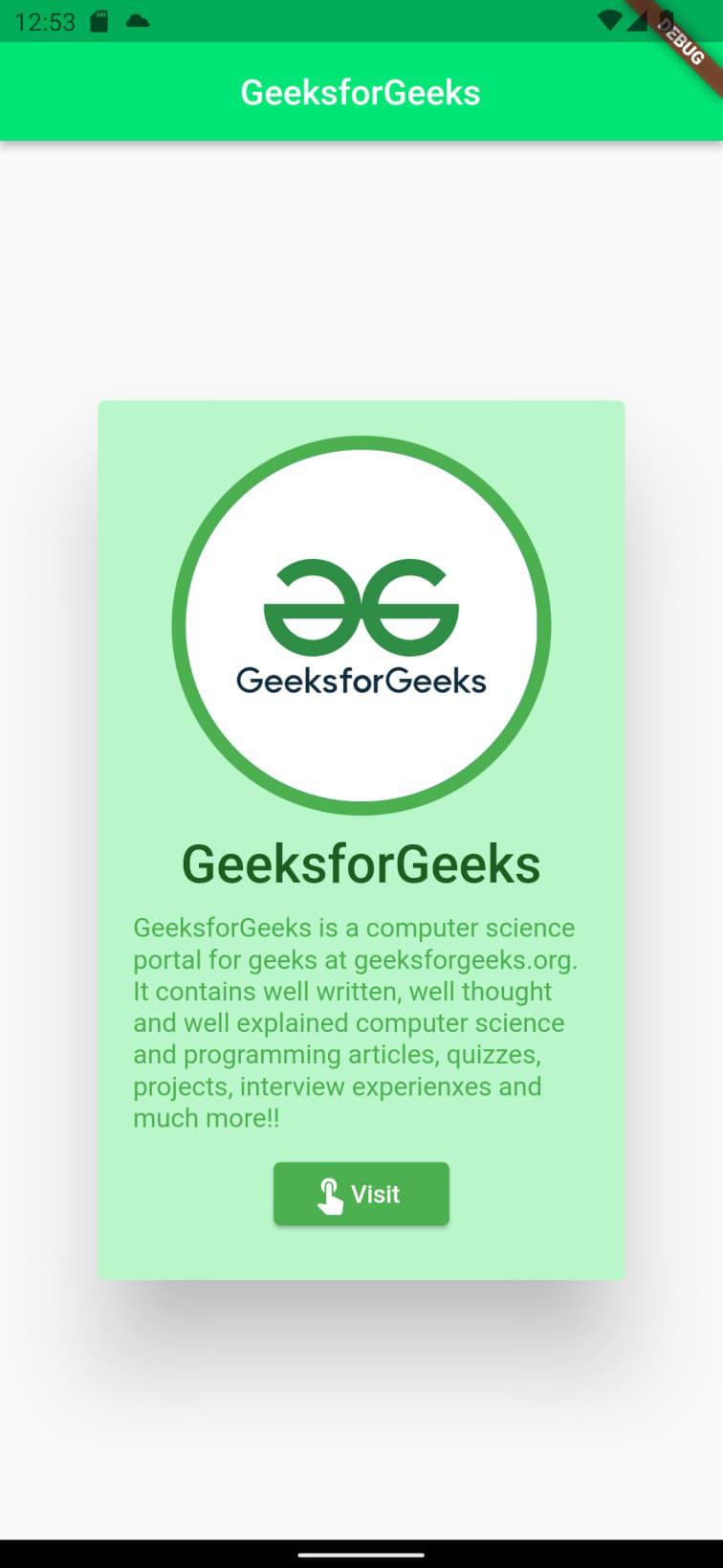
Output
**Explanation of the above Program:
In this flutter app the _Center is the parent widget to all, which is holding _Card widget as a child. The properties of Card widget which are employed here are elevation which is set to 50, makes the card look a little up from the white background, _shadowColor which is assigned black color (it is giving a faint shadow beneath the card), and color is assigned greenAccent[400] as the object (it is responsible for the green background of the card). The _Card widget is holding _SizedBox widget as the child, which is, in turn, holding the _Padding as the child. There is a 20 px empty space in the card, which is assigned by the _padding property. The _Column widget is holding _CircleAvatar (image), two _Text widgets, and a _RaisedButton all separated by SizedBox widget. And the end result of all this is this beautiful card.