Flutter SizedBox Widget (original) (raw)
Last Updated : 17 Mar, 2025
**SizedBox is a built-in widget in flutter SDK. It is a simple box with a specified size. It can be used to set size constraints to the child widget, put an empty SizedBoxbetween the two widgets to get some space in between, or something else. It is somewhat similar to a Container widget with fewer properties.
**Constructor of SizedBox Class
It draws a simple box with the mentioned height and width or a child widget inside.
const SizedBox(
{
Key key,
double width,
double height,
Widget child}
)
**Constructor of SizedBox.expand
This implementation of the SizedBoxwidget allows it to be as big as the parent widget allows it to be.
const SizedBox.expand(
{
Key key,
Widget child}
)
**Constructor of SizedBox.fromSize
This allows the creation ofa **SizedBoxwith a specified size.
SizedBox.fromSize(
{
Key key,
Widget child,
Size size}
)
**Constructor of SizedBox.shrink
This implementation of thewidget allows it to be as small as the child widget allows it to be.
const SizedBox.shrink(
{
Key key,
Widget child}
)
**Properties of SizedBox Widget
| Property | Description |
|---|---|
| child | This property takes in a child widget as the object to display it below the SizedBox in the widget tree or inside the SizedBox onthe screen. |
| height | This property specifies the height of the SizedBox in pixels. It is a double value as the object. |
| width | This property is alsoa double value as the object to give width to the _SizedBox. |
**Example 1:
Dart `
import 'package:flutter/material.dart';
//Importing material design library void main() { runApp( //Our app widget tree starts from here MaterialApp( debugShowCheckedModeBanner: false, home: Scaffold( appBar: AppBar( title: Text('GeeksforGeeks'), centerTitle: true, backgroundColor: Colors.green, foregroundColor: Colors.white, ), //AppBar body: Center( //SizedBox Widget child: SizedBox( width: 200.0, height: 100.0, child: Card( color: Colors.green, child: Center( child: Text( 'GeeksForGeeks', style: TextStyle(color: Colors.white, fontSize: 25), ), //Text ), //Center ), //Card ), //SizedBox ), //Center ), //Scaffold ), //MaterialApp ); }
`
**Output:
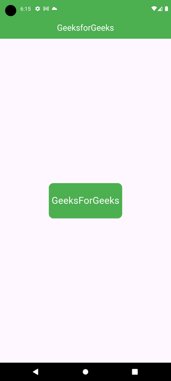
**Explanation of the above Program:
By taking a look at the code, Wecan see that the body of this flutter app is holding the **Centerwidget as the parent of all. Inside the Centerwidget, we have a **SizedBoxwhose height is mentioned as 100 pixels and width as 200 pixels. The SizedBoxwidget is holding the Cardas the child and restricting its size.
**Using SizedBox.expand
Dart `
SizedBox.expand( child: Card( color: Colors.green, child: Center( child: Text( 'GeeksForGeeks', style: TextStyle(color: Colors.white, fontSize: 25 ), ), //Text ), //Center ), //Card ), //SizedBox.expand
`
**Output:
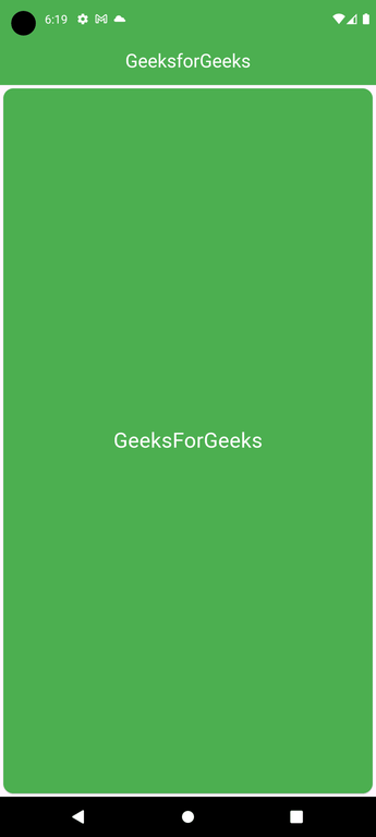
**Explanation of the above Program:
Here we have used the**SizedBox.expand which is enabling it to expand as big as its parent allows. And the Center widget allows it to fill the whole screen.
**Example 2:
Dart `
Center( child: Row( children: [ Container( width: 200, height: 200, color: Colors.red, ), //Container //SizedBox Widget SizedBox( width: 50, ), Container( width: 100, height: 100, color: Colors.blue, ) //Container ], //[] ), //Row ), //center
`
**Output:
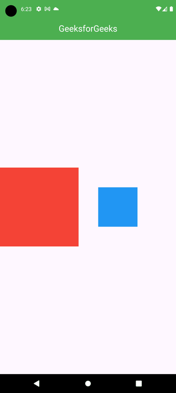
**Explanation of the above Program:
In this example, we have used the **SizedBox widget to add a **gap between the two Container widgets. Here, we **have two Container widgets inside the Row. The first red container has a height and width of 200 pixels each. The second blue **has a height and width of 100 pixels each. And in between these two containers, we have a SizedBox widget with a width of 50 pixels and no height.