Getting Started with Plotly in R (original) (raw)
Last Updated : 26 Mar, 2024
creation**Plotly in R Programming Language allows the creation of interactive web graphics from 'ggplot2' graphs and a custom interface to the JavaScript library 'plotly.js' inspired by the grammar of graphics.
Installation
To use a package in R programming one must have to install the package first. This task can be done using the command **install.packages****(“packagename”)**. To install the whole **plotly package type this:
install.packages("plotly")
Or install the latest development version (on GitHub) via dev tools:
devtools::install_github("ropensci/plotly")
Important Functions
**plot_ly: It basically initiates a plotly visualization. This function maps R objects to plotly.js, an (MIT licensed) web-based interactive charting library. It provides abstractions for doing common things and sets some different defaults to make the interface feel more 'R-like' (i.e., closer to plot() and ggplot2::qplot()).
**Syntax:
plot_ly(data = data.frame(), ..., type = NULL, name, color, colors = NULL, alpha = NULL, stroke, strokes = NULL, alpha_stroke = 1, size, sizes = c(10, 00), span, spans = c(1, 20), symbol, symbols = NULL, linetype, linetypes = NULL, split, frame, width = NULL, height = NULL, source = "A")
Scatter Plot with Colors plotly in R
R `
Load necessary libraries
library(plotly) library(dplyr)
Load Iris dataset
data(iris)
#Scatter Plot with Colors plot_ly(iris, x = ~Sepal.Length, y = ~Sepal.Width, color = ~Species, type = "scatter", mode = "markers", marker = list(size = 10, opacity = 0.8)) %>% layout(title = "Scatter Plot of Sepal Length vs. Sepal Width", xaxis = list(title = "Sepal Length"), yaxis = list(title = "Sepal Width"))
`
**Output:
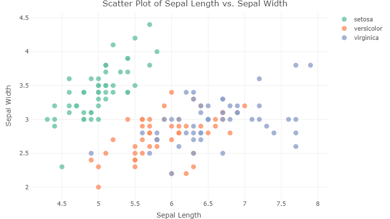
Scatter Plot with Plotly in R
**plotly_build: This generic function creates the list object sent to plotly.js for rendering. Using this function can be useful for overriding defaults or for debugging rendering errors.
**Syntax: plotly_build(p, registerFrames = TRUE)
Box Plot with Plotly in R
R `
#Box Plot plot_ly(iris, x = ~Species, y = ~Petal.Length, type = "box", boxpoints = "all", jitter = 0.3, pointpos = -1.8, boxmean = "sd") %>% layout(title = "Box Plot of Petal Length by Species", xaxis = list(title = "Species"), yaxis = list(title = "Petal Length"))
`
**Output:
.png)
Box Plot with Plotly in R
3D Scatter Plot with Plotly in R
R `
3D Scatter Plot
plot_ly(iris, x = ~Sepal.Length, y = ~Sepal.Width, z = ~Petal.Length, color = ~Species, type = "scatter3d", mode = "markers", marker = list(size = 8, opacity = 0.8)) %>% layout(title = "3D Scatter Plot of Sepal Length, Sepal Width, and Petal Length", scene = list(xaxis = list(title = "Sepal Length"), yaxis = list(title = "Sepal Width"), zaxis = list(title = "Petal Length")))
`
**Output:
.png)
3D Scatter Plot with Plotly in R
Heatmap Plot with Plotly in R
R `
#Heatmap plot_ly(z = ~cor(iris[, 1:4]), type = "heatmap", colorscale = "Viridis", showscale = FALSE) %>% layout(title = "Correlation Heatmap of Iris Features", xaxis = list(ticktext = colnames(iris[, 1:4]), tickvals = seq(0.5, 4.5, by = 1), title = "Features"), yaxis = list(ticktext = colnames(iris[, 1:4]), tickvals = seq(0.5, 4.5, by = 1), title = "Features"))
`
**Output:
.png)
Heatmap Plot with Plotly in R
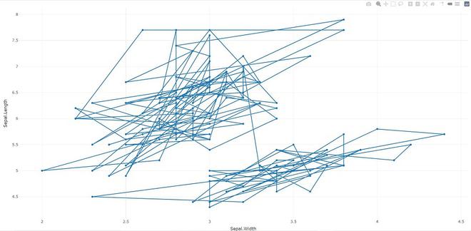
Adding trace (lines) to plotly in R
R `
import plotly library
library(plotly)
create plotly visualisation
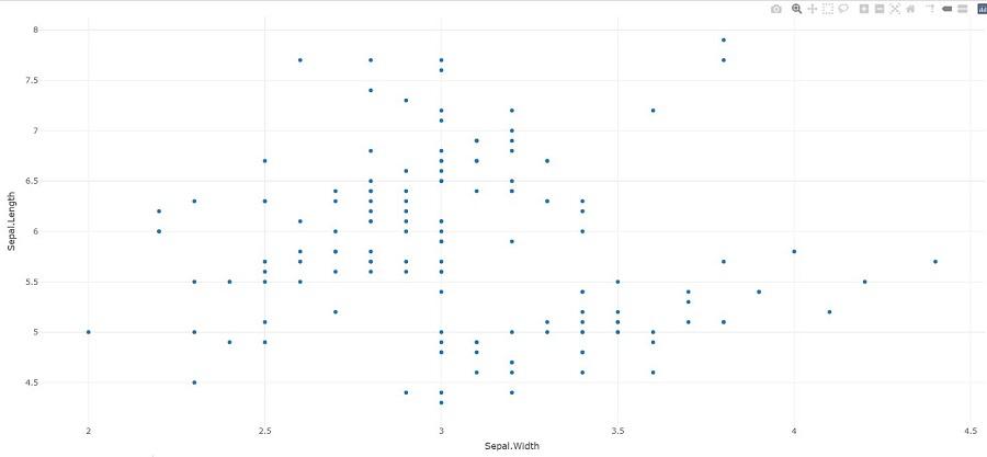
p <- plot_ly(iris, x = ~Sepal.Width, y = ~Sepal.Length)
adding trace (lines) to plotly
visualisation
add_trace(p, type = "scatter", mode = "markers+lines")
`
**Output:
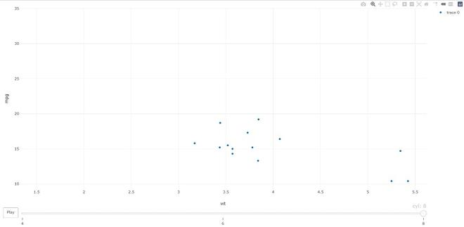
**animation_opts: Provides animation configuration options. Animations can be created by either using the frame argument in plot_ly() or frame ggplot2 aesthetic in ggplotly(). By default, animations populate a play button and slider component for controlling the state of the animation (to pause an animation, click on a relevant location on the slider bar). Both the play button and slider component transition between frames according to rules specified by animation_opts().
**Syntax:
animation_opts(p, frame = 500, transition = frame, easing = “linear”, redraw = TRUE, mode = “immediate”)
animation_slider(p, hide = FALSE, …)
animation_button(p, …, label)
R `
import plotly library
library(plotly)
plot_ly(mtcars, x = ~wt, y = ~mpg, frame = ~cyl) %>% animation_opts(transition = 0)
`
**Output:
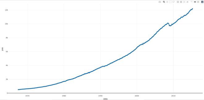
**add_data: Add data to a plotly visualization.
**Syntax: add_data(p, data = NULL)
R `
import plotly library
library(plotly)
plot_ly() %>% add_data(economics) %>% add_trace(x = ~date, y = ~pce)
`
**Output:
**plotly_IMAGE: Creates a static image for plotly visualization. The images endpoint turns a plot (which may be given in multiple forms) into an image of the desired format.
**Syntax:
plotly_IMAGE(x, width = 1000, height = 500, format = "png", scale = 1, out_file, ...)
R `
import plotly library
library(plotly)
create plotly visualisation
p <- plot_ly(iris, x = ~Sepal.Width, y = ~Sepal.Length)
importing plotly visualisation
as image files
Png <- plotly_IMAGE(p, out_file = "plotly-test-image.png") Jpeg <- plotly_IMAGE(p, format = "jpeg", out_file = "plotly-test-image.jpeg")
importing plotly visualisation
as vector graphics
Svg <- plotly_IMAGE(p, format = "svg",
out_file = "plotly-test-image.svg")
importing plotly visualisation as
pdf file
Pdf <- plotly_IMAGE(p, format = "pdf", out_file = "plotly-test-image.pdf")
`
**Output:
Plotly in R
Conclusion
We can leverage the plotly R package to create a variety of interactive graphics. Two main ways of creating a plotly object: either by transforming a ggplot2 object (via ggplotly()) into a plotly object or by directly initializing a plotly object with plot_ly()/plot_geo()/plot_mapbox(). Both approaches have somewhat complementary strengths and weaknesses, so it can pay off to learn both approaches.