Graph Plotting in Python | Set 1 (original) (raw)
This series will introduce you to graphing in Python with Matplotlib, which is arguably the most popular graphing and data visualization library for Python.
**Installation
The easiest way to install matplotlib is to use pip. Type the following command in the terminal:
pip install matplotlib
OR, you can download it from here and install it manually.
How to plot a graph in Python?
There are various ways to do this in Python. here we are discussing some generally used methods for plotting matplotlib in Python. those are the following.
- Plotting a Line
- Plotting Two or More Lines on the Same Plot
- Customization of Plots
- Plotting Matplotlib Bar Chart
- Plotting Matplotlib Histogram
- Plotting Matplotlib Scatter plot
- Plotting Matplotlib Pie-chart
- Plotting Curves of Given Equation
**Plotting a line
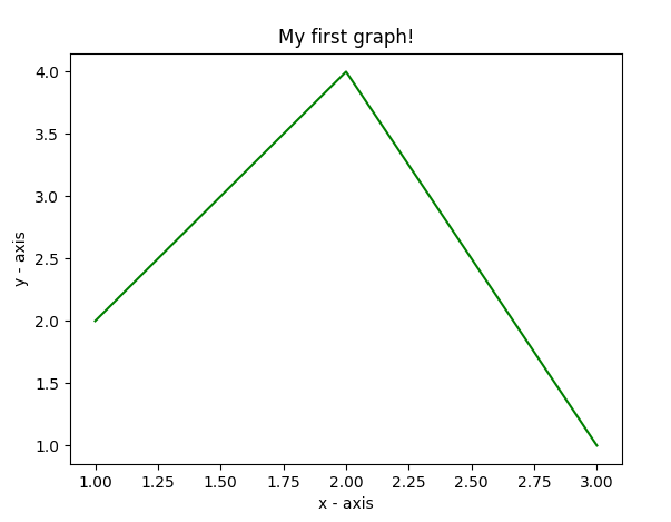
In this example, the code uses Matplotlib to create a simple line plot. It defines x and y values for data points, plots them using `plt.plot()`, and labels the x and y axes with `plt.xlabel()` and `plt.ylabel()`. The plot is titled “My first graph!” using `plt.title()`. Finally, the `plt.show()` function is used to display the graph with the specified data, axis labels, and title.
Python `
importing the required module
import matplotlib.pyplot as plt
x axis values
x = [1,2,3]
corresponding y axis values
y = [2,4,1]
plotting the points
plt.plot(x, y)
naming the x axis
plt.xlabel('x - axis')
naming the y axis
plt.ylabel('y - axis')
giving a title to my graph
plt.title('My first graph!')
function to show the plot
plt.show()
`
**Output:
**Plotting Two or More Lines on Same Plot
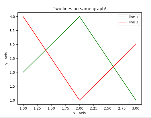
In this example code uses Matplotlib to create a graph with two lines. It defines two sets of x and y values for each line and plots them using `plt.plot()`. The lines are labeled as “line 1” and “line 2” with `label` parameter. Axes are labeled with `plt.xlabel()` and `plt.ylabel()`, and the graph is titled “Two lines on the same graph!” with `plt.title()`. The legend is displayed using `plt.legend()`, and the `plt.show()` function is used to visualize the graph with both lines and labels.
Python `
import matplotlib.pyplot as plt
line 1 points
x1 = [1,2,3] y1 = [2,4,1]
plotting the line 1 points
plt.plot(x1, y1, label = "line 1")
line 2 points
x2 = [1,2,3] y2 = [4,1,3]
plotting the line 2 points
plt.plot(x2, y2, label = "line 2")
naming the x axis
plt.xlabel('x - axis')
naming the y axis
plt.ylabel('y - axis')
giving a title to my graph
plt.title('Two lines on same graph!')
show a legend on the plot
plt.legend()
function to show the plot
plt.show()
`
**Output:
**Customization of Plots
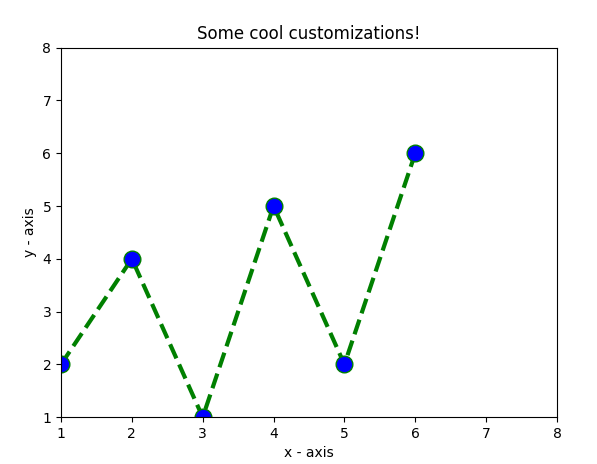
In this example code uses Matplotlib to create a customized line plot. It defines x and y values, and the plot is styled with a green dashed line, a blue circular marker for each point, and a marker size of 12. The y-axis limits are set to 1 and 8, and the x-axis limits are set to 1 and 8 using `plt.ylim()` and `plt.xlim()`. Axes are labeled with `plt.xlabel()` and `plt.ylabel()`, and the graph is titled “Some cool customizations!” with `plt.title()`.
Python `
import matplotlib.pyplot as plt
x axis values
x = [1,2,3,4,5,6]
corresponding y axis values
y = [2,4,1,5,2,6]
plotting the points
plt.plot(x, y, color='green', linestyle='dashed', linewidth = 3, marker='o', markerfacecolor='blue', markersize=12)
setting x and y axis range
plt.ylim(1,8) plt.xlim(1,8)
naming the x axis
plt.xlabel('x - axis')
naming the y axis
plt.ylabel('y - axis')
giving a title to my graph
plt.title('Some cool customizations!')
function to show the plot
plt.show()
`
**Output:
Plotting Matplotlib Using Bar Chart
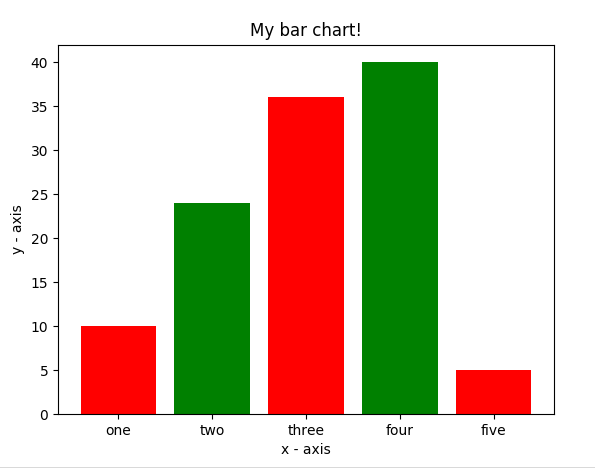
In this example code uses Matplotlib to create a bar chart. It defines x-coordinates (`left`), heights of bars (`height`), and labels for the bars (`tick_label`). The `plt.bar()` function is then used to plot the bar chart with specified parameters such as bar width, colors, and labels. Axes are labeled with `plt.xlabel()` and `plt.ylabel()`, and the chart is titled “My bar chart!” using `plt.title()`.
Python `
import matplotlib.pyplot as plt
x-coordinates of left sides of bars
left = [1, 2, 3, 4, 5]
heights of bars
height = [10, 24, 36, 40, 5]
labels for bars
tick_label = ['one', 'two', 'three', 'four', 'five']
plotting a bar chart
plt.bar(left, height, tick_label = tick_label, width = 0.8, color = ['red', 'green'])
naming the x-axis
plt.xlabel('x - axis')
naming the y-axis
plt.ylabel('y - axis')
plot title
plt.title('My bar chart!')
function to show the plot
plt.show()
`
**Output :
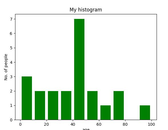
Plotting Matplotlib Using Histogram
In this example code uses Matplotlib to create a histogram. It defines a list of age frequencies (ages), sets the range of values from 0 to 100, and specifies the number of bins as 10. The plt.hist() function is then used to plot the histogram with the provided data and formatting, including the color, histogram type, and bar width. Axes are labeled with plt.xlabel() and plt.ylabel(), and the chart is titled “My histogram” using plt.title().
Python `
import matplotlib.pyplot as plt
frequencies
ages = [2,5,70,40,30,45,50,45,43,40,44, 60,7,13,57,18,90,77,32,21,20,40]
setting the ranges and no. of intervals
range = (0, 100) bins = 10
plotting a histogram
plt.hist(ages, bins, range, color = 'green', histtype = 'bar', rwidth = 0.8)
x-axis label
plt.xlabel('age')
frequency label
plt.ylabel('No. of people')
plot title
plt.title('My histogram')
function to show the plot
plt.show()
`
**Output:
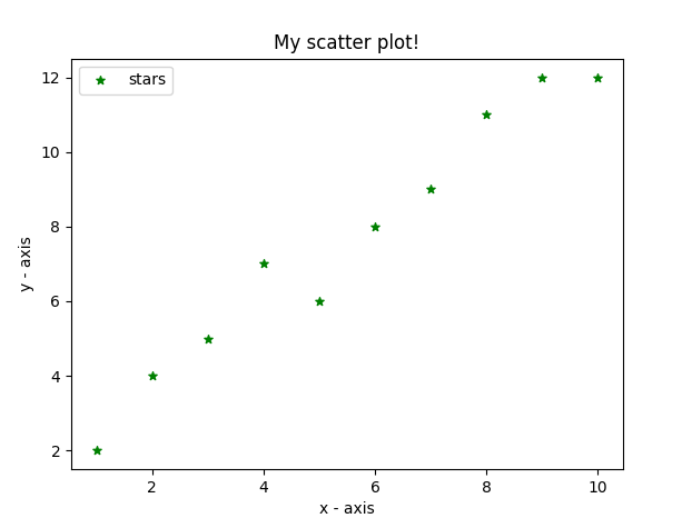
Plotting Matplotlib Using Scatter Plot
In this example code uses Matplotlib to create a scatter plot. It defines x and y values and plots them as scatter points with green asterisk markers (`*`) of size 30. Axes are labeled with `plt.xlabel()` and `plt.ylabel()`, and the plot is titled “My scatter plot!” using `plt.title()`. The legend is displayed with the label “stars” using `plt.legend()`, and the resulting scatter plot is shown using `plt.show()`.
Python `
import matplotlib.pyplot as plt
x-axis values
x = [1,2,3,4,5,6,7,8,9,10]
y-axis values
y = [2,4,5,7,6,8,9,11,12,12]
plotting points as a scatter plot
plt.scatter(x, y, label= "stars", color= "green", marker= "*", s=30)
x-axis label
plt.xlabel('x - axis')
frequency label
plt.ylabel('y - axis')
plot title
plt.title('My scatter plot!')
showing legend
plt.legend()
function to show the plot
plt.show()
`
**Output:
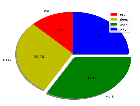
Plotting Matplotlib Using Pie-chart
In this example code uses Matplotlib to create a pie chart. It defines labels for different activities (`activities`), the portion covered by each label (`slices`), and colors for each label (`colors`). The `plt.pie()` function is then used to plot the pie chart with various formatting options, including start angle, shadow, explosion for a specific slice, radius, and autopct for percentage display. The legend is added with `plt.legend()`, and the resulting pie chart is displayed using `plt.show()`.
Python `
import matplotlib.pyplot as plt
defining labels
activities = ['eat', 'sleep', 'work', 'play']
portion covered by each label
slices = [3, 7, 8, 6]
color for each label
colors = ['r', 'y', 'g', 'b']
plotting the pie chart
plt.pie(slices, labels = activities, colors=colors, startangle=90, shadow = True, explode = (0, 0, 0.1, 0), radius = 1.2, autopct = '%1.1f%%')
plotting legend
plt.legend()
showing the plot
plt.show()
`
The output of above program looks like this:
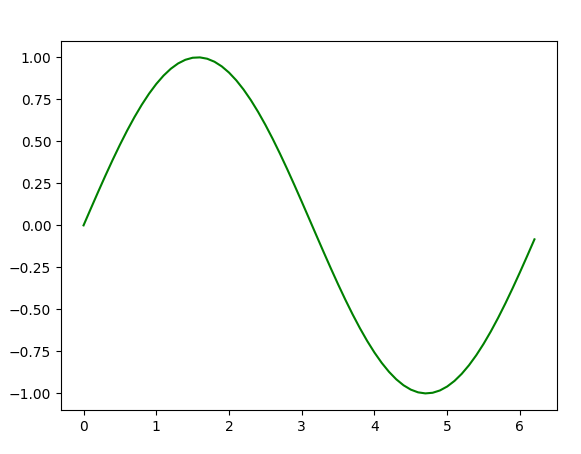
**Plotting Curves of Given Equation
In this example code uses Matplotlib and NumPy to create a sine wave plot. It generates x-coordinates from 0 to 2π in increments of 0.1 using `np.arange()` and calculates the corresponding y-coordinates by taking the sine of each x-value using `np.sin()`. The points are then plotted using `plt.plot()`, resulting in a sine wave. Finally, the `plt.show()` function is used to display the sine wave plot.
Python `
importing the required modules
import matplotlib.pyplot as plt import numpy as np
setting the x - coordinates
x = np.arange(0, 2*(np.pi), 0.1)
setting the corresponding y - coordinates
y = np.sin(x)
plotting the points
plt.plot(x, y)
function to show the plot
plt.show()
`
**Output:
So, in this part, we discussed various types of plots we can create in matplotlib. There are more plots that haven’t been covered but the most significant ones are discussed here –
If you like GeeksforGeeks and would like to contribute, you can also write an article using write.geeksforgeeks.org or mail your article to review-team@geeksforgeeks.org. See your article appearing on the GeeksforGeeks main page and help other Geeks.
Please write comments if you find anything incorrect, or you want to share more information about the topic discussed above.