Grids in Matplotlib (original) (raw)
Last Updated : 15 Mar, 2025
**Grids are made up of intersecting straight (vertical, horizontal, and angular) or curved lines used to structure our content. Matplotlib helps us to draw plain graphs but it is sometimes necessary to use grids for better understanding and get a reference for our data points. Thus, Matplotlib provides a grid() for easy creation of gridlines with tonnes of customization.
matplotlib.pyplot.grid()
grid() function in the Pyplot module of the Matplotlib library is used to configure the grid lines in a plot.
**Syntax:
matplotlib.pyplot.grid(True, color = “grey”, linewidth = “1.4”, axis = ”Y”, linestyle = “-.”)
**Parameters:
- **True/False: Specifies whether the grid should be displayed.
- **color: Defines the color of the grid lines.
- **linewidth: Sets the thickness of the grid lines.
- **axis: Determines which axis to apply the grid (“x”, “y”, or both).
- **linestyle: Specifies the style of the grid lines (e.g., dashed, dotted, etc.).
**Returns: It does not return anything; it modifies the existing plot by adding a grid.
Adding Grid Lines to a Plot
**grid() function allows us to enable or disable grid lines in a plot. We can also choose to display major grid lines, minor grid lines, or both. Additionally, we can customize the color, linewidth and linestyle of the grid lines to enhance visualization.
Python `
Implementation of matplotlib function
import matplotlib.pyplot as plt import numpy as np
dummy data
x1 = np.linspace(0.0, 5.0) y1 = np.cos(2 * np.pi * x1) * np.exp(-x1)
creates two subplots
fig, (ax1, ax2) = plt.subplots(1, 2, figsize = (12, 5))
Plot without grid
ax1.plot(x1, y1) ax1.set_title('Plot without grid')
plot with grid
ax2.plot(x1, y1) ax2.set_title("Plot with grid")
draw gridlines
ax2.grid(True)
plt.show()
`
**Output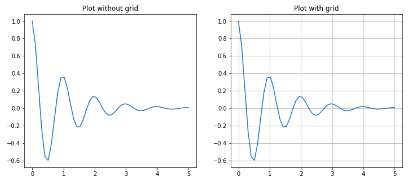
**Explanation: We generate dummy data using **NumPy, where x1 has evenly spaced values from 0 to 5 and y1 follows cos(2πx) * e^(-x), combining oscillation with exponential decay. Two side-by-side subplots are created **ax1 shows the plot without grid lines, while **ax2 enables grid lines using **ax2.grid(True).
Customizing grid line properties
We can enhance the appearance of grid lines using parameters like color, linestyle, and linewidth.
Python `
Implementation of matplotlib function
import matplotlib.pyplot as plt import numpy as np
dummy data
x = np.linspace(0, 2 * np.pi, 400) y = np.sin(x ** 2)
set graph color
plt.plot(x, y, 'green')
to set title
plt.title("Plot with linewidth and linestyle")
draws gridlines of grey color using given
linewidth and linestyle
plt.grid(True, color = "grey", linewidth = "1.4", linestyle = "-.")
plt.show()
`
**Output
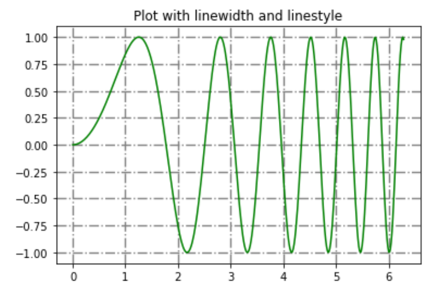
**Explanation: We generate dummy data using NumPy, where x has evenly spaced values from 0 to 2𝜋 and y follows sin(x 2 ) follow he plot is drawn in green, with a title set using **plt.title(). Grid lines are enabled using **plt.grid(True), customized with grey color, linewidth of 1.4 and a dash-dot linestyle.
Displaying grid lines for a specific axis
Matplotlib allows us to display gridlines only for the x-axis or y-axis.
1. Display only grid lines for the x-axis
Use axis=’x’ to enable grid lines only along the x-axis.
Python `
Implementation of matplotlib function
import matplotlib.pyplot as plt import numpy as np
dummy data
x = np.linspace(0, 2 * np.pi, 400) y = np.sin(x ** 2)
set graph color
plt.plot(x, y, 'green')
to set title
plt.title("Plot with linewidth and linestyle")
draws gridlines of grey color using given
linewidth and linestyle
plt.grid(True, color = "grey", linewidth = "1.4",axis = 'x')
plt.show()
`
**Output
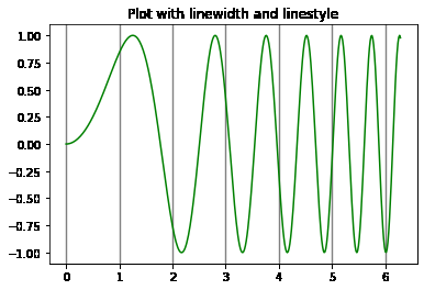
**Explanation: Grid lines are enabled only along the x-axis using plt.grid(True, axis=’x’), customized with grey color and a linewidth of 1.4.
2. Display only grid lines for the y-axis
Use axis=’y’ to enable grid lines only along the y-axis.
Python `
Implementation of matplotlib function
import matplotlib.pyplot as plt import numpy as np
dummy data
x = np.linspace(0, 2 * np.pi, 400) y = np.sin(x ** 2)
set graph color
plt.plot(x, y, 'green')
to set title
plt.title("Plot with linewidth and linestyle")
draws gridlines of grey color using given
linewidth and linestyle
plt.grid(True, color = "grey", linewidth = "1.4", axis = 'y')
plt.show()
`
**Output
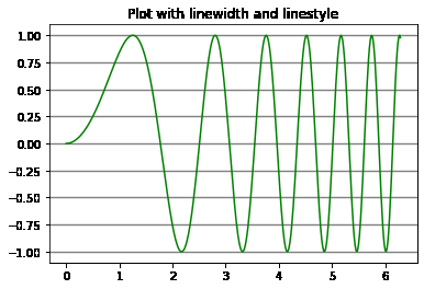
**Explanation: Grid lines are enabled only along the y-axis using plt.grid(True, axis=’y’), customized with grey color and a linewidth of 1.4.