How to Add Markers to a Graph Plot in Matplotlib with Python? (original) (raw)
Last Updated : 03 Oct, 2022
In this article, we will learn how to add markers to a Graph Plot in Matplotlibwith Python. For that just see some concepts that we will use in our work.
- Graph Plot: A plot is a graphical technique for representing a data set, usually as a graph showing the relationship between two or more variables.
- Markers: The markers are shown in graphs with different shapes and colors to modify the meaning of the graph.
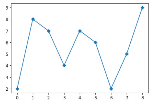
Example 1: Add Square Markers to a Graph Plot in Matplotlib
Python3
import matplotlib.pyplot as plt
plt.plot([ 2 , 8 , 7 , 4 , 7 , 6 , 2 , 5 , 9 ], marker = 'D' )
plt.show()
Output :
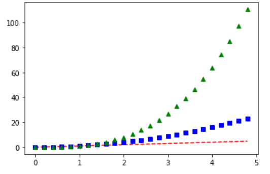
Example 2: Add Triangle Markers to a Graph Plot in Matplotlib
Python3
import matplotlib.pyplot as plt
t = np.arange( 0. , 5. , 0.2 )
plt.plot(t, t, 'r--' , t, t * * 2 , 'bs' , t, t * * 3 , 'g^' )
plt.show()
Output :
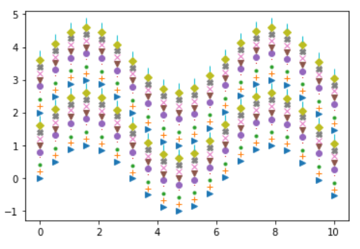
Example 3: Add Circle Markers to a Graph Plot in Matplotlib
Python3
import matplotlib.pyplot as plt
import numpy as np
x_values = np.linspace( 0 , 10 , 20 )
y_values = np.sin(x_values)
markers = [ '>' , '+' , '.' , ',' , 'o' , 'v' , 'x' , 'X' , 'D' , '|' ]
for i in range ( 20 ):
`` plt.plot(x_values, y_values + i * 0.2 , markers[i % 10 ])
plt.show()
Output :
Similar Reads
- How to Change the Line Width of a Graph Plot in Matplotlib with Python? Prerequisite : Matplotlib In this article we will learn how to Change the Line Width of a Graph Plot in Matplotlib with Python. For that one must be familiar with the given concepts: Matplotlib : Matplotlib is a tremendous visualization library in Python for 2D plots of arrays. Matplotlib may be a 2 min read
- How to Add Axes to a Figure in Matplotlib with Python? Matplotlib is a library in Python used to create figures and provide tools for customizing it. It allows plotting different types of data, geometrical figures. In this article, we will see how to add axes to a figure in matplotlib. We can add axes to a figure in matplotlib by passing a list argument 2 min read
- How to Change the Color of a Graph Plot in Matplotlib with Python? Prerequisite: Matplotlib Python offers a wide range of libraries for plotting graphs and Matplotlib is one of them. Matplotlib is simple and easy to use a library that is used to create quality graphs. The pyplot library of matplotlib comprises commands and methods that makes matplotlib work like ma 2 min read
- How to Change the Transparency of a Graph Plot in Matplotlib with Python? Matplotlib is a library in Python and it is numerical — mathematical extension for NumPy library. Pyplot is a state-based interface to a matplotlib module which provides a MATLAB-like interface. There are various plots that can be used in Pyplot are Line Plot, Contour, Histogram, Scatter, 3D Plot, e 3 min read
- How to Change Point to Comma in Matplotlib Graphics in Python We are given a Matplotlib Graph and our task is to change the point to a comma in Matplotlib Graphics such that there is only a comma in the whole graph instead of a point. In this article, we will see how we can change the point to comma in Matplotlib Graphics in Python. Change Point to Comma in Ma 2 min read
- How to plot two dotted lines and set marker using Matplotlib? In this article, we will plot two dotted lines and set markers using various functions of the matplotlib package in the python programming language. We can use the pyplot.plot along with the linestyle parameter function to draw the dotted line. matplotlib.pyplot.plot(array1,array2,linestyle='dotted 2 min read
- How to Draw Shapes in Matplotlib with Python Matplotlib provides a collection of classes and functions that allow you to draw and manipulate various shapes on your plots. Whether you're adding annotations, creating diagrams, or visualizing data, understanding how to use these tools effectively will enhance your ability to create compelling vis 3 min read
- How to Create Subplots in Matplotlib with Python? Matplotlib is a widely used data visualization library in Python that provides powerful tools for creating a variety of plots. One of the most useful features of Matplotlib is its ability to create multiple subplots within a single figure using the plt.subplots() method. This allows users to display 6 min read
- How to add a legend to a scatter plot in Matplotlib ? In this article, we are going to add a legend to the depicted images using matplotlib module. We will use the matplotlib.pyplot.legend() method to describe and label the elements of the graph and distinguishing different plots from the same graph. Syntax: matplotlib.pyplot.legend( ["title_1", "Titl 2 min read
- How To Annotate Bars in Barplot with Matplotlib in Python? Annotation means adding notes to a diagram stating what values do it represents. It often gets tiresome for the user to read the values from the graph when the graph is scaled down or is overly populated. In this article, we will discuss how to annotate the bar plots created in python using matplotl 3 min read