How To Annotate Bars in Barplot with Matplotlib in Python? (original) (raw)
Last Updated : 21 Nov, 2024
**Annotation means adding notes to a diagram stating what values do it represents. It often gets tiresome for the user to read the values from the graph when the graph is scaled down or is overly populated. In this article, we will discuss how to annotate the bar plots created in python using _matplotlib library.
Following are examples of annotated and non-annotated bar plots:
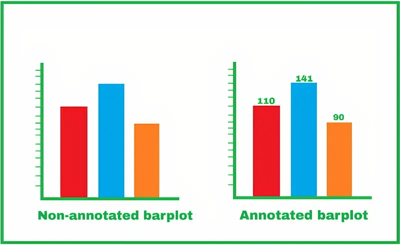
Annotate Bars in Barplot with Matplotlib
**Step-by-step Approach:
- Let’s first plot simple graphs from a Pandas dataframe, so now we have the following dataframe ready: Python `
Importing necessary libraries
import matplotlib.pyplot as plt
Example 1: Barplot for Marks Secured
data = {"Name": ["Alex", "Bob", "Clarein", "Dexter"], "Marks": [45, 23, 78, 65]} names = data["Name"] marks = data["Marks"] df = pd.DataFrame(data) df
`
**Output:
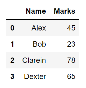
User generated pandas dataframe
- Let’s now start plotting the dataframe using the _seaborn library. We get the following results. But it is not quite visible that what are the actual values in the bar plots. This condition can also arise when the values of neighboring plots are quite close to each other. Python `
plt.figure(figsize=(8, 6)) bars = plt.bar(df['Name'],df['Marks'], color='skyblue')
plt.xlabel("Students", fontsize=14) plt.ylabel("Marks Secured", fontsize=14) plt.title("Marks Secured by Students", fontsize=16) plt.show()
`
**Output:
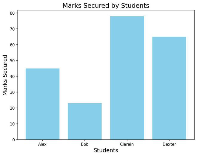
Bar Plot Without Annotations
- Adding the annotations. Our strategy here will be to iterate all over the bars and put a text over all of them that will point out the values of that particular bar. Here we will use the Matlpotlib’s function called **annotate(). We can find various uses of this function in various scenarios, currently, we will be just showing the value of the respective bars at their top.
Our steps will be:
- Iterate over the bars
- Get the x-axis position(x) and the width(w) of the bar this will help us to get the x coordinate of the text i.e. _get_x()+get_width()/2.
- The y-coordinate(y) of the text can be found using the height of the bar i.e. get_height()
- So we have the coordinates of the annotation value i.e. _get_x()+get_width()/2, get_height()
- But this will print the annotation exactly on the boundary of the bar so to get a more pleasing annotated plot we use the parameter _xyplot=(0, 8). Here 8 denotes the pixels that will be left from the top of the bar. Therefore to go below the barline we can use _xy=(0,-8).
- So we execute the following code to get the annotated graph: Python `
for bar in bars: plt.text(bar.get_x() + bar.get_width() / 2, bar.get_height(), f'{bar.get_height():.2f}', ha='center', va='bottom', fontsize=12)
`
**Below is the complete program based on the above approach:
Python `
plt.figure(figsize=(8, 6)) bars = plt.bar(names, marks, color='orange')
Annotating bars
for bar in bars: plt.text(bar.get_x() + bar.get_width() / 2, bar.get_height(), f'{bar.get_height():.2f}', ha='center', va='bottom', fontsize=12)
Adding labels and title
plt.xlabel("Students", fontsize=14) plt.ylabel("Marks Secured", fontsize=14) plt.title("Marks Secured by Students", fontsize=16) plt.show()
`
**Output:
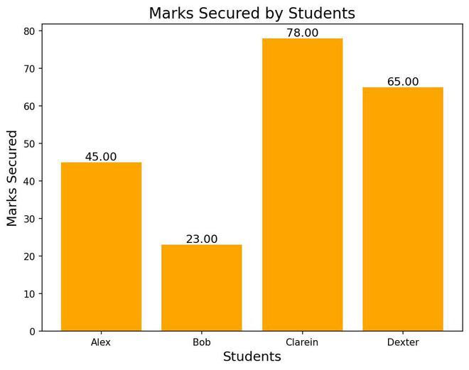
Bar Plot With Annotations
Below are some examples which depict annotate bars in barplot with **matplotlib library**:**
**Example 1:
Python `
Example 2: Barplot for Language Popularity
data = {"Language": ["Python", "C++", "Java"], "Students": [75, 50, 25]} languages = data["Language"] students = data["Students"]
plt.figure(figsize=(6, 5)) bars = plt.bar(languages, students, color='green')
Annotating bars
for bar in bars: plt.text(bar.get_x() + bar.get_width() / 2, bar.get_height(), f'{bar.get_height():.2f}', ha='center', va='bottom', fontsize=12)
Adding labels and title
plt.xlabel("Programming Language", fontsize=14) plt.ylabel("Number of Students", fontsize=14) plt.title("Programming Language Popularity", fontsize=16) plt.show()
`
**Output:

Bar Plot With Annotations Example 1
**Example 2:
Python `
Example 3: Barplot for Sections
data = {"Section": ["A", "B", "C", "D", "E"], "Students": [0, 10, 20, 30, 40]} sections = data["Section"] students = data["Students"]
plt.figure(figsize=(6, 5)) bars = plt.bar(sections, students, color='salmon')
Annotating bars
for bar in bars: plt.text(bar.get_x() + bar.get_width() / 2, bar.get_height(), f'{bar.get_height():.2f}', ha='center', va='bottom', fontsize=12)
Adding labels and title
plt.xlabel("Sections", fontsize=14) plt.ylabel("Number of Students", fontsize=14) plt.title("Students in Different Sections", fontsize=16) plt.show()
`
**Output:
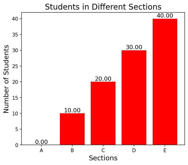
Bar Plot With Annotations Example 2