Create a Responsive Admin Dashboard using HTML CSS and JavaScript (original) (raw)
Last Updated : 21 Apr, 2025
An Admin Panel typically has several sections that enable the **administrator to manage and control various activities on a **website. The layout usually consists of a header and a **sidebarnavigation bar, which allows the admin to easily **navigate between the various sections of the panel. In the header, there will also be a search **button, enabling the **admin to directly search for a module.
Project Preview
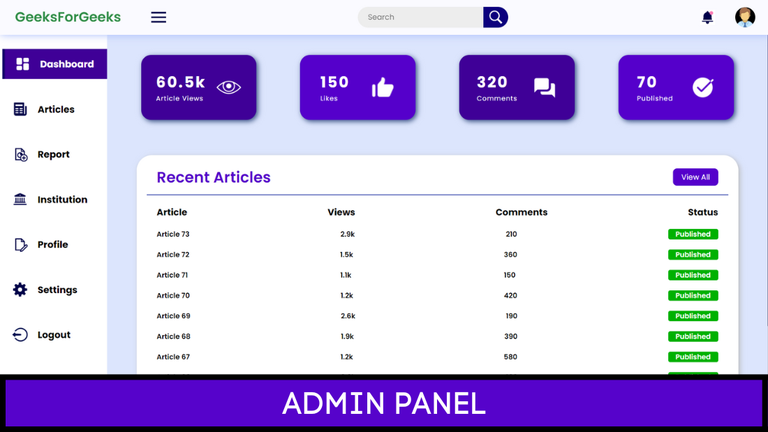
Responsive Admin Dashboard
**Approach to Create a Responsive Admin Dashboard
**1. Set Up the Project Structure: Begin by creating a folder for your project. Inside the folder, create three files:
- **index.html: The file for the HTML structure.
- **style.css: The file for styling the dashboard.
- **index.js: The file for adding interactivity using JavaScript.
**2. Create the Header Section: The header typically contains the logo and essential options like the menu button, admin profile picture, and a search bar.
- Use the tag to create a search bar and apply styling using CSS.
- Use Flexbox for the header to align and space the items properly
**3. Design the Sidebar (Navigation Bar):
- Position the sidebar on the left side of the screen using relative positioning.
- Implement a JavaScript function that will open and close the sidebar when the menu button is clicked. This can be done using the addEventListener() method.
**4. Create the Main Content Area:
- Create a for the main body of the dashboard.
- In the upper section of this div, add four cards that display essential information such as Daily Views, Likes, Comments, and so on.
- Use Flexbox properties to align and justify these cards. Apply flex-wrap: wrap; to ensure that the cards remain responsive and adjust based on the page size.
**5. **Recent Articles Section:
- Below the cards, create a square to display recent article information.
- Apply overflow-x: scroll; to make the horizontal overflow of this section scrollable.
- Use Flexbox to align the content within this section to the right.
**6. Make the Page Responsive:
- To ensure the dashboard is responsive, add media queries at different breakpoints.
- Adjust the styling according to the screen size.
**Example: This example illustrates how to build a create the Responsive Admin Dashboard using Html CSS & Javascript.
HTML `
GeeksForGeeks.png)
.png)
    <div class="message">
        <div class="circle"></div>
        <img src="https://media.geeksforgeeks.org/wp-content/uploads/20221210183322/8.png" class="icn" alt="" />
        <div class="dp">
            <img src="https://media.geeksforgeeks.org/wp-content/uploads/20221210180014/profile-removebg-preview.png"
                class="dpicn" alt="dp" />
        </div>
    </div>
</header>

<div class="main-container">
    <div class="navcontainer">
        <nav class="nav">
            <div class="nav-upper-options">
                <div class="nav-option option1">
                    <img src="https://media.geeksforgeeks.org/wp-content/uploads/20221210182148/Untitled-design-(29).png"
                        class="nav-img" alt="dashboard" />
                    <h3>Dashboard</h3>
                </div>

                <div class="option2 nav-option">
                    <img src="https://media.geeksforgeeks.org/wp-content/uploads/20221210183322/9.png"
                        class="nav-img" alt="articles" />
                    <h3>Articles</h3>
                </div>

                <div class="nav-option option3">
                    <img src="https://media.geeksforgeeks.org/wp-content/uploads/20221210183320/5.png"
                        class="nav-img" alt="report" />
                    <h3>Report</h3>
                </div>

                <div class="nav-option option4">
                    <img src="https://media.geeksforgeeks.org/wp-content/uploads/20221210183321/6.png"
                        class="nav-img" alt="institution" />
                    <h3>Institution</h3>
                </div>

                <div class="nav-option option5">
                    <img src="https://media.geeksforgeeks.org/wp-content/uploads/20221210183323/10.png"
                        class="nav-img" alt="blog" />
                    <h3>Profile</h3>
                </div>

                <div class="nav-option option6">
                    <img src="https://media.geeksforgeeks.org/wp-content/uploads/20221210183320/4.png"
                        class="nav-img" alt="settings" />
                    <h3>Settings</h3>
                </div>

                <div class="nav-option logout">
                    <img src="https://media.geeksforgeeks.org/wp-content/uploads/20221210183321/7.png"
                        class="nav-img" alt="logout" />
                    <h3>Logout</h3>
                </div>
            </div>
        </nav>
    </div>
    <div class="main">
        <div class="searchbar2">
            <input type="text" name="" id="" placeholder="Search" />
            <div class="searchbtn">
                <img src="https://media.geeksforgeeks.org/wp-content/uploads/20221210180758/Untitled-design-(28).png"
                    class="icn srchicn" alt="search-button" />
            </div>
        </div>

        <div class="box-container">
            <div class="box box1">
                <div class="text">
                    <h2 class="topic-heading">60.5k</h2>
                    <h2 class="topic">Article Views</h2>
                </div>

                <img src="https://media.geeksforgeeks.org/wp-content/uploads/20221210184645/Untitled-design-(31).png"
                    alt="Views" />
            </div>

            <div class="box box2">
                <div class="text">
                    <h2 class="topic-heading">150</h2>
                    <h2 class="topic">Likes</h2>
                </div>

                <img src="https://media.geeksforgeeks.org/wp-content/uploads/20221210185030/14.png" alt="likes" />
            </div>

            <div class="box box3">
                <div class="text">
                    <h2 class="topic-heading">320</h2>
                    <h2 class="topic">Comments</h2>
                </div>

                <img src="https://media.geeksforgeeks.org/wp-content/uploads/20221210184645/Untitled-design-(32).png"
                    alt="comments" />
            </div>

            <div class="box box4">
                <div class="text">
                    <h2 class="topic-heading">70</h2>
                    <h2 class="topic">Published</h2>
                </div>

                <img src="https://media.geeksforgeeks.org/wp-content/uploads/20221210185029/13.png"
                    alt="published" />
            </div>
        </div>

        <div class="report-container">
            <div class="report-header">
                <h1 class="recent-Articles">Recent Articles</h1>
                <button class="view">View All</button>
            </div>

            <div class="report-body">
                <div class="report-topic-heading">
                    <h3 class="t-op">Article</h3>
                    <h3 class="t-op">Views</h3>
                    <h3 class="t-op">Comments</h3>
                    <h3 class="t-op">Status</h3>
                </div>

                <div class="items">
                    <div class="item1">
                        <h3 class="t-op-nextlvl">Article 73</h3>
                        <h3 class="t-op-nextlvl">2.9k</h3>
                        <h3 class="t-op-nextlvl">210</h3>
                        <h3 class="t-op-nextlvl label-tag">Published</h3>
                    </div>

                    <div class="item1">
                        <h3 class="t-op-nextlvl">Article 72</h3>
                        <h3 class="t-op-nextlvl">1.5k</h3>
                        <h3 class="t-op-nextlvl">360</h3>
                        <h3 class="t-op-nextlvl label-tag">Published</h3>
                    </div>

                    <div class="item1">
                        <h3 class="t-op-nextlvl">Article 71</h3>
                        <h3 class="t-op-nextlvl">1.1k</h3>
                        <h3 class="t-op-nextlvl">150</h3>
                        <h3 class="t-op-nextlvl label-tag">Published</h3>
                    </div>

                    <div class="item1">
                        <h3 class="t-op-nextlvl">Article 70</h3>
                        <h3 class="t-op-nextlvl">1.2k</h3>
                        <h3 class="t-op-nextlvl">420</h3>
                        <h3 class="t-op-nextlvl label-tag">Published</h3>
                    </div>

                    <div class="item1">
                        <h3 class="t-op-nextlvl">Article 69</h3>
                        <h3 class="t-op-nextlvl">2.6k</h3>
                        <h3 class="t-op-nextlvl">190</h3>
                        <h3 class="t-op-nextlvl label-tag">Published</h3>
                    </div>

                    <div class="item1">
                        <h3 class="t-op-nextlvl">Article 68</h3>
                        <h3 class="t-op-nextlvl">1.9k</h3>
                        <h3 class="t-op-nextlvl">390</h3>
                        <h3 class="t-op-nextlvl label-tag">Published</h3>
                    </div>

                    <div class="item1">
                        <h3 class="t-op-nextlvl">Article 67</h3>
                        <h3 class="t-op-nextlvl">1.2k</h3>
                        <h3 class="t-op-nextlvl">580</h3>
                        <h3 class="t-op-nextlvl label-tag">Published</h3>
                    </div>

                    <div class="item1">
                        <h3 class="t-op-nextlvl">Article 66</h3>
                        <h3 class="t-op-nextlvl">3.6k</h3>
                        <h3 class="t-op-nextlvl">160</h3>
                        <h3 class="t-op-nextlvl label-tag">Published</h3>
                    </div>

                    <div class="item1">
                        <h3 class="t-op-nextlvl">Article 65</h3>
                        <h3 class="t-op-nextlvl">1.3k</h3>
                        <h3 class="t-op-nextlvl">220</h3>
                        <h3 class="t-op-nextlvl label-tag">Published</h3>
                    </div>
                </div>
            </div>
        </div>
    </div>
</div>

<script src="./index.js"></script>
style.css
/style.css/
- { margin: 0; padding: 0; box-sizing: border-box; font-family: "Poppins", sans-serif; }
:root { --background-color1: #fafaff; --background-color2: #ffffff; --background-color3: #ededed; --background-color4: #cad7fda4; --primary-color: #4b49ac; --secondary-color: #0c007d; --Border-color: #3f0097; --one-use-color: #3f0097; --two-use-color: #5500cb; }
body { background-color: var(--background-color4); max-width: 100%; overflow-x: hidden; }
header { height: 70px; width: 100vw; padding: 0 30px; background-color: var(--background-color1); position: fixed; z-index: 100; box-shadow: 1px 1px 15px rgba(161, 182, 253, 0.825); display: flex; justify-content: space-between; align-items: center; }
.logo { font-size: 27px; font-weight: 600; color: rgb(47, 141, 70); }
.icn { height: 30px; }
.menuicn { cursor: pointer; }
.searchbar, .message, .logosec { display: flex; align-items: center; justify-content: center; }
.searchbar2 { display: none; }
.logosec { gap: 60px; }
.searchbar input { width: 250px; height: 42px; border-radius: 50px 0 0 50px; background-color: var(--background-color3); padding: 0 20px; font-size: 15px; outline: none; border: none; }
.searchbtn { width: 50px; height: 42px; display: flex; align-items: center; justify-content: center; border-radius: 0px 50px 50px 0px; background-color: var(--secondary-color); cursor: pointer; }
.message { gap: 40px; position: relative; cursor: pointer; }
.circle { height: 7px; width: 7px; position: absolute; background-color: #fa7bb4; border-radius: 50%; left: 19px; top: 8px; }
.dp { height: 40px; width: 40px; background-color: #626262; border-radius: 50%; display: flex; align-items: center; justify-content: center; overflow: hidden; }
.main-container { display: flex; width: 100vw; position: relative; top: 70px; z-index: 1; }
.dpicn { height: 42px; }
.main { height: calc(100vh - 70px); width: 100%; overflow-y: scroll; overflow-x: hidden; padding: 40px 30px 30px 30px; }
.main::-webkit-scrollbar-thumb { background-image: linear-gradient(to bottom, rgb(0, 0, 85), rgb(0, 0, 50)); }
.main::-webkit-scrollbar { width: 5px; }
.main::-webkit-scrollbar-track { background-color: #9e9e9eb2; }
.box-container { display: flex; justify-content: space-evenly; align-items: center; flex-wrap: wrap; gap: 50px; }
.nav { min-height: 91vh; width: 250px; background-color: var(--background-color2); position: absolute; top: 0px; left: 00; box-shadow: 1px 1px 10px rgba(198, 189, 248, 0.825); display: flex; flex-direction: column; justify-content: space-between; overflow: hidden; padding: 30px 0 20px 10px; }
.navcontainer { height: calc(100vh - 70px); width: 250px; position: relative; overflow-y: scroll; overflow-x: hidden; transition: all 0.5s ease-in-out; }
.navcontainer::-webkit-scrollbar { display: none; }
.navclose { width: 80px; }
.nav-option { width: 250px; height: 60px; display: flex; align-items: center; padding: 0 30px 0 20px; gap: 20px; transition: all 0.1s ease-in-out; }
.nav-option:hover { border-left: 5px solid #a2a2a2; background-color: #dadada; cursor: pointer; }
.nav-img { height: 30px; }
.nav-upper-options { display: flex; flex-direction: column; align-items: center; gap: 30px; }
.option1 { border-left: 5px solid #010058af; background-color: var(--Border-color); color: white; cursor: pointer; }
.option1:hover { border-left: 5px solid #010058af; background-color: var(--Border-color); }
.box { height: 130px; width: 230px; border-radius: 20px; box-shadow: 3px 3px 10px rgba(0, 30, 87, 0.751); padding: 20px; display: flex; align-items: center; justify-content: space-around; cursor: pointer; transition: transform 0.3s ease-in-out; }
.box:hover { transform: scale(1.08); }
.box:nth-child(1) { background-color: var(--one-use-color); }
.box:nth-child(2) { background-color: var(--two-use-color); }
.box:nth-child(3) { background-color: var(--one-use-color); }
.box:nth-child(4) { background-color: var(--two-use-color); }
.box img { height: 50px; }
.box .text { color: white; }
.topic { font-size: 13px; font-weight: 400; letter-spacing: 1px; }
.topic-heading { font-size: 30px; letter-spacing: 3px; }
.report-container { min-height: 300px; max-width: 1200px; margin: 70px auto 0px auto; background-color: #ffffff; border-radius: 30px; box-shadow: 3px 3px 10px rgb(188, 188, 188); padding: 0px 20px 20px 20px; }
.report-header { height: 80px; width: 100%; display: flex; align-items: center; justify-content: space-between; padding: 20px 20px 10px 20px; border-bottom: 2px solid rgba(0, 20, 151, 0.59); }
.recent-Articles { font-size: 30px; font-weight: 600; color: #5500cb; }
.view { height: 35px; width: 90px; border-radius: 8px; background-color: #5500cb; color: white; font-size: 15px; border: none; cursor: pointer; }
.report-body { max-width: 1160px; overflow-x: auto; padding: 20px; }
.report-topic-heading, .item1 { width: 1120px; display: flex; justify-content: space-between; align-items: center; }
.t-op { font-size: 18px; letter-spacing: 0px; }
.items { width: 1120px; margin-top: 15px; }
.item1 { margin-top: 20px; }
.t-op-nextlvl { font-size: 14px; letter-spacing: 0px; font-weight: 600; }
.label-tag { width: 100px; text-align: center; background-color: rgb(0, 177, 0); color: white; border-radius: 4px; }
responsive.css
/* responsive.css*/
@media screen and (max-width: 950px) { .nav-img { height: 25px; }
.nav-option {
    gap: 30px;
}

.nav-option h3 {
    font-size: 15px;
}

.report-topic-heading,
.item1,
.items {
    width: 800px;
}
}
@media screen and (max-width: 850px) { .nav-img { height: 30px; }
.nav-option {
    gap: 30px;
}

.nav-option h3 {
    font-size: 20px;
}

.report-topic-heading,
.item1,
.items {
    width: 700px;
}

.navcontainer {
    width: 100vw;
    position: absolute;
    transition: all 0.6s ease-in-out;
    top: 0;
    left: -100vw;
}

.nav {
    width: 100%;
    position: absolute;
}

.navclose {
    left: 00px;
}

.searchbar {
    display: none;
}

.main {
    padding: 40px 30px 30px 30px;
}

.searchbar2 {
    width: 100%;
    display: flex;
    margin: 0 0 40px 0;
    justify-content: center;
}

.searchbar2 input {
    width: 250px;
    height: 42px;
    border-radius: 50px 0 0 50px;
    background-color: var(--background-color3);
    padding: 0 20px;
    font-size: 15px;
    border: 2px solid var(--secondary-color);
}
}
@media screen and (max-width: 490px) { .message { display: none; }
.logosec {
    width: 100%;
    justify-content: space-between;
}

.logo {
    font-size: 20px;
}

.menuicn {
    height: 25px;
}

.nav-img {
    height: 25px;
}

.nav-option {
    gap: 25px;
}

.nav-option h3 {
    font-size: 12px;
}

.nav-upper-options {
    gap: 15px;
}

.recent-Articles {
    font-size: 20px;
}

.report-topic-heading,
.item1,
.items {
    width: 550px;
}
}
@media screen and (max-width: 400px) { .recent-Articles { font-size: 17px; }
.view {
    width: 60px;
    font-size: 10px;
    height: 27px;
}

.report-header {
    height: 60px;
    padding: 10px 10px 5px 10px;
}

.searchbtn img {
    height: 20px;
}
}
@media screen and (max-width: 320px) { .recent-Articles { font-size: 12px; }
.view {
    width: 50px;
    font-size: 8px;
    height: 27px;
}

.report-header {
    height: 60px;
    padding: 10px 5px 5px 5px;
}

.t-op {
    font-size: 12px;
}

.t-op-nextlvl {
    font-size: 10px;
}

.report-topic-heading,
.item1,
.items {
    width: 300px;
}

.report-body {
    padding: 10px;
}

.label-tag {
    width: 70px;
}

.searchbtn {
    width: 40px;
}

.searchbar2 input {
    width: 180px;
}
}
script.js
//index.js
let menuicn = document.querySelector(".menuicn"); let nav = document.querySelector(".navcontainer");
menuicn.addEventListener("click", () => { nav.classList.toggle("navclose"); })
`
**Output