How to generate a random color for a Matplotlib plot in Python? (original) (raw)
Last Updated : 11 Dec, 2020
Handling huge dataset requires libraries and methods that can be used to store, analyze and manipulate the datasets. Python is a popular choice when it comes to data science and analytics. Data scientists prefer Python due to its wide library support that contains functions which can be used to work with datasets to create graphs and charts. Matplotlib is a data visualization library in Python. Matplotlib works similar to Matlab and produces interactive charts and graphs. Matplotlib offers variety of chart types to choose from. The chart properties can be set explicitly using the inbuilt methods and attributes. To generate random colors for a Matplotlib plot in Python the matplotlib.pyplot and random libraries of Python are used. Following is an example to generate random colors for a Matplotlib plot :
First Approach
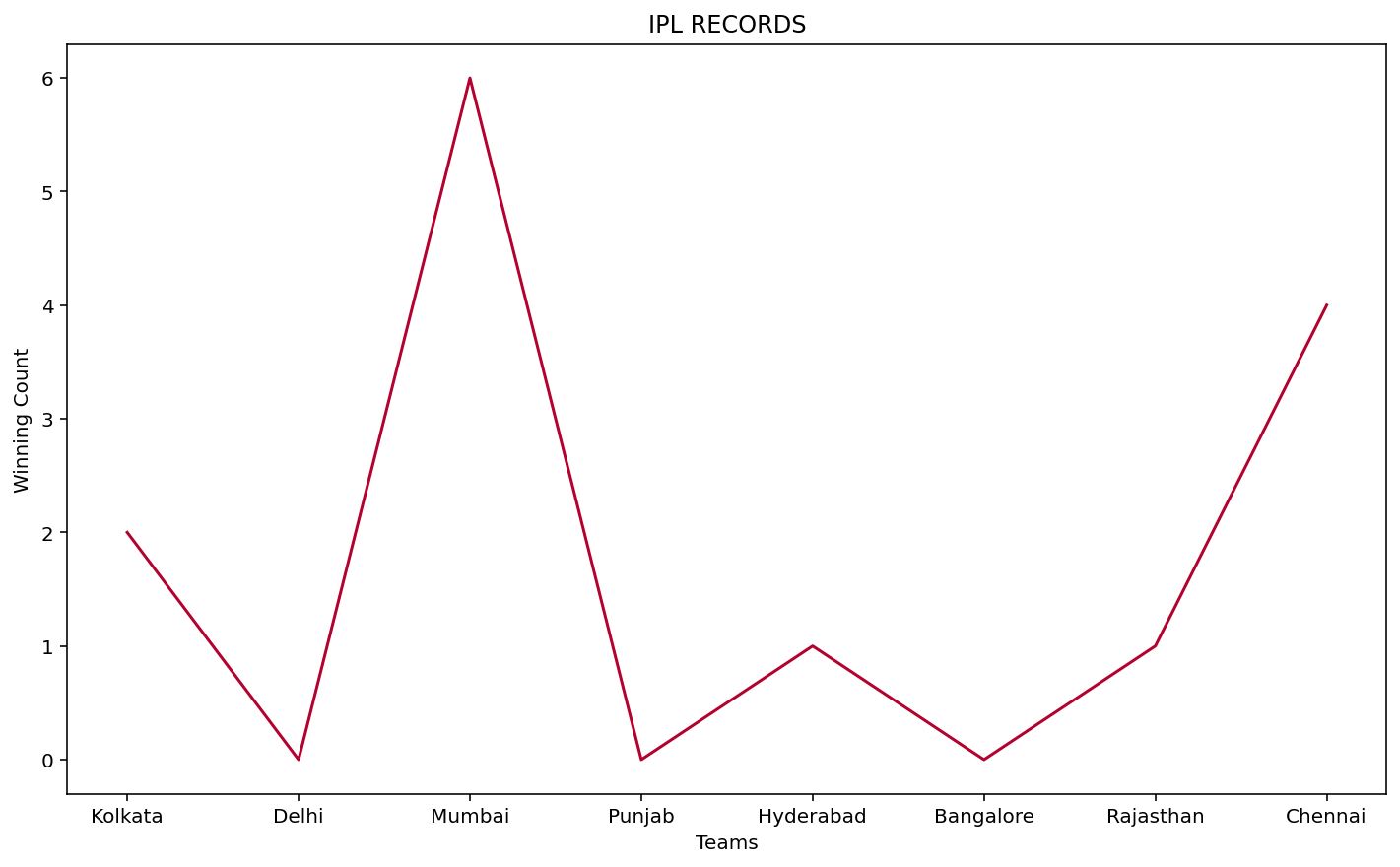
- A dataset is created with a teams array and wincount array.
- The teams array is plotted against the X axis and wincount array is plotted against the Y axis. Matplotlib supports RGB or RGBA with float values in the range 0-1.
- Now RGB or RGBA values that range between 0-1 determine the color for the chart.
- In this example, in-order to create random values ranging between 0 and 1. The red ‘r’, green ‘g’ and blue ‘b’ values obtained are then passed into a tuple color which forms the final color.
- This tuple is next assigned to the color attribute of plot() method.
- The X and Y axis are labeled and a title is provided to the chart using the xlabel() , ylabel() and title() method of matplotlib.pyplot library.
Code Implementation:
Python3
import random as random
import matplotlib.pyplot as plt
teams = [ 'Kolkata' , 'Delhi' , 'Mumbai' , 'Punjab' ,
`` 'Hyderabad' , 'Bangalore' , 'Rajasthan' , 'Chennai' ]
wincount = [ 2 , 0 , 6 , 0 , 1 , 0 , 1 , 4 ]
r = random.random()
b = random.random()
g = random.random()
color = (r, g, b)
plt.xlabel( "Teams" )
plt.ylabel( "Winning Count" )
plt.title( "IPL RECORDS" )
plt.plot(teams, wincount, c = color)
Output:
Second Approach
- In the second approach, a bar chart is demonstrated. An empty list is declared to hold the color tuples.
- The X and Y axis are labeled and a title is set for the chart.
- To append different colors for n records a for loop is executed.
- The random.choice() method of numpy library is used to create tuples of size 3 with values between 0 and 1.
- The teams and wincount array are plotted against the X and Y axis.
- The color attribute of bar() method of matplotlib.pyplot is assigned the list of tuples. Random tuples are chosen from the list for each bar.
Code Implementation
Python3
import random as random
import matplotlib.pyplot as plt
import numpy as np
l = []
teams = [ 'Kolkata' , 'Delhi' , 'Mumbai' , 'Punjab' ,
`` 'Hyderabad' , 'Bangalore' , 'Rajasthan' , 'Chennai' ]
wincount = [ 2 , 0 , 6 , 0 , 1 , 0 , 1 , 4 ]
plt.xlabel( "Teams" )
plt.ylabel( "Winning Count" )
plt.title( "IPL RECORDS" )
for i in range ( 0 , len (teams) + 1 ):
`` l.append( tuple (np.random.choice( range ( 0 , 2 ), size = 3 )))
plt.bar(teams, wincount, color = l)
Output:
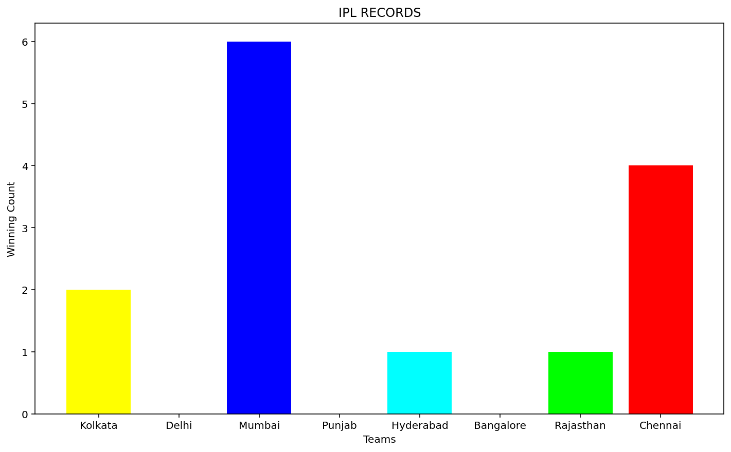
However the disadvantage of using random colors is in case white is chosen, the particular bar or line becomes invisible.
Similar Reads
- How to Change the Color of a Graph Plot in Matplotlib with Python? Prerequisite: Matplotlib Python offers a wide range of libraries for plotting graphs and Matplotlib is one of them. Matplotlib is simple and easy to use a library that is used to create quality graphs. The pyplot library of matplotlib comprises commands and methods that makes matplotlib work like ma 2 min read
- How to create a Scatter Plot with several colors in Matplotlib? Matplotlib is a plotting library for creating static, animated, and interactive visualizations in Python. Matplotlib can be used in Python scripts, the Python and IPython shell, web application servers, and various graphical user interface toolkits like Tkinter, awxPython, etc. In this article, we w 3 min read
- How to create a matrix of random integers in Python ? Prerequisites: numpy To create a matrix of random integers in Python, randint() function of the numpy module is used. This function is used for random sampling i.e. all the numbers generated will be at random and cannot be predicted at hand. Syntax : Â numpy.random.randint(low, high=None, size=None, 2 min read
- How to Add Markers to a Graph Plot in Matplotlib with Python? In this article, we will learn how to add markers to a Graph Plot in Matplotlib with Python. For that just see some concepts that we will use in our work. Graph Plot: A plot is a graphical technique for representing a data set, usually as a graph showing the relationship between two or more variable 2 min read
- How to Have One Colorbar for All Subplots in Matplotlib Creating visualizations with multiple subplots is a common task in data analysis and scientific research. However, when dealing with multiple subplots, managing colorbars can become a challenge. This article will guide you through the process of adding a single colorbar for all subplots in Matplotli 4 min read
- How to generate a random number between 0 and 1 in Python ? The use of randomness is an important part of the configuration and evaluation of modern algorithms. Here, we will see the various approaches for generating random numbers between 0 ans 1. Method 1: Here, we will use uniform() method which returns the random number between the two specified numbers 1 min read
- How to reverse a Colormap using Matplotlib in Python? Prerequisites: Matplotlib Matplotlib has many built-in Colormaps. Colormaps are nothing but the dictionary which maps the integer data/numbers into colors. Colormaps are used to differentiate or distinguish the data in a particular plot. The reason to use the colormaps is that it is easier for human 6 min read
- Matplotlib.pyplot.colorbar() function in Python The matplotlib.pyplot.colorbar() function in Python adds a color scale (color bar) to a plot, helping to interpret the relationship between data values and colors in colormapped plots like imshow(), scatter() or contourf(). Let us see an example to understand this better: [GFGTABS] Python import num 4 min read
- Matplotlib.colors.to_rgba() in Python Matplotlib is an amazing visualization library in Python for 2D plots of arrays. Matplotlib is a multi-platform data visualization library built on NumPy arrays and designed to work with the broader SciPy stack. matplotlib.colors.to_rgba() The matplotlib.colors.to_rgba() function is used convert c( 3 min read
- Matplotlib.colors.rgb_to_hsv() in Python Matplotlib is an amazing visualization library in Python for 2D plots of arrays. Matplotlib is a multi-platform data visualization library built on NumPy arrays and designed to work with the broader SciPy stack. matplotlib.colors.rgb_to_hsv() The matplotlib.colors.rgb_to_hsv() function belongs to th 2 min read