How to plot two histograms together in Matplotlib? (original) (raw)
Last Updated : 12 Sep, 2022
Creating the histogram provides the visual representation of data distribution. By using a histogram we can represent a large amount of data and its frequency as one continuous plot.
How to plot a histogram using Matplotlib
For creating the Histogram in Matplotlib we use hist() function which belongs to pyplot module. For plotting two histograms together, we have to use hist() function separately with two datasets by giving some settings.
Syntax of matplotlib.pyplot.hist
matplotlib.pyplot.hist(x, bins, edgecolor color, label)
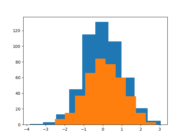
Example 1:
Here, we are simply taking two series using the Numpy random and passing both series to the hist()function, and we’re using the same plot to plot two histograms together.
Python3
import matplotlib.pyplot as plt
import numpy as np
series1 = np.random.randn( 500 , 1 )
series2 = np.random.randn( 400 , 1 )
plt.hist(series1)
plt.hist(series2)
plt.show()
Output:
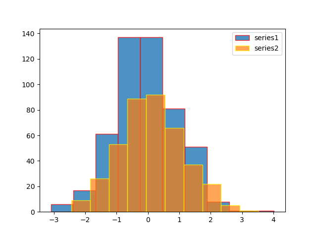
Example 2:
Here, we are using label, edgecolor, and opacity.
Python3
import matplotlib.pyplot as plt
import numpy as np
from numpy.lib.histograms import histogram
series1 = np.random.randn( 500 , 1 )
series2 = np.random.randn( 400 , 1 )
plt.hist(series1, label = 'series1' , alpha = . 8 , edgecolor = 'red' )
plt.hist(series2, label = 'series2' , alpha = 0.7 , edgecolor = 'yellow' )
plt.legend()
plt.show()
Output:
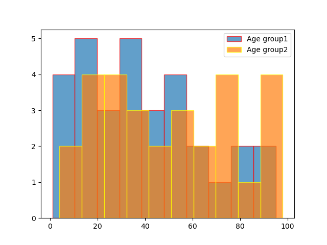
Example 3:
Histograms represent two age groups using given data.
Python3
import matplotlib.pyplot as plt
age_g1 = [ 1 , 3 , 5 , 10 , 15 , 17 , 18 , 16 , 19 ,
`` 21 , 23 , 28 , 30 , 31 , 33 , 38 , 32 ,
`` 40 , 45 , 43 , 49 , 55 , 53 , 63 , 66 ,
`` 85 , 80 , 57 , 75 , 93 , 95 ]
age_g2 = [ 6 , 4 , 15 , 17 , 19 , 21 , 28 , 23 , 31 ,
`` 36 , 39 , 32 , 50 , 56 , 59 , 74 , 79 , 34 ,
`` 98 , 97 , 95 , 67 , 69 , 92 , 45 , 55 , 77 ,
`` 76 , 85 ]
plt.hist(age_g1, label = 'Age group1' , bins = 14 , alpha = . 7 , edgecolor = 'red' )
plt.hist(age_g2, label = "Age group2" , bins = 14 , alpha = . 7 , edgecolor = 'yellow' )
plt.legend()
plt.show()
Output:
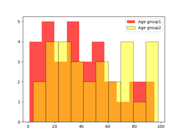
Example 4:
Changing bar color from the default
Python3
import matplotlib.pyplot as plt
age_g1 = [ 1 , 3 , 5 , 10 , 15 , 17 , 18 , 16 , 19 , 21 ,
`` 23 , 28 , 30 , 31 , 33 , 38 , 32 , 40 , 45 ,
`` 43 , 49 , 55 , 53 , 63 , 66 , 85 , 80 , 57 ,
`` 75 , 93 , 95 ]
age_g2 = [ 6 , 4 , 15 , 17 , 19 , 21 , 28 , 23 , 31 , 36 ,
`` 39 , 32 , 50 , 56 , 59 , 74 , 79 , 34 , 98 , 97 ,
`` 95 , 67 , 69 , 92 , 45 , 55 , 77 , 76 , 85 ]
plt.hist(age_g1, label = 'Age group1' , alpha = . 7 , color = 'red' )
plt.hist(age_g2, label = "Age group2" , alpha = . 5 ,
`` edgecolor = 'black' , color = 'yellow' )
plt.legend()
plt.show()
Output: