HTML <input type="checkbox"> (original) (raw)
Last Updated : 20 May, 2024
The HTML creates a checkbox input element. It displays as a square box, checked when activated. Checkboxes enable users to select one or more options from a limited set of choices.
**Syntax
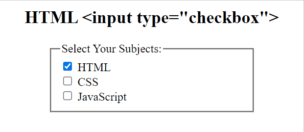
**Example: In this example, we will demonstrate using the HTML element.
html `
HTML Input Type Checkbox<style>
h2 {
text-align: center;
}
fieldset {
width: 250px;
margin: auto;
}
</style>
HTML
<form action="#">
<fieldset>
<legend>Select Your Subjects:</legend>
<input type="checkbox"
name="check"
id="checkbox1"
value="html" checked>
<label for="checkbox1">HTML</label>
<br>
<input type="checkbox"
name="check"
id="checkbox2"
value="css">
<label for="checkbox2">CSS</label>
<br>
<input type="checkbox"
name="check"
id="checkbox3"
value="javascript">
<label for="checkbox3">JavaScript</label>
</fieldset>
</form>
`
**Output
**Supported Browsers
Similar Reads
- HTML The HTML element creates a clickable button that can be customized with text or an image. It does not have any default behavior but can be used to perform actions using JavaScript. It makes versatile for various interactive purposes in web forms and applications. Syntax 1 min read
- HTML The HTML creates a checkbox input element. It displays as a square box, checked when activated. Checkboxes enable users to select one or more options from a limited set of choices. Syntax Example: In this example, we will demonstrate using 1 min read
- HTML The HTML element is used to define a color picker. The value should be a seven-character hexadecimal notation representing RGB values in hexadecimal format. Its default value is #000000 (black). Syntax Example: In this example, we will demonstrate 1 min read
- HTML The HTML element provides a date picker interface for selecting dates. It allows users to input dates using a calendar widget, ensuring standardized date input across different browsers and devices. SyntaxExample: In this example, the HTML <inpu 1 min read
- HTML The HTML is used to create an input field specifically for email addresses. It automatically validates the input to ensure it follows the correct email format. Adding the "multiple" attribute allows the user to input multiple email addresses, separated by commas.Syntax< 1 min read
- HTML The HTML element is used to create a file input box in forms. It allows users to browse and select files to upload from the devices. When the form is submitted, the selected file(s) can be uploaded to the server. Syntax Example: In this example, we 1 min read
- HTML The HTML element defines a hidden input field. Hidden fields store data that are not visible or modifiable by users when they submit a form. They are useful for including data that needs to be sent with the form but does not need to be displayed. Syntax<input type="hid 1 min read
- HTML The HTML element defines an image as a submit button within a form. When the image is clicked, the form is submitted, similar to a regular submit button. It allows for more visually appealing form submissions, as the image can serve as the button instead of a plain text or 2 min read
- HTML The HTML element creates a month picker, allowing users to select a specific month and year without specifying a day. It provides a standardized way to input month-based data to enhance user experience. Syntax Example: This example demonstrate the 1 min read
- HTML The HTML element creates an input field for entering numeric values. It allows for easy input of numbers with optional restrictions such as minimum, maximum, and step values. This element enhances form validation by ensuring only numeric input is accepted, improving user 1 min read