AutoCorrelation (original) (raw)
Last Updated : 14 Mar, 2026
Autocorrelation is a key concept in time series analysis that measures the relationship between a variable and its lagged values. It is widely used in finance, economics, weather forecasting and many other fields to identify trends, seasonality, and temporal dependencies in sequential data.
Understanding Autocorrelation in Time Series
Autocorrelation, measures how a time series X_{t} relates to its past values X_{t-k} where k is the lag. Unlike correlation between two different variables, autocorrelation examines the internal structure of a single series.
\rho(k) = \frac{\text{Cov}(X_t, X_{t-k})}{\sigma(X_t) \sigma(X_{t-k})}
where
- X_{t}: Value at time t
- X_{t-k}: Value at time t-k
- k: Time lag between observations
- \text{Cov}: Covariance between current and lagged values
- \sigma: Standard deviation of the respective values
value of \rho(k) lies between -1 and 1
Autocorrelation values near zero suggest little or no linear dependence between current and past observations. Autocorrelation can be computed at different lags to analyze short-term dependencies as well as long-term patterns, making it important for time series analysis and forecasting.
Use Case
Autocorrelation measures the relationship between current and past values in a time series and is widely used in trading to analyze market behavior.
- **Pattern Identification: Helps detect repeating trends or reversals by comparing present prices with past price movements.
- **Predicting Future Price Changes: Past autocorrelation patterns provide clues about whether prices are likely to continue a trend or reverse.
- **Smart Strategy Development: Enables traders to choose trend-following strategies during high autocorrelation and mean-reversion strategies during low or negative autocorrelation periods.
- **Risk Management: Assists in evaluating market volatility and stability, helping traders manage risk through informed stop-loss and position-sizing decisions.
- **Regression Analysis: Detects serial correlation in residuals, which violates linear regression assumptions.
Types of Autocorrelation
- Positive autocorrelation (\rho(k)=1) indicates persistence where high values are likely to be followed by high values and low values by low values.
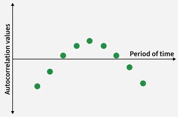
Positive Autocorrelation
- Negative autocorrelation (\rho(k)=-1) indicates reversal, meaning an increase is likely to be followed by a decrease and vice versa.
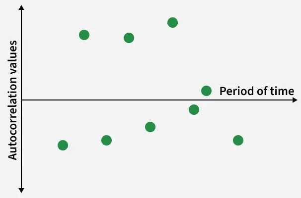
Negative Autocorrelation
- At (\rho(k)=0) no linear correlation
How to Compute Autocorrelation
Autocorrelation measures the relationship between a time series and its lagged values. Below are the step-by-step instructions to compute autocorrelation
1. Preprocess the Data
Ensure the time-series data is properly ordered, cleaned, and free from missing or irrelevant values to avoid incorrect correlation results.
2. Calculate the Mean
Compute the mean of the time series, which serves as a reference for measuring deviations in data points.
\text{Mean} = \frac{1}{n} \sum_{t=1}^{n} X(t)
3. Calculate the Variance
Calculate the variance of the time series to normalize the autocorrelation values.
\text{Variance} = \frac{1}{n} \sum_{t=1}^{n} (X(t) - \text{Mean})^2
4. Compute the Autocovariance
For a given lag k compute the autocovariance between the original series and its lagged version.
\text{Autocovariance}(k) = \frac{1}{n} \sum_{t=k+1}^{n} (X(t) - \text{Mean})(X(t - k) - \text{Mean})
5. Compute the Autocorrelation Coefficient
Normalize the autocovariance by dividing it by the variance to obtain the autocorrelation coefficient.
\text{Autocorrelation}(k) = \frac{\text{Autocovariance}(k)}{\text{Variance}}
6. Repeat for Different Lag Values
Compute autocorrelation coefficients for multiple lag values to analyze how dependency changes over time.
7. Visualize the Autocorrelation
Plot autocorrelation coefficients against their corresponding lags to obtain the Autocorrelation Function (ACF) plot which helps in identifying trends, seasonality and randomness in the data.
Detecting Autocorrelation Using the Durbin–Watson Test
The Durbin–Watson (DW) Test is a statistical test used to detect autocorrelation (serial correlation) in the residuals of a regression model. Autocorrelation occurs when the errors are related to their past values, which violates the assumptions of linear regression.
The DW statistic always lies between 0 and 4
d = \frac{\sum_{t=2}^{n}(e_t - e_{t-1})^2}{\sum_{t=1}^{n} e_t^2}
where
- e_t: residual at time t
- n: number of observations
Analysis of DW Test Results
- d \approx 2: No autocorrelation
- d < 2: Positive autocorrelation
- d > 2: Negative autocorrelation
Implementation
Step 1: Import Required Libraries
- Import Pandas for data loading and manipulation.
- Use Matplotlib for visualizing time-series trends.
- Import ACF and PACF plotting utilities from statsmodels. Python `
import pandas as pd import matplotlib.pyplot as plt from statsmodels.graphics.tsaplots import plot_acf, plot_pacf
`
Step 2: Load the Training and Testing Datasets
- Read the CSV files containing daily climate data.
- Separate datasets are used for training and testing analysis.
You can download Dataset from here
Python `
train_data = pd.read_csv("/content/DailyDelhiClimateTrain.csv") test_data = pd.read_csv("/content/DailyDelhiClimateTest.csv")
`
Step 3: Convert Date Column to DateTime and Set Index
- Convert the date column to datetime format.
- Set the date as the index to enable time-series operations.
- This is essential for rolling calculations and plots.
- Apply the transformation to both datasets. Python `
for df in [train_data, test_data]: df["date"] = pd.to_datetime(df["date"]) df.set_index("date", inplace=True)
`
Step 4: Select Target Variable for Analysis
- Choose mean temperature as the primary variable.
- Store it in a new column named value.
- Apply the same transformation to both datasets Python `
train_data["value"] = train_data["meantemp"] test_data["value"] = test_data["meantemp"]
`
Step 5: Create Lag Features
- Generate lagged values to analyze temporal dependency.
- Lag-1 captures short-term dependency.
- Lag-7 captures weekly seasonal behavior. Python `
train_data["lag_1"] = train_data["value"].shift(1) train_data["lag_7"] = train_data["value"].shift(7)
`
Step 6: Compute Rolling Autocorrelation
- Calculate autocorrelation over a rolling window of 30 days.
- Rolling autocorrelation shows how dependency changes over time. Python `
train_data["rolling_autocorr"] = ( train_data["value"] .rolling(window=30) .apply(lambda x: x.autocorr()) )
`
Step 7: Visualize Train vs Test Time Series
- Plot training and testing temperature values together.
- Helps identify seasonal trends and distribution shift. Python `
plt.figure(figsize=(10, 5)) plt.plot(train_data.index, train_data["value"], label="Train Data", color="steelblue") plt.plot(test_data.index, test_data["value"], label="Test Data", color="orange") plt.title("Daily Mean Temperature (Train vs Test)") plt.xlabel("Date") plt.ylabel("Temperature") plt.legend() plt.grid(True) plt.show()
`
**Output:
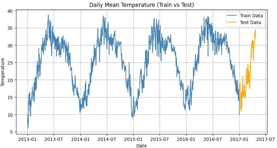
Daily Mean Temperature: Train vs Test
The graph compares daily mean temperatures for the training and testing datasets showing a clear seasonal pattern with repeating yearly peaks and troughs.
The test data (orange) follows the same trend as the train data (blue), indicating consistent temperature behavior over time.
Step 8: Plot Rolling Autocorrelation
- Visualize how autocorrelation varies across time.
- Zero line helps distinguish positive and negative correlation. Python `
plt.figure(figsize=(10, 4)) plt.plot(train_data.index, train_data["rolling_autocorr"], color="darkgreen") plt.axhline(0, linestyle="--", color="gray") plt.title("Rolling Autocorrelation (30-Day Window)") plt.xlabel("Date") plt.ylabel("Autocorrelation") plt.grid(True) plt.show()
`
**Output:
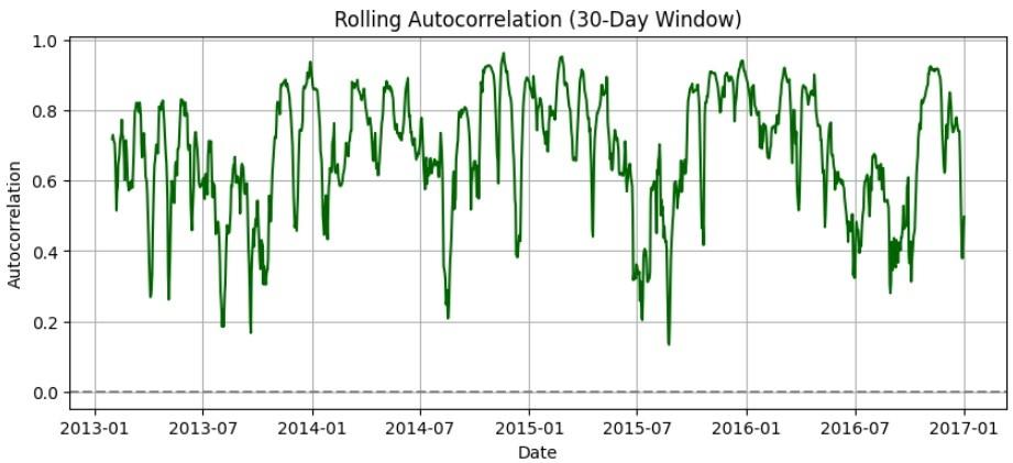
Rolling Autocorrelation
The graph shows 30-day rolling autocorrelation of daily mean temperature, indicating strong positive temporal dependence over most periods
Step 9: Plot Autocorrelation Function (ACF)
- ACF shows correlation with multiple lag values.
- Helps identify trend persistence and seasonality. Python `
fig, ax = plt.subplots(figsize=(8, 4)) plot_acf(train_data["value"].dropna(), lags=30, ax=ax) ax.set_title("Autocorrelation Function (ACF) – Training Data") plt.show()
`
**Output:
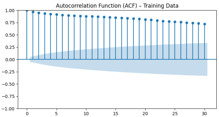
Autocorrelation Function
The ACF plot shows strong positive autocorrelation across multiple lags, indicating that daily mean temperatures are highly dependent on past values.
Step 10: Plot Partial Autocorrelation Function (PACF)
- PACF shows direct correlation excluding intermediate lags.
- Helps determine the order of autoregressive models.
- Yule-Walker method ensures stable estimation.
Partial Autocorrelation measures the direct relationship between a time-series variable and its lagged values after removing the effect of intermediate lags. It helps identify the order of autoregressive (AR) models by showing significant direct dependencies.
Python `
fig, ax = plt.subplots(figsize=(8, 4)) plot_pacf(train_data["value"].dropna(), lags=30, ax=ax, method="ywm") ax.set_title("Partial Autocorrelation Function (PACF) – Training Data") plt.show()
`
**Output:
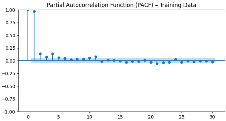
Partial Autocorrelation Function
The PACF plot shows a strong spike at lag 1 followed by insignificant values, indicating that the series is mainly influenced by its immediate past value.
You can download full code from here
Difference Between Autocorrelation and Multicollinearity
Both autocorrelation and multicollinearity deal with correlation but they occur in different contexts and affect models in different ways
| Feature | Autocorrelation | Multicollinearity |
|---|---|---|
| Definition | Correlation between a variable and its own lagged values over time | Correlation among two or more independent variables in a model |
| Focus | Temporal relationship within a single variable | Relationship among multiple predictor variables |
| Primary Use | Identifying patterns, trends and seasonality in time-series data | Detecting redundancy and dependency among independent variables |
| Nature of Correlation | Measures dependence between current and past values | Measures interdependence between different explanatory variables |
| Impact on Model | Can cause biased or inefficient estimates | Leads to inflated standard errors |
| Where It Occurs | Common in time-series and sequential data | Common in regression and machine learning models |
Advantages
- **Trend Identification: Helps detect trends and repeating patterns; positive autocorrelation indicates trend persistence.
- **Predictive Insight: Reveals relationships between past and future values, supporting short-term forecasting.
- **Market Regime Detection: Distinguishes between trending and mean-reverting market conditions.
- **Strategy Development: Assists in refining entry exit rules and improving trading strategies.
Limitations
- **False Signals: Noisy or random data may produce misleading correlations.
- **Lag Selection Issue: Choosing an inappropriate lag length can distort analysis.
- **Overfitting Risk: Examining many lags may fit historical data but perform poorly on new data.
- **No Causality: Measures correlation only and does not explain underlying causes.
- **Ignores Fundamentals: Relies on price data alone, overlooking economic or fundamental factors.