Relational plots in Seaborn Part I (original) (raw)
Last Updated : 21 Jul, 2021
Relational plots are used for visualizing the statistical relationship between the data points. Visualization is necessary because it allows the human to see trends and patterns in the data. The process of understanding how the variables in the dataset relate each other and their relationships are termed as Statistical analysis.
Seaborn, unlike to matplotlib, also provides some default datasets. In this article, we will be using a default dataset named 'tips'. This dataset gives information about people who had food at some restaurant and whether they left tip for waiters or not, their gender and whether they do smoke or not, and more.
Let us have a look to the dataset.
python3 `
importing the library
import seaborn as sns
reading the dataset
data = sns.load_dataset('tips')
printing first five entries
print(data.head())
`
Output :
total_bill tip sex smoker day time size 0 16.99 1.01 Female No Sun Dinner 2 1 10.34 1.66 Male No Sun Dinner 3 2 21.01 3.50 Male No Sun Dinner 3 3 23.68 3.31 Male No Sun Dinner 2 4 24.59 3.61 Female No Sun Dinner 4
To draw the relational plots seaborn provides three functions. These are:
- relplot()
- scatterplot()
- lineplot()
Seaborn.relplot()
This function provides us the access to some other different axes-level functions which shows the relationships between two variables with semantic mappings of subsets.
Syntax :
seaborn.relplot(x=None, y=None, data=None, **kwargs)
Parameters :
| Parameter | Value | Use |
|---|---|---|
| x, y | numeric | Input data variables |
| Data | Dataframe | Dataset that is being used. |
| hue, size, style | name in data; optional | Grouping variable that will produce elements with different colors. |
| kind | scatter or line; default : scatter | defines the type of plot, either scatterplot() or lineplot() |
| row, col | names of variables in data; optional | Categorical variables that will determine the faceting of the grid. |
| col_wrap | int; optional | “Wrap” the column variable at this width, so that the column facets span multiple rows. |
| row_order, col_order | lists of strings; optional | Order to organize the rows and columns of the grid. |
| palette | name, list, or dict; optional | Colors to use for the different levels of the hue variable. |
| hue_order | list; optional | Specified order for the appearance of the hue variable levels. |
| hue_norm | tuple or Normalize object; optional | Normalization in data units for colormap applied to the hue variable when it is numeric. |
| sizes | list, dict, or tuple; optional | determines the size of each point in the plot. |
| size_order | list; optional | Specified order for appearance of the size variable levels |
| size_norm | tuple or Normalize object; optional | Normalization in data units for scaling plot objects when the size variable is numeric. |
| legend | “brief”, “full”, or False; optional | If “brief”, numeric hue and size variables will be represented with a sample of evenly spaced values. If “full”, every group will get an entry in the legend. If False, no legend data is added and no legend is drawn. |
| height | scalar; optional | Height (in inches) of each facet. |
| Aspect | scalar; optional | Aspect ratio of each facet, i.e. width/height |
| facet_kws | dict; optional | Dictionary of other keyword arguments to pass to FacetGrid. |
| kwargs | key, value pairings | Other keyword arguments are passed through to the underlying plotting function. |
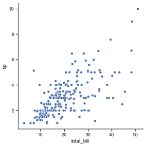
Example 1: Visualizing the most basic plot to show all the data points in tips dataset.
Python3 `
importing the library
import seaborn as sns
selecting style
sns.set(style ="ticks")
reading the dataset
tips = sns.load_dataset('tips')
plotting a simple visualization of data points
sns.relplot(x ="total_bill", y ="tip", data = tips)
`
Output :
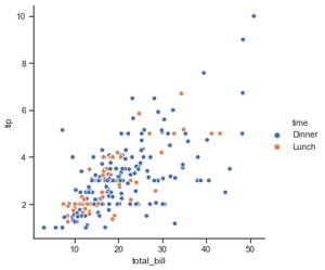
Example 2: Grouping data points on the basis of category, here as time.
Python3 `
importing the library
import seaborn as sns
selecting style
sns.set(style ="ticks")
reading the dataset
tips = sns.load_dataset('tips')
sns.relplot(x="total_bill", y="tip", hue="time", data=tips)
`
Output :
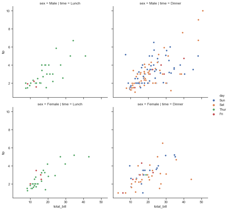
Example 3: usingtime and sex for determining the facet of the grid.
Python3 `
importing the library
import seaborn as sns
selecting style
sns.set(style ="ticks")
reading the dataset
tips = sns.load_dataset('tips')
sns.relplot(x="total_bill", y="tip", hue="day", col="time", row="sex", data=tips)
`
Output :
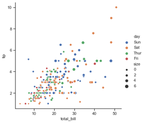
Example 4: using size attribute, we can see data points having different size.
Python3 `
importing the library
import seaborn as sns
selecting style
sns.set(style ="ticks")
reading the dataset
tips = sns.load_dataset('tips')
sns.relplot(x="total_bill", y="tip", hue="day", size="size", data=tips)
`
Output :