Circle Graph : Definition, Types and Examples (original) (raw)
Last Updated : 23 Jul, 2025
Circle graphs, also known as pie charts, are a visual way to display data using a circle divided into slices. Each slice represents a category's proportion or percentage of the whole. This makes it easy to compare different parts within datasets. Circle graphs are commonly used to display categorical data clearly and quickly.

Circle Graph
The whole circle graph measures equal to 360 degrees, which is further broken into smaller parts from the center with certain angles.
Circle Graph Example
In a school with 300 students, a survey was done to collect data on each student's favorite sports. The results were represented using a circle graph(pie chart). Each sport's share was calculated as a percentage of the total and converted into the angle out of 360 degrees to show the proportional size of each slice in the pie chart. This helps visualize the popularity of different sports.
The pie chart of the data is given below:

Circle Graph Example
Circle Graph Formula
A Circle graph is used in presentations to show visual data of the fractional or proportional part of the whole sum of information. To get a precise circle graph or pie chart circle graph formula is used.
The formula is given below:
- **Percentage = Amount of category/ Total × 100
- **Angle = Amount of category/total × 360°
Steps to Make a Circle Graph
Let's see the steps to create a circle graph using an example:
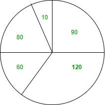
**Example: Given below is the data for different fruits and their quantities:
- **Apple -9
- **Banana - 12
- **Orange - 6
- **Strawberry - 8
- **Coconut - 1
**Step 1- Understand the Data- You have the quantities of different fruits, as shown above.
**Step 2- Calculate the Total Quantity.
- Total Quantity = 9 + 12 + 6 + 8 + 1 = 36
**Step 3- Calculate the angle for each Slice
The total angle in the circle is 360°. Calculate each fruit's slice angle:
Angle = (Quantity/ Total Qunatity) X 360°
| Fruit | Calculation | Angle (degrees) |
|---|---|---|
| Apple | (9/36) X 360 | 90° |
| Banana | (12/36) X 360 | 120° |
| Orange | (6/36) X 360 | 60° |
| Strawberry | ( 8/36) X 360 | 80° |
| Cocount | ( 1/36) X 360 | 10° |
**Step 4- Draw a circle, use a protractor to mark each fruit's angle slice, draw the slice lines from the center, then add lines connecting each slice to its label placed outside the circle.
Types of Circle Graphs
Circle graphs, also known as pie charts, are a common visual representation used to display the proportions of different categories within a whole. Several types of circle graphs can be used to convey information effectively:
- **Standard Pie Chart
A standard pie chart divides a circle into slices where each slice shows a category's share of the total.
- **Exploded Pie Chart
An exploded pie chart separates one or more slices from the rest of the pie. This can emphasize specific segments of the data.
- **Doughnut Chart
A doughnut chart is similar to a pie chart but with a hole in the center. This can make it easier to compare multiple datasets or highlight the overall total more clearly.
- **3D Pie Chart
A 3D pie chart adds a three-dimensional look for visual appeal, though it may distort the true proportions.
- **Nested Pie Chart (Multi-level Pie Chart)
Nested pie charts, or multi-level pie charts, display hierarchical relationships within the data. Each level represents a deeper layer of the hierarchy.
- **Polar Area Diagram (Rose Chart)
A polar area diagram, or rose chart, uses equal angles for each sector but varies the radius to represent values, combining elements of a pie chart and polar plots.
**Read More,
Solved Examples of Circle Graph
**Example 1: Prepare a circle graph for the personal expenses listed below.
- Food 37%
- Rent 16%
- Clothing 11%
- Education 20%
- Medicine 12%
- Other expenses 4%
**Solution:

**Example 2: Prepare a pie chart for the given data.
| Companies | Data |
|---|---|
| Vivo | 36% |
| Oppo | 29% |
| Samsung | 10% |
| Sony | 7% |
| Jio | 18% |
**Solution:

**Example 3: Prepare a pie chart of the given percentages of household expenses.
| Expenses | Percentage |
|---|---|
| Foods | 30% |
| Rent | 15% |
| Education | 25% |
| Medicine | 10% |
| Others | 20% |
**Solution:

**Example 4: Prepare a pie chart based on percentage.
| Beverages | Number of users |
|---|---|
| Fanta | 9 |
| Coke | 12 |
| Thumbs up | 6 |
| Sprite | 7 |
| Mazza | 2 |
- For Fanta
Percentage = (Amount in the category/Total) × 100
=> 9/36 × 100
=> 25%
- For Coke
Percentage = (Amount in the category/Total) × 100
=> 12/36 × 100
=> 33%
- In Thumps Up
Percentage = (Amount in the category/Total) × 100
=> 6/36 × 100
=> 17%
- In Sprite
Percentage = (Amount in the category/Total) × 100
=> 7/36 × 100
=> 19%
- In Mazza
Percentage = (Amount in the category/Total) × 100
=> 2/36 × 100
=> 6%

**Example 5: Draw a pie chart based on angle proportion.
| Subjects | Marks |
|---|---|
| Maths | 50 |
| Science | 20 |
| English | 15 |
| Geography | 15 |
**Solution:
Subject Marks Angles Maths 50 50/100 ×360°=180° Science 20 20/100 × 360°=72° English 15 15/100 × 360°=54° Geography 15 15/100 × 360°=54°
