Matplotlib.axes.Axes.axis() in Python (original) (raw)
Last Updated : 28 May, 2025
The Axes.axis() function in Matplotlib is used to get or set the properties of the x-axis and y-axis limits on a given Axes object. It provides an easy way to control the view limits, aspect ratio, and visibility of the axes in a plot. It's key feature include:
- Get the current axis limits as [xmin, xmax, ymin, ymax].
- Set custom axis limits by passing a list or tuple [xmin, xmax, ymin, ymax].
- Control axis appearance and scaling by passing specific string options like 'equal', 'tight', 'off', 'on'.
- Modifies the Axes object in-place and affects both x-axis and y-axis simultaneously.
Syntax
Axes.axis(self, *args, **kwargs)
**Parameters: This method accept the following parameters that are described below:
- **xmin, xmax, ymin, ymax : These parameter are the axis limits to be set.
axis([xmin, xmax, ymin, ymax]) - **option : This parameter is the used to turns axis lines and labels on or off or the options.
- **emit : This parameter is used to check whether the observers are notified of the axis limit change.
**Returns: This method returns the following:
- ****xmin, xmax, ymin, ymax :**This returns the axis limits.
Examples
**Example 1:
Python `
import matplotlib.pyplot as plt import numpy as np
lbls = ['Geek1', 'Geek2', 'Geek3', 'Geek4', 'Geek5'] vals = [95, 230, 145, 40, 65] exp = (0, 0.2, 0, 0, 0)
fig, ax = plt.subplots() ax.pie(vals, explode=exp, labels=lbls, autopct='%1.0f%%', shadow=True, startangle=90) ax.axis('square') ax.set_title('matplotlib.axes.Axes.axis() Example\n', fontsize=14, fontweight='bold') plt.show()
`
**Output
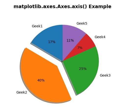
**Explanation: A pie chart is created with custom slice sizes and labels. The explode parameter highlights the second slice by offsetting it. Using **ax.axis('square') ensures the plot area is square, keeping the pie circular and evenly scaled.
**Example 2:
Python `
import matplotlib.pyplot as plt import matplotlib.patches as patches import matplotlib.cbook as cbook
Load sample image
with cbook.get_sample_data('geek.JPG') as img_file: img = plt.imread(img_file)
fig, (ax1, ax2) = plt.subplots(2, 1)
First subplot
im1 = ax1.imshow(img) clip_rect1 = patches.Rectangle((0, 0), 260, 200, transform=ax1.transData) im1.set_clip_path(clip_rect1) ax1.set_title('Without Axis Function', fontsize=10, fontweight='bold')
Second subplot
im2 = ax2.imshow(img) clip_rect2 = patches.Rectangle((0, 0), 260, 200, transform=ax2.transData) im2.set_clip_path(clip_rect2) ax2.axis('off') ax2.set_title("Axis Function with 'Off' option", fontsize=10, fontweight='bold')
plt.show()
`
**Output

**Explanation: A sample image is displayed in two vertical subplots with clipping applied. The first shows axes normally, while the second hides all axis elements using ax.axis('off') for a cleaner view.