Matplotlib.axes.Axes.plot() in Python (original) (raw)
Last Updated : 02 Apr, 2025
**Axes.plot() method in Matplotlib is used to plot data on a set of axes. It is primarily used for creating line plots but can be extended for other types of plots, including scatter plots, bar plots, and more. When using this function, you typically provide the x and y coordinates of the data points you want to plot. Example:
Python `
import matplotlib.pyplot as plt import numpy as np
make an agg figure
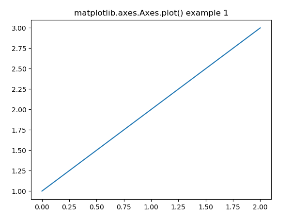
fig, ax = plt.subplots() ax.plot([1, 2, 3]) ax.set_title('matplotlib.axes.Axes.plot() example 1') fig.canvas.draw() plt.show()
`
**Output:

**Explanation: This code creates a line plot with the data [1, 2, 3], adds a title “matplotlib.axes.Axes.plot() example 1”, and then displays the plot using plt.show(). The plot is drawn on an agg backend figure to render without displaying the window immediately until plt.show() is called.
Syntax
Axes.plot(self, *args, **kwargs)
**Parameters:
- ***args: Data points to be plotted. At a minimum, you need to pass the x and y values, but you can also pass additional data or specify other plot attributes.
- ****kwargs: Additional keyword arguments for customization. These allow you to control aspects like color, line style, markers, labels, etc.
**Return Value: This returns a list of Line2D objects representing the plotted data. These objects allow further customization or modification of the plotted lines after they have been created.
Examples of Matplotlib.axes.Axes.plot()
1. Line Plot with Date Formatting Using matplotlib.axes.Axes.plot()
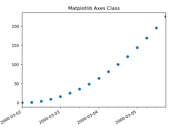
This code demonstrates how to create a line plot with dates on the x-axis using matplotlib.axes.Axes.plot() in Python. It shows how to format date-time values and customize the x-axis with different date and time locators, formats, and labels.
Python `
import datetime import matplotlib.pyplot as plt from matplotlib.dates import DayLocator, HourLocator, DateFormatter, drange import numpy as np
date1 = datetime.datetime(2000, 3, 2) date2 = datetime.datetime(2000, 3, 6) delta = datetime.timedelta(hours = 6) dates = drange(date1, date2, delta)
y = np.arange(len(dates))
fig, ax = plt.subplots() ax.plot_date(dates, y ** 2)
ax.set_xlim(dates[0], dates[-1])
ax.xaxis.set_major_locator(DayLocator()) ax.xaxis.set_minor_locator(HourLocator(range(0, 25, 6))) ax.xaxis.set_major_formatter(DateFormatter('% Y-% m-% d'))
ax.fmt_xdata = DateFormatter('% Y-% m-% d % H:% M:% S') fig.autofmt_xdate()
plt.title("Matplotlib Axes Class Example") plt.show()
`
**Output:

**Explanation:
- The code uses drange() to generate a range of datetime values from March 2, 2000, to March 6, 2000, with a 6-hour interval.
- It then creates a simple line plot with these datetime values on the x-axis, and squares of the indices ****(y ** 2)** as the y-values.
- The plot is customized to display dates on the x-axis, with major and minor ticks formatted using **DayLocator() and **HourLocator().
- The x-axis labels are formatted withDateFormatter(‘%Y-%m-%d’).The x-axis data formatting is set using **ax.fmt_xdata, and the plot is displayed with the **plt.show() method.
**2. Plotting Multiple Lines with Random Data
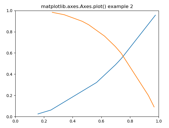
This code demonstrates how to create multiple line plots with different data series using matplotlib.axes.Axes.plot() in Python. It also shows how to customize the color of the lines and set axis limits.
Python `
import matplotlib.pyplot as plt import numpy as np
Fixing random state for reproducibility
np.random.seed(19680801)
xdata = np.random.random([2, 10])
xdata1 = xdata[0, :] xdata2 = xdata[1, :]
xdata1.sort() xdata2.sort()
ydata1 = xdata1 ** 2 ydata2 = 1 - xdata2 ** 3
fig = plt.figure() ax = fig.add_subplot(1, 1, 1) ax.plot(xdata1, ydata1, color ='tab:blue') ax.plot(xdata2, ydata2, color ='tab:orange')
set the limits
ax.set_xlim([0, 1]) ax.set_ylim([0, 1])
ax.set_title('matplotlib.axes.Axes.plot() example 2')
plt.show()
`
**Output:

**Explanation:
- **np.random.random() generates random data.
- **ax.plot() plots two lines with different colors.
- **ax.set_xlim() and **ax.set_ylim() set the axis limits.