Matplotlib.pyplot.colorbar() function in Python (original) (raw)
Last Updated : 28 Apr, 2025
The matplotlib.pyplot.colorbar() function in Python adds a color scale (color bar) to a plot, helping to interpret the relationship between data values and colors in colormapped plots like imshow(), scatter() or contourf(). Let us see an example to understand this better:
Python `
import numpy as np import matplotlib.pyplot as plt
p = [100, 200, 150, 23, 30, 50, 156, 32, 67, 89] # Purchase counts
l = [50, 70, 100, 10, 10, 34, 56, 18, 35, 45] # Likes
r = [1, 0.53, 2, 0.76, 0.5, 2.125, 0.56, 1.28, 1.09, 1.02] # Like/Dislike ratio
scatterplot
plt.scatter(p, l, c=r, cmap="summer")
add Colorbar
plt.colorbar(label="Like/Dislike Ratio", orientation="horizontal")
plt.xlabel("Purchases")
plt.ylabel("Likes")
plt.title("Purchases vs Likes")
plt.show()
`
**Output
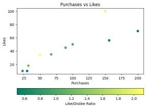
Horizontal Colorbar to a Scatterplot
**Explanation: This example creates a scatter plot where the x-axis represents purchase counts and the y-axis represents likes. The color of each point corresponds to a “Like/Dislike Ratio,” mapped using the summer colormap. A horizontal colorbar is added to indicate the color mapping of the ratio values.
Syntax
matplotlib.pyplot.colorbar(mappable=None, cax=None, ax=None, **kwargs)
**Parameters:
- **mappable: The image, contour set, or other object that the colorbar applies to.
- **cax: An existing axes object where the colorbar will be drawn.
- **ax: The parent axes associated with the colorbar.
- ****kwargs (keyword arguments): Additional properties that can be passed to customize the colorbar.
**Common kwargs Properties:
- **extend: Determines whether to extend the colorbar at one or both ends. Options: {‘neither’, ‘both’, ‘min’, ‘max’}.
- **label: Sets a label on the colorbar’s long axis.
- **ticks: Defines the location of ticks on the colorbar.
- **orientation: Sets the colorbar orientation (‘horizontal’ or ‘vertical’).
**Returns: The function returns a colorbar, which is an instance of the **matplotlib.colorbar.Colorbar class.
Examples of Using colorbar()
**Example 1: This example demonstrates how to display multiple image plots in a grid layout while using a single, shared colorbar for all subplots.
Python `
import numpy as np import matplotlib.pyplot as plt
2x2 grid
fig, axes = plt.subplots(2, 2, figsize=(8, 8))
random images
for ax in axes.flat:
im = ax.imshow(np.random.random((10, 10)), vmin=0, vmax=1)
shared colorbar
plt.colorbar(im, ax=axes.ravel().tolist())
plt.show()
`
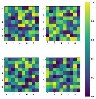
Mutple image plot
**Explanation: Here, a 2×2 grid of subplots is created, where each subplot contains an image plot generated from random values. Instead of adding individual colorbars to each subplot, a single shared colorbar is applied across all plots using **ax=axes.ravel().tolist(), ensuring consistent color mapping.
**Example 2: This example shows how to attach a colorbar to plot elements (like lines) that don’t directly support colormaps by using a ScalarMappable.
Python `
import numpy as np import matplotlib.pyplot as plt import matplotlib as mpl
x = np.linspace(0, 5, 100) cmap = plt.get_cmap('jet', 7)
fig, ax = plt.subplots(figsize=(8, 6)) for i, n in enumerate(np.linspace(0, 2, 7)): ax.plot(x, x * i + n, color=cmap(i))
sm = mpl.cm.ScalarMappable(cmap=cmap, norm=mpl.colors.Normalize(0, 2)) plt.colorbar(sm, ax=ax, ticks=np.linspace(0, 2, 7), label="Color Mapping")
plt.xlabel('x-axis') plt.ylabel('y-axis') plt.title("Colorbar for Non-Mappable Object") plt.show()
`
**Output
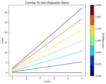
Using matplotlib.pyplot.colorbar()
Explanation: In this case, multiple lines are plotted using different colors from the ‘jet’ colormap. Since the lines themselves are not directly associated with a colormap, a ScalarMappable``**object is created with a normalized range of values.
**Example 3: This example demonstrates how to customize the appearance of a colorbar, including its label orientation and tick styling.
Python `
import numpy as np import matplotlib.pyplot as plt
data = np.random.rand(10, 10)
fig, ax = plt.subplots() cax = ax.imshow(data, cmap='plasma')
Adding a customized colorbar
cbar = plt.colorbar(cax) cbar.set_label('Intensity', rotation=270, labelpad=15) cbar.ax.tick_params(labelsize=10)
plt.title("Customized Colorbar Example") plt.show()
`
**Output
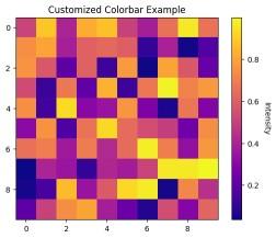
Using matplotlib.pyplot.colorbar()
**Explanation: A 10×10 grid of random intensity values is displayed using **imshow() and a customized colorbar is added. The colorbar’s label is rotated by 270 degrees and positioned with a label padding of 15. The tick labels on the colorbar are adjusted for better readability using **tick_params().
**Example 4: This example shows how to change the orientation of a colorbar from vertical to horizontal for better layout flexibility.
Python `
import numpy as np import matplotlib.pyplot as plt
data = np.random.rand(10, 10)
fig, ax = plt.subplots() cax = ax.imshow(data, cmap='coolwarm')
Adding a Horizontal Colorbar
plt.colorbar(cax, orientation='horizontal', label='Temperature Scale') plt.title("Horizontal Colorbar Example") plt.show()
`
**Output
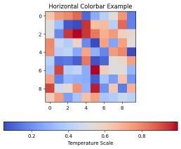
Using matplotlib.pyplot.colorbar()
**Explanation: This example generates a heatmap using imshow() with the coolwarm colormap. Instead of the default vertical orientation, the colorbar is set to be horizontal using **orientation=’horizontal’, with an appropriate label indicating the temperature scale.