Matplotlib.pyplot.hist() in Python (original) (raw)
Last Updated : 13 Jan, 2025
**The matplotlib.pyplot.hist() function in Python is used to create histograms, which are graphical representations of data distribution. It divides the data into bins (non-overlapping intervals) and counts the frequency of values in each bin, plotting them as bars. Lets consider the data values and visualise histogram with help of an example:
Python `
import matplotlib.pyplot as plt
data = [32, 96, 45, 67, 76, 28, 79, 62, 43, 81, 70,61, 95, 44, 60, 69, 71, 23 ,69, 54, 76, 67,82, 97, 26, 34, 18, 16, 59, 88, 29, 30, 66,23, 65, 72, 20, 78, 49, 73, 62, 87, 37, 68,81, 80, 77, 92, 81, 52, 43, 68, 71, 86] plt.hist(data) plt.show()
`
**Output:
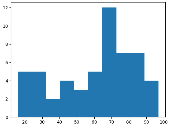
Histogram with hist() with default parameters
Understanding the syntax and parameters
**Syntax: matplotlib.pyplot.hist(x, bins=None, range=None, density=False, histtype=’bar’, color=None, label=None)
- **x: The data to be represented in the histogram.
- **bins: Specifies the number of bins or the bin edges for the histogram.
- **range: The lower and upper range of the bins.
- **density: If True, the histogram is normalized to form a probability density.
- **histtype: Defines the type of histogram (e.g., ‘bar’ for a traditional bar histogram).
- **color: Sets the color of the bars.
- **label: Label for the histogram, used in legends.
Create a Histogram in Matplotlib
Using the Matplotlib library in python, we can create many types of histograms. Let us see a few examples to better understand the **functionality of hist() function. In this example, we will create a histogram and pass the necessary parameters such as bins, color, density, etc.
Python `
import matplotlib.pyplot as plt import numpy as np
mu, sigma = 121, 21 x = np.random.normal(mu, sigma, 1000)
num_bins = 100 n, bins, _ = plt.hist(x, num_bins, density=True, color='green', alpha=0.7)
plt.xlabel('X-Axis') plt.ylabel('Y-Axis') plt.title('matplotlib.pyplot.hist() Example', fontweight='bold')
plt.show()
`
**Output:
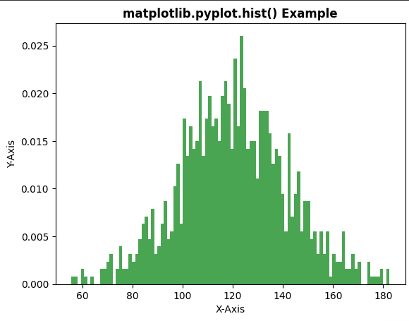
Creating the histogram
**Example 2: Visualize the Specific Bars of Histogram
In this example, we will create a histogram with different attributes using matplotlib.pyplot.hist() function. We define a specific set of colors for the bars of the histogram bars.
Python `
import numpy as np import matplotlib.pyplot as plt
x = np.random.randn(10000, 3) colors = ['green', 'blue', 'lime']
plt.hist(x, bins=20, density=True, histtype='bar', color=colors, label=colors)
plt.legend(fontsize=10) plt.title('matplotlib.pyplot.hist() Example', fontweight='bold')
plt.show()
`
**Output:
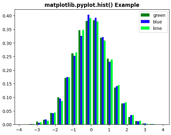
different color bars in matplot.pyplot.hist()