Matplotlib.pyplot.legend() in Python (original) (raw)
Last Updated : 01 Aug, 2024
A legend is an area describing the elements of the graph. In the Matplotlib library, there’s a function called **legend() which is used to place a legend on the axes. In this article, we will learn about the Matplotlib Legends.
Python Matplotlib.pyplot.legend() Syntax
**Syntax: matplotlib.pyplot.legend([“blue”, “green”], bbox_to_anchor=(0.75, 1.15), ncol=2)
Attributes:
- **shadow: [None or bool] Whether to draw a shadow behind the legend.It’s Default value is None.
- **markerscale: [None or int or float] The relative size of legend markers compared with the originally drawn ones.The Default is None.
- **numpoints: [None or int] The number of marker points in the legend when creating a legend entry for a Line2D (line).The Default is None.
- **fontsize: The font size of the legend.If the value is numeric the size will be the absolute font size in points.
- **facecolor: [None or “inherit” or color] The legend’s background color.
- **edgecolor: [None or “inherit” or color] The legend’s background patch edge color.
Matplotlib.pyplot.legend() in Python
Matplotlib.pyplot.legend() function is a utility given in the Matplotlib library for Python that gives a way to label and differentiate between multiple plots in the same figure
The attribute **Loc in legend() is used to specify the location of the legend. The default value of loc is loc= “best” (upper left). The strings ‘upper left’, ‘upper right’, ‘lower left’, and ‘lower right’ place the legend at the corresponding corner of the axes/figure.
The attribute **bbox_to_anchor=(x, y) of the legend() function is used to specify the coordinates of the legend, and the attribute **ncol represents the number of columns that the legend has. Its default value is 1.
Python Matplotlib legend() Function Examples
Below are some examples that can see the Matplotlib interactive mode setup using Matplotlib.pyplot.legend() in Python:
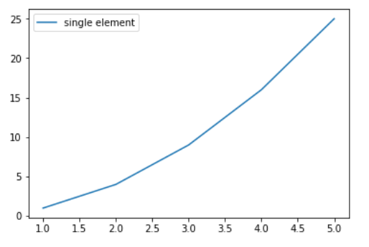
Add a Legend to a Matplotlib
In this example, a simple quadratic function \( y = x^2 \) is plotted against the x-values [1, 2, 3, 4, 5]. A legend labeled “single element” is added to the plot, clarifying the plotted data.
Python `
import numpy as np import matplotlib.pyplot as plt
X-axis values
x = [1, 2, 3, 4, 5]
Y-axis values
y = [1, 4, 9, 16, 25]
Function to plot
plt.plot(x, y)
Function add a legend
plt.legend(['single element'])
function to show the plot
plt.show()
`
**Output :
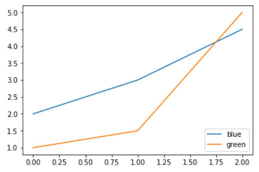
Change the Position of the Legend
In this example, two data series, represented by `y1` and `y2`, are plotted. Each series is differentiated by a specific color, and the legend provides color-based labels “blue” and “green” for clarity.
Python `
importing modules
import numpy as np import matplotlib.pyplot as plt
Y-axis values
y1 = [2, 3, 4.5]
Y-axis values
y2 = [1, 1.5, 5]
Function to plot
plt.plot(y1) plt.plot(y2)
Function add a legend
plt.legend(["blue", "green"], loc="lower right")
function to show the plot
plt.show()
`
**Output :
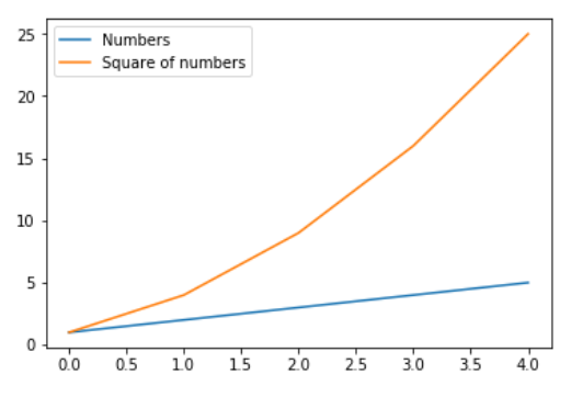
Combine Multiple labels in legend
In this example, two curves representing `y1` and `y2` are plotted against the `x` values. Each curve is labeled with a distinct legend entry, “Numbers” and “Square of numbers”, respectively, providing clarity to the viewer.
Python `
import numpy as np import matplotlib.pyplot as plt
X-axis values
x = np.arange(5)
Y-axis values
y1 = [1, 2, 3, 4, 5]
Y-axis values
y2 = [1, 4, 9, 16, 25]
Function to plot
plt.plot(x, y1, label='Numbers') plt.plot(x, y2, label='Square of numbers')
Function add a legend
plt.legend()
function to show the plot
plt.show()
`
**Output :
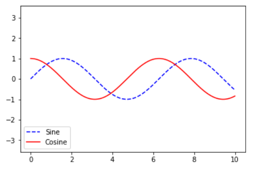
Plotting Sine and Cosine Functions with Legends in Matplotlib
In this example, both the sine and cosine functions are plotted against the range [0, 10] on the x-axis. The plot includes legends distinguishing the sine and cosine curves, enhancing visual clarity.
Python `
import numpy as np import matplotlib.pyplot as plt
x = np.linspace(0, 10, 1000) fig, ax = plt.subplots()
ax.plot(x, np.sin(x), '--b', label='Sine') ax.plot(x, np.cos(x), c='r', label='Cosine') ax.axis('equal')
leg = ax.legend(loc="lower left")
`
**Output:
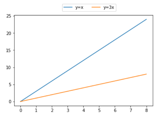
Place the Legend Outside the Plot in Matplotlib
In this example, two functions **y = x and **y = 3x are plotted against the x-values. The legend is strategically positioned above the plot with two columns for improved layout and clarity.
Python `
importing modules
import numpy as np import matplotlib.pyplot as plt
X-axis values
x = [0, 1, 2, 3, 4, 5, 6, 7, 8]
Y-axis values
y1 = [0, 3, 6, 9, 12, 15, 18, 21, 24]
Y-axis values
y2 = [0, 1, 2, 3, 4, 5, 6, 7, 8]
Function to plot
plt.plot(y1, label="y = x") plt.plot(y2, label="y = 3x")
Function add a legend
plt.legend(bbox_to_anchor=(0.75, 1.15), ncol=2) plt.show()
`
**Output: