Matplotlib.pyplot.plot_date() function in Python (original) (raw)
Last Updated : 09 Jan, 2024
Matplotlib is a module package or library in Python which is used for data visualization. Pyplot is an interface to a Matplotlib module that provides a MATLAB-like interface. The matplotlib.pyplot.plot_date() function is like the regular plot() function, but it's tailored for showing data over dates. Think of it as a handy tool for visualizing events or values that happen over time, making your time-related charts look sharp and clear.
Matplotlib.pyplot.plot_date() function Syntax
This function is used to add dates to the plot. Below is the syntax by which we can plot datetime on the x-axis Matplotlib.
**Syntax : matplotlib.pyplot.plot_date(x, y, fmt='o', tz=None, xdate=True, ydate=False, data=None, **kwargs)
**Parameters :
- **x, y: x and y both are the coordinates of the data i.e. x-axis horizontally and y-axis vertically.
- **fmt: It is a optional string parameter that contains the corresponding plot details like color, style etc.
- **tz: tz stands for timezone used to label dates, default(UTC).
- **xdate: xdate parameter contains boolean value. If xdate is true then x-axis is interpreted as date in matplotlib. By default xdate is true.
- **ydate: If ydate is true then y-axis is interpreted as date in matplotlib. By default ydate is false.
- **data: The data which is going to be used in plot.
The last parameter **kwargs is the Keyword arguments control the Line2D properties like animation, dash_ joint-style, colors, linewidth, linestyle, marker, etc.
Matplotlib.pyplot.plot_date() function Examples
Below are the examples by which we can see how to plot datetime on x axis matplotlib in Python:
Plotting a Date Series Using Matplotlib
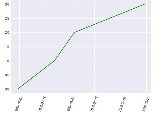
In this example, dates are plotted against a numeric sequence using the matplotlib.pyplot.plot_date() function, with green markers, and the x-axis date labels are rotated for better visibility.
Python3 `
importing libraries
import matplotlib.pyplot as plt from datetime import datetime
creating array of dates for x axis
dates = [ datetime(2020, 6, 30), datetime(2020, 7, 22), datetime(2020, 8, 3), datetime(2020, 9, 14) ]
for y axis
x = [0, 1, 2, 3]
plt.plot_date(dates, x, 'g') plt.xticks(rotation=70) plt.show()
`
**Output:
Creating a Plot Using Dataset
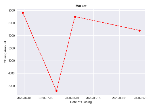
In this example, a Pandas DataFrame is used to store and plot market closing prices against dates. The plotted graph showcases closing amounts with red dashed lines.
Python3 `
importing libraries
import pandas as pd import matplotlib.pyplot as plt from datetime import datetime
creating a dataframe
data = pd.DataFrame({'Date': [datetime(2020, 6, 30), datetime(2020, 7, 22), datetime(2020, 8, 3), datetime(2020, 9, 14)],
'Close': [8800, 2600, 8500, 7400]})x-axis
price_date = data['Date']
y-axis
price_close = data['Close']
plt.plot_date(price_date, price_close, linestyle='--', color='r') plt.title('Market', fontweight="bold") plt.xlabel('Date of Closing') plt.ylabel('Closing Amount')
plt.show()
`
**Output:
Customizing Date Formatting in a Market Closing Price Plot
In this example, after plotting market closing prices against dates, the date format is customized using the dateformatter class to display dates in the format 'DD-MM-YYYY'.
Python3 `
importing libraries
import pandas as pd import matplotlib.pyplot as plt from datetime import datetime
creating a dataframe
data = pd.DataFrame({'Date': [datetime(2020, 6, 30), datetime(2020, 7, 22), datetime(2020, 8, 3), datetime(2020, 9, 14)],
'Close': [8800, 2600, 8500, 7400]})x-axis
price_date = data['Date']
y-axis
price_close = data['Close']
plt.plot_date(price_date, price_close, linestyle='--', color='r') plt.title('Market', fontweight="bold") plt.xlabel('Date of Closing') plt.ylabel('Closing Amount')
Changing the format of the date using
dateformatter class
format_date = mpl_dates.DateFormatter('%d-%m-%Y')
getting the accurate current axes using gca()
plt.gca().xaxis.set_major_formatter(format_date)
plt.show()
`
**Output:
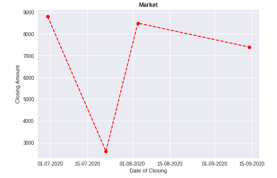
The format of the date changed to dd-mm-yyyy. To know more about dataformatter and gca() click here.