Matplotlib.pyplot.title() in Python (original) (raw)
Last Updated : 26 Apr, 2025
The **title() method in the **Matplotlib module is used to specify the title of the visualization depicted and display the title using various attributes. In this article, we will learn about this function with the help of examples.
**Syntax: matplotlib.pyplot.title(label, fontdict=None, loc=’center’, pad=None, **kwargs)
**Parameters:
- **label(str): This argument refers to the actual title text string of the visualization depicted.
- **fontdict(dict): This argument controls the appearance of the text such as text size, text alignment etc using a dictionary.
- **loc(str): This argument refers to the location of the title and takes string values like ‘center’, ‘left’ and ‘right’.
- **pad(float): This argument refers to the offset of the title from the top of the axes in points. Its default values in None.
- ****kwargs: This argument refers to the use of other keyword arguments as text properties such as color, fonstyle, linespacing, backgroundcolor, rotation, etc.
**Return Type:
The return type is generally a **matplotlib.text.Text object. It returns the **Textobject that represents the title.
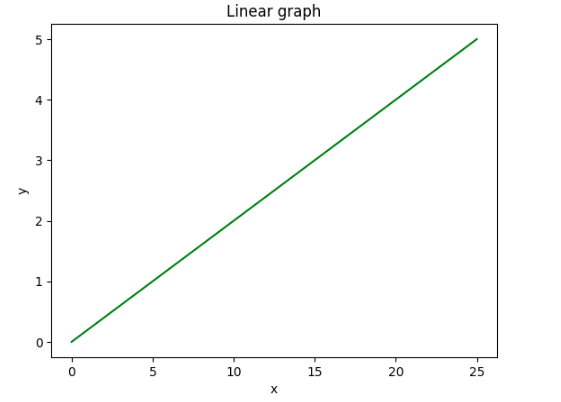
1. Displaying a Title on a Linear Graph
In this example, a linear graph is created and title “Linear Graph” is added to the plot using the matplotlib.pyplot.title()function. To display the title setting the label argument is the minimum requirement.
Python `
import matplotlib.pyplot as plt
y = [0, 1, 2, 3, 4, 5] x = [0, 5, 10, 15, 20, 25]
plt.plot(x, y, color='green') plt.xlabel('x') plt.ylabel('y')
plt.title("Linear graph") plt.show()
`
**Output:
Displaying Title
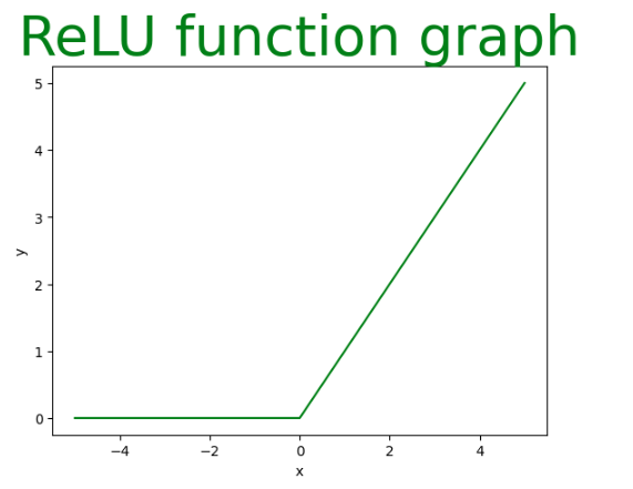
2. Visualizing the ReLU Function with a Title
Here a ReLU function graph is created using matplotlib.pyplot based on the provided x-coordinates. The title “ReLU Function Graph” is added to the plot with custom styling.
Python `
x = [-5, -4, -3, -2, -1, 0, 1, 2, 3, 4, 5] y = []
for i in range(len(x)): y.append(max(0, x[i]))
plt.plot(x, y, color='green') plt.xlabel('x') plt.ylabel('y')
plt.title(label="ReLU function graph", fontsize=40, color="green")
`
**Output:
Visualizing the ReLU Function
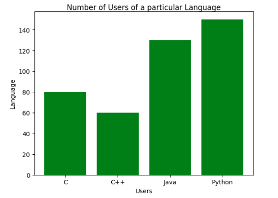
3. Customizing a Bar Graph Title
In this example, a bar graph is created and title is customized with the fontweight key from the fontdict argument and the pad argument along with the label parameter.
Python `
import matplotlib.pyplot as plt import numpy as np
language = ['C', 'C++', 'Java', 'Python'] users = [80, 60, 130, 150]
index = np.arange(len(language)) plt.bar(index, users, color='green') plt.xlabel('Users') plt.ylabel('Language') plt.xticks(index, language)
plt.title(label='Number of Users of a particular Language', fontweight=10, pad='2.0')
`
**Output:
Customizing a Bar Graph Title
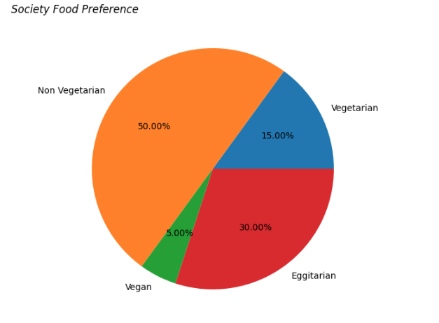
**4. Customizing Title of Pie Chart Title
In this example, a pie chart is created and title is customized with the _label, _fontweight keyword from the _fontdict and the _fontstyle (**kwargs) argument which can take values such as _italic, _bold or _oblique.
Python `
foodPreference = ['Vegetarian', 'Non Vegetarian', 'Vegan', 'Eggitarian']
consumers = [30, 100, 10, 60]
fig = plt.figure() ax = fig.add_axes([0, 0, 1, 1]) ax.axis('equal') ax.pie(consumers, labels=foodPreference, autopct='%1.2f%%')
plt.title(label="Society Food Preference", loc="left", fontstyle='italic')
`
**Output:
Customizing Title of Pie Chart Title
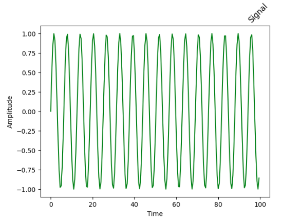
5. **Customizing Sinusoidal Signal Title
In this example, a sinusoidal signal is visualized and title is customized with the label argument set to ‘Signal’, loc argument set to right and the rotation argument (**kwargs) set to 45 degrees.
Python `
from matplotlib import pyplot import numpy
signalTime = numpy.arange(0, 100, 0.5)
signalAmplitude = numpy.sin(signalTime)
pyplot.plot(signalTime, signalAmplitude, color='green')
pyplot.xlabel('Time') pyplot.ylabel('Amplitude')
pyplot.title("Signal", loc='right', rotation=45)
`
**Output:
Customizing Title of Sinusoidal Signal
6. Displaying a Image Title
In this example, an image is displayed and the title is customized with the label argument set to “Geeks 4 Geeks” the _fontsize key from _fontdict set to 20 and additional parameters _backgroundcolor set to ‘green’ and color set to ‘white’.
Python `
from PIL import ImageTk, Image from matplotlib import pyplot as plt
testImage = Image.open('g4g.png')
plt.title("Geeks 4 Geeks", fontsize='20', backgroundcolor='green', color='white') plt.imshow(testImage)
`
**Output:
![]()
Image Displayed
With these methods, we can customize title of our plots and can make our visualizations better and interactive.