Overlapping Histograms with Matplotlib in Python (original) (raw)
Last Updated : 06 May, 2025
Histograms are used to represent the frequencies across various intervals in a dataset. In this article, we will learn how to create overlapping histograms in Python using the **Matplotlib library. The **matplotlib.pyplot.hist() function will be used to plot these histograms so that we can compare different sets of data on the same chart. This makes it easy to spot patterns and differences in data.
**Step 1: Imporing the libraries
We will use **Matplotlib for plotting graphs and **Seaborn for loading datasets and creating visualizations.
Python `
import matplotlib.pyplot as plt import seaborn as sns
`
**Step 2: Loading dataset
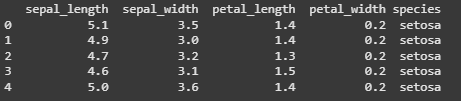
We will be using the **Iris dataset which contains measurements of sepal length, sepal width, petal length and petal width for three different species of Iris flowers.
Python `
data = sns.load_dataset('iris') print(data.head(5))
`
**Output:
Iris Dataset
**Step 3: Ploting Histograms
We will plot histogram for sepal_length and petal_length.
Python `
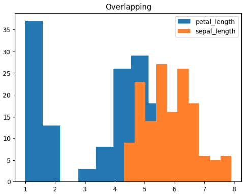
plt.hist(data['petal_length'], label='petal_length')
plt.hist(data['sepal_length'], label='sepal_length')
plt.legend(loc='upper right') plt.title('Overlapping') plt.show()
`
**Output:
Overlapping Histogram
Here, we can see that some part of the histogram for petal_length has been hidden behind the histogram for sepal_length. To properly visualize both the histograms we need to set the transparency parameter i.e **alpha to a suitable value. So let's check various values for alpha and find out suitable one.
**Step 4: Setting Transparency
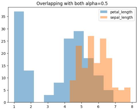
We will set alpha=0.5 for both sepal_length and petal_length.
Python `
plt.hist(data['petal_length'], alpha=0.5, label='petal_length')
plt.hist(data['sepal_length'], alpha=0.5, label='sepal_length')
plt.legend(loc='upper right') plt.title('Overlapping with both alpha=0.5') plt.show()
`
**Output:
Histogram with alpha = 0.5
After setting our alpha value to 0.5 we are able to properly see the histograms for both our values even though there is overlapping between them. Let us try to make further changes to our alpha and see its impact on our visualization.
**Step 5: Setting Different Alpha Valuse
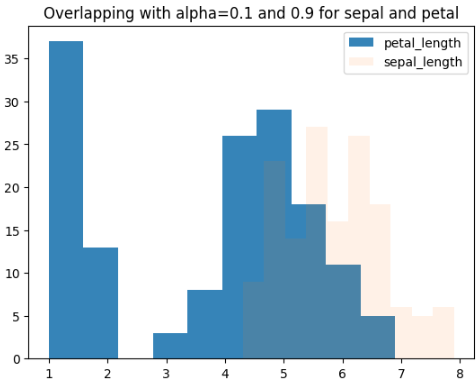
We will set _alpha=0.1 for sepal_length and 0.9 for petal_length
Python `
plt.hist(data['petal_length'], alpha=0.9, label='petal_length')
plt.hist(data['sepal_length'], alpha=0.1, label='sepal_length')
plt.legend(loc='upper right') plt.title('Overlapping with alpha=0.1 and 0.9 for sepal and petal') plt.show()
`
**Output:
Histogram with a Different Alpha
**Step 6: Create more than 2 overlapping histograms with customized colors.
Now, let us plot more than two overlapping histograms where we need custom colors.
Python `
plt.hist(data['sepal_width'], alpha=0.5, label='sepal_width', color='red')
plt.hist(data['petal_width'], alpha=0.5, label='petal_width', color='green')
plt.hist(data['petal_length'], alpha=0.5, label='petal_length', color='yellow')
plt.hist(data['sepal_length'], alpha=0.5, label='sepal_length', color='purple')
plt.legend(loc='upper right') plt.show()
`
**Output:
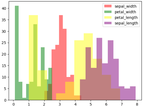
Histogram with Customized Colors
Here, we created overlapping histograms for four different measurements of the Iris flowers. Each histogram is given a different color and some transparency so we can easily compare how these measurements are distributed.