Editing Power BI Report Interactions (original) (raw)
Last Updated : 19 Jan, 2026
Editing report interactions in Power BI controls how visuals affect each other on a report page. It helps define whether a visual should filter, highlight or ignore other visuals.
- Manages interactions between charts, tables and slicers
- Prevents unwanted filtering in reports
- Improves clarity and user experience
- Useful for building interactive dashboards
Power BI Report Interactions
Power BI report interactions enable users to explore and analyze data dynamically across multiple visuals. They allow filtering, highlighting and drilling down into data, creating an interactive and intuitive reporting experience that helps users quickly gain meaningful insights.
- **Filtering visuals: Users can filter visuals based on specific criteria such as selecting a particular region or date range, to narrow down the displayed data and focus on relevant information.
- **Highlighting related visuals: When a user interacts with one visual, related visuals can be highlighted to emphasize the connections between different data points and provide context for analysis.
- **Drilling down into data: Users can drill down into data by clicking on specific data points to explore underlying details and uncover granular insights.
- **Navigating between pages: Users can seamlessly move between pages or sections of the report using page navigation interactions, facilitating a comprehensive overview of the data.
- **Custom interactions: Custom interactions can be created using JavaScript or Power BI APIs to tailor the interaction experience to specific data exploration needs and provide unique interactive functionalities.
Different Types of Interactions in Power BI
Power BI offers several different types of interactions include:
- **Basic (None): This interaction does nothing when a data point is clicked, allowing users to view all data without filtering or highlighting.
- **Highlight: This interaction highlights the selected data point while fading the rest helping users focus on or compare specific data points.
- **Filter: This interaction filters other visuals to display only related data helping users explore relationships between different visuals.
- **Drill through: This interaction takes the user to another page with a detailed breakdown of the selected data point, providing more in-depth information.
- **Tooltip: This interaction shows a tooltip with more information about the selected data point allowing quick insights without navigating away.
Getting Started with Editing Power BI Report Interactions
Refer to Power BI interactive dashboards for implementation of charts
**DataSet used
Going further we will be using the Sale Data as an example for understanding the concept of Edit interactions of Reports. Upload the dataset in Power BI and refer to the dataset to follow along with the below-given sections of the article.
You can download dataset from here

Sale Data
The user can take a general idea about the data fields of the above dataset.
**Data
The major variables used to show the charts are as follows.
- **Item: This represents the item names. This is the variable for which the sale is shown in the form of pie or donuts.
- **Brand: This is the brand name for any particular item. One item can belong to different variety of brands.
- **SaleAmt: This is the total amount sold.
- **OrderDate: This is the date of the order or sale of the item.
Following is the Edit Interactions feature of the Power BI desktop. It is seen on accessing the **Format tab of the top toolbar.

This button allows you to create, edit and manage interactions between different visuals in a Power BI report.
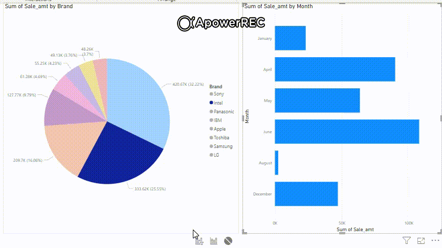
Consider the following report it contains a Pie chart showing Sum of Sale_amt by Brand and a Bar chart showing Sum of Sale_amt by Month. At the bottom there are three icons from left to right Filter, Highlight and None.
Types of Edit interactions in Power BI are:
- **Filter: Data in a chart or report shows only that part which selected by the filtered section, like data related to a particlular brand or item.
- **Highlight: Selecting any item or brand will highlight the chart relevant to the selection.
- **None: When "none" is chosen for "Edit interactions", there is no dependency or interaction between any 2 charts or visualizations, each displaying its data independently.
By default selecting a data point in one chart updates the other chart accordingly. To completely disable interaction click the None button and then click Edit Interactions in the toolbar at the top left.
When None is selected choosing a slice in the Pie chart does not affect the Bar chart and selecting a bar or month in the Bar chart does not affect the Pie chart.

Filter
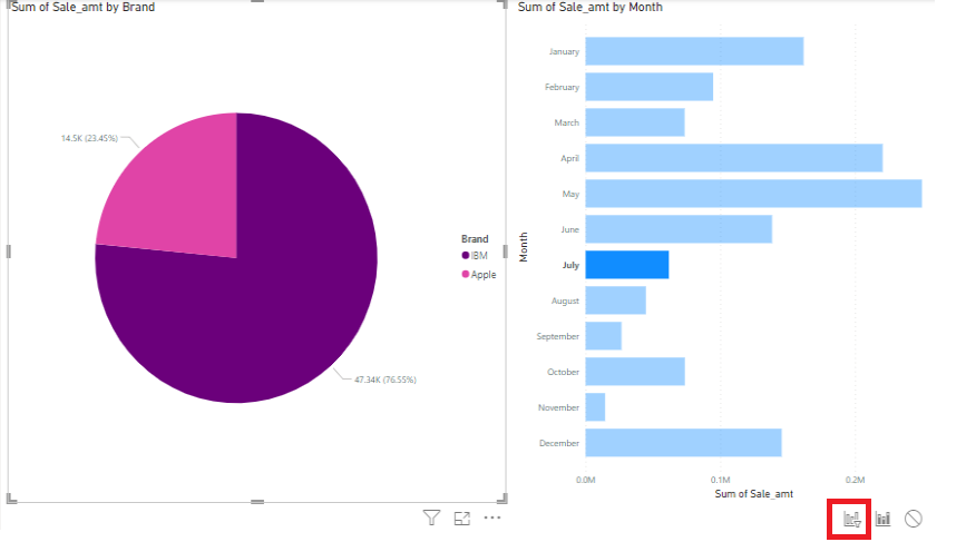
- The image shows the filtered Sum of Sale_amt for the brand Apple, highlighted in pink on the Pie chart.
- Sales for this brand occurred in March, July, August and October, with their totals represented by the corresponding bars in the Bar chart.
- The red icon at the bottom indicates that the Filter feature is enabled, allowing interaction between these two visuals.

Select different Pie chart slices to see the Bar chart update with Sum of Sale_amt by month. Click Refresh if “Visual has pending changes” appears.
Highlight
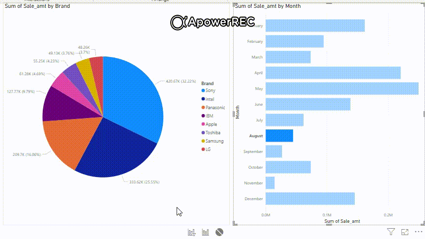
Similar example is given for the Highlight on "Samsung" item brand and its filtered result of sales in the month of "February", "March", "April", "September" and "November".

This shows the video output for a better understanding.
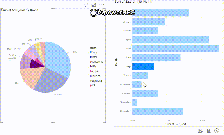
In the following image, the "Filter" interaction is set for "July" month in the Bar chart. It shows sales for "IBM" and "Apple" item brands.
Filter on bar chart for July
We can understand it better from the following video output. Keep playing by selecting different months for analyzing it's respective "Sum of Sale_amt" showing with different Brands. Different months have different sales for item brands.

None
**None icon: This icon is used when the user do not want any interaction between the visuals and want individual visual to act independently. Notice the red colored icon on the right bottom. Click the round icon and click on the "Edit interactions" button of the top toolbar.

The output is for better understanding of the "none" interaction. We can see no changes in the pie chart, when the months are changed. When the "none" icon is clicked for the "Bar" chart.

When the "none" icon is clicked for the "Pie" chart.
**Advantages of controlling visual interactions
- Controlling the visual interactions leads to comprehensive conclusions and understanding of data.
- Provides a complete drill down details to the users.
- Helps in dynamic analysis and explore of data promoting collaboration.
- Helps in decision making for business needs by going into details.
- Use of filters make you choose subsets of particular part or sections.
Different Ways to Edit Interactions
Power BI offers multiple methods to customize how visuals interact enhancing data exploration and understanding:
- **Visual Interaction Controls: Displays Filter and Highlight icons on each visual allowing direct interaction to affect related visuals.
- **Format Pane: Lets you configure cross-filtering, highlighting and drill-down settings for individual visuals via the Format pane.
- **Interaction Rules: Define how one visual influences another enabling advanced scenarios like selective filtering or highlighting based on user actions.
- **Bi-directional Interactions: Establishes relationships where visuals filter each other in both directions ensuring changes in one visual reflect on related visuals and vice versa.
Let us understand it in a better way by the following example.
Considering the following report of "Sum of Sale_amt by Brand" and "Sum of Sale_amt by Month", the filter is working in both directions. Selecting any brand will display the relevant month of "OrderDate" and vice-versa.Notice the output video and its changes when the selection of "Brand" and "Month(s)" are changing.
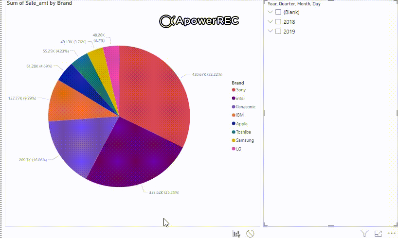
Hierarchy Interactions
This type of interactions deals with a slicer configuration and restrict the interaction to specify some heirarchy. In this case the hierarchy is "OrderDate", the heirarchy can be Year, Quarter, Month, Week or day.
Let us consider the above example for understanding the hierarchy interaction. Keep the field as shown in the red-colored box for setting the date heirarchy.

Select any "OrderDate" in any order or hierarchy as per the need of the user and the pie chart changes depending on the "orderdate" selection.
**Advantages of Editing Power BI Report Interactions
- **Enhanced Data Comprehension: Customizable interactions provide context, highlight relevant information and facilitate a deeper understanding of data patterns and trends.
- **Empowered Data Analysis: Users can interactively explore data, ask their own questions, drill down into details and uncover hidden insights.
- **Tailored User Experience: Interactions can be tailored to specific data types, analysis needs and user preferences, enhancing the overall experience.
- **Customizable Data Storytelling: Interactive data stories can be created to guide users through a structured exploration of the data.
- **Self-Service Analytics: Users can explore and analyze data without relying on external assistance, enabling informed decision-making.