Power BI Create a Filled Map (original) (raw)
Last Updated : 23 Jan, 2026
A Filled Map in Power BI is a geographic visual that shades entire regions based on data values. It helps present information in a region-wise manner, making geographic analysis more intuitive.
- Highlights the exact boundaries of areas such as countries, states or districts.
- Uses colour intensity to show variation in values across regions.
- Helps identify regional patterns and comparisons at a glance.
Creating a Filled Map in Power BI
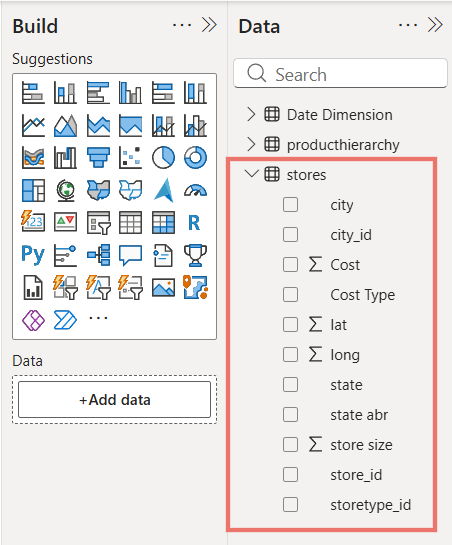
A Filled Map in Power BI offers multiple options for building and customising geographic visualisations. Here we will use the Stores dataset to create a Filled Map by using State as the location, Cost Type as the legend and relevant fields such as City, Store Size or Cost in tooltips to better understand region-wise insights.
Step 1: Load the Dataset
First, we will load the Stores dataset into Power BI and view its table to understand the available columns like State, City, Store Size, Cost Type and Cost for building visualizations.
You can download dataset from here
Dataset
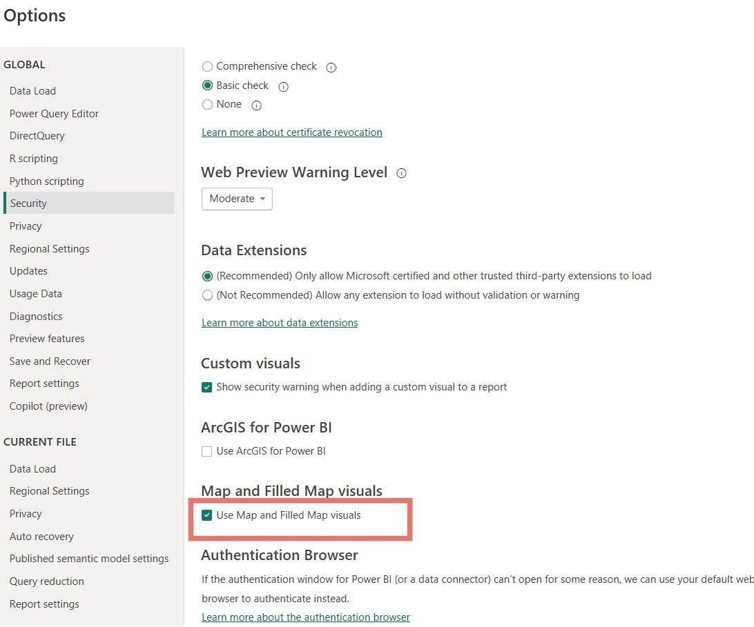
Step 2: Enable Map and Filled Map Options
Before inserting the visual:
- Go to the Options and Settings menu.
- Select Options, then Security.
- Tick the Use Map and Filled Map visuals option.
This ensures that the Filled Map feature is enabled and ready for use in your report.
Use Map and Filled Map visuals
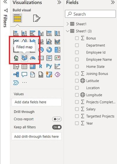
Step 3: Insert a Filled Map Visual
In the Visualizations pane, click on the Filled Map icon to add a map visual to your report canvas which will allow you to plot geographic data.
Filled map
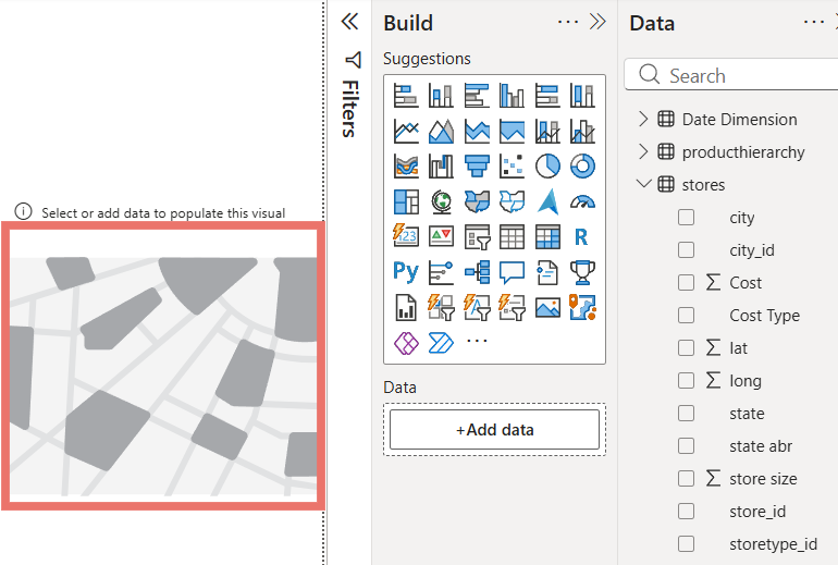
Step 4: Add Data Fields to the Filled Map
An empty Filled Map appears on the canvas. Next, drag relevant columns like State, Cost Type and fields such as City, Store Size or Cost into Tooltips to populate the map with meaningful data.
Empty Filled Map
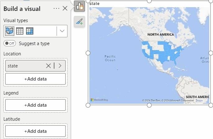
Step 5: Add State as Location
In the Filled Map visual, drag the State column into the Location field. This maps the data at the state level and displays each state as a filled geographic region on the map.
Add Location
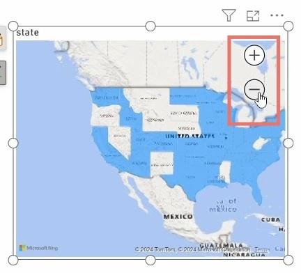
Step 6: Enable Zoom Controls
In the Format pane, expand the Controls section and turn on the Zoom buttons option. This allows users to zoom in and out of the Filled Map for better geographic exploration.
Zoom Buttons
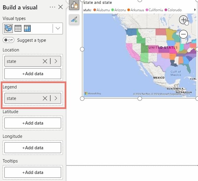
Step 7: Add State to Legend
In the Build visual pane, drag the State column into the Legend field. This helps visually distinguish states using different colors on the Filled Map.
Add Legend
Step 8: Add Tooltips to the Filled Map
Tooltips help display additional information when you hover over a state on the Filled Map making it easier to understand store-level and cost-related details without overcrowding the visual.
- Select the Filled Map visual on the report canvas.
- In the Build visual pane, drag fields like City, Store Size, Cost or Cost Type into the Tooltips field well.
- Hover over any state on the map to view the added details in the tooltip.

Tooltips
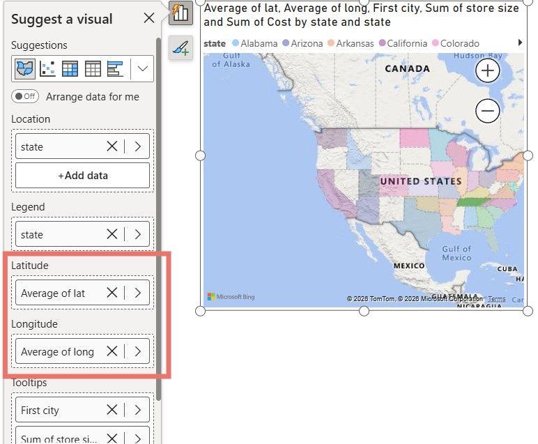
Step 9: Adding Latitude and Longitude
Latitude and Longitude represent exact point locations and are not suitable for area-based visuals like a Filled Map. Even after adding the Latitude and Longitude columns from the Stores dataset to the visual, there is no change in the map because Filled Maps work only with regions such as States, not coordinate points.
Add Latitute and Longitude
You can download full Power BI file from here