Power BI Create a Stacked Column Chart (original) (raw)
Last Updated : 16 Jan, 2023
Sometimes there is a range of scenarios where it is hard to convey the information in the form of a table and written format. Under such situations, Column charts make things easier and more understandable. Let's understand what is stacked column chart is and how to create a stacked column chart.
What are Stacked Column Chart
Stacked charts are a sort of bar chart which are multiple-bar in nature where related values are placed at one another. This feature shows the composition and comparison of a few variables, either in absolute or relative terms together with comparing multiple categories simultaneously.
Types of Column Charts:
There are mainly two variations of Column Chats. Depending on the situation charts are used.
- Clustered Column Charts: This is a default column chart where all the categories are displayed against the same value category.
- Stacked Column Charts: These are the basic typed charts that allow the comparison of one category to another category.
The main parts of Stacked Column Charts are:
- Title: It denotes the information about the chart.
- X-axis: It is the individual entry for the category to be presented.
- Y-axis: It is for the value against each type of category.
- Legend: It is the different category that will contribute to the charts.
- Bars: These heights represent the total value of all the legends.
Creation of Stacked Column Charts
Step 1: Import data from Your Excel to Power BI. Go to Home Tab-> Get Data -> Choose Data which you want Example Excel -> Select the file and Open -> Select The sheet and Load.

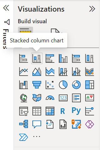
Step 2: Load the column chart under visualization and click on the 'stacked column chart' icon.
Step 3: The chart will be loaded on the screen and resized if required.

Step 4: To start creating a column chart click on the fields which is to be used in a column chart.

Step 2: Drag and drops the fields that are to be placed on the X-axis and Y-axis of the chart respectively.

Step 3: A simple Column chart has been created as shown below.

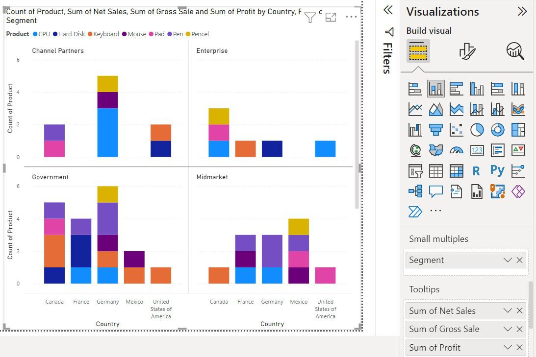
Step 4: To show the category in different colors use 'Legend', and drag and drop the category which is to be shown in color.

On hovering on certain visuals Little information is shown

To add more information on the data field drag and drop the category under 'ToolTips'.

To split the visuals into multiple versions of itself drag the category under 'Small Multiples'