Introduction to Power BI Dashboard (original) (raw)
Last Updated : 30 Apr, 2026
Power BI allows users to convert data into visuals and graphics to explore and analyze data, collaborate on interactive dashboards and reports. A Power BI dashboard is one page that shows different charts and visuals all designed to explore and interact with your data easily.
Steps to create a Dashboard
Step 1: Importing data
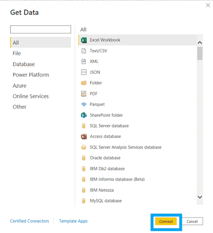
Open Power BI and import your dataset from any supported format by clicking the Get Data button
You can download dataset from here

Get Data
2. In the navigation pane, select Files and browse to the folder containing your Excel workbook or other data file. Choose the file and click Connect to import it.
Connecting to Data
3. Processing time depends on the file size. After ensuring the data is extracted, click Load to import it.
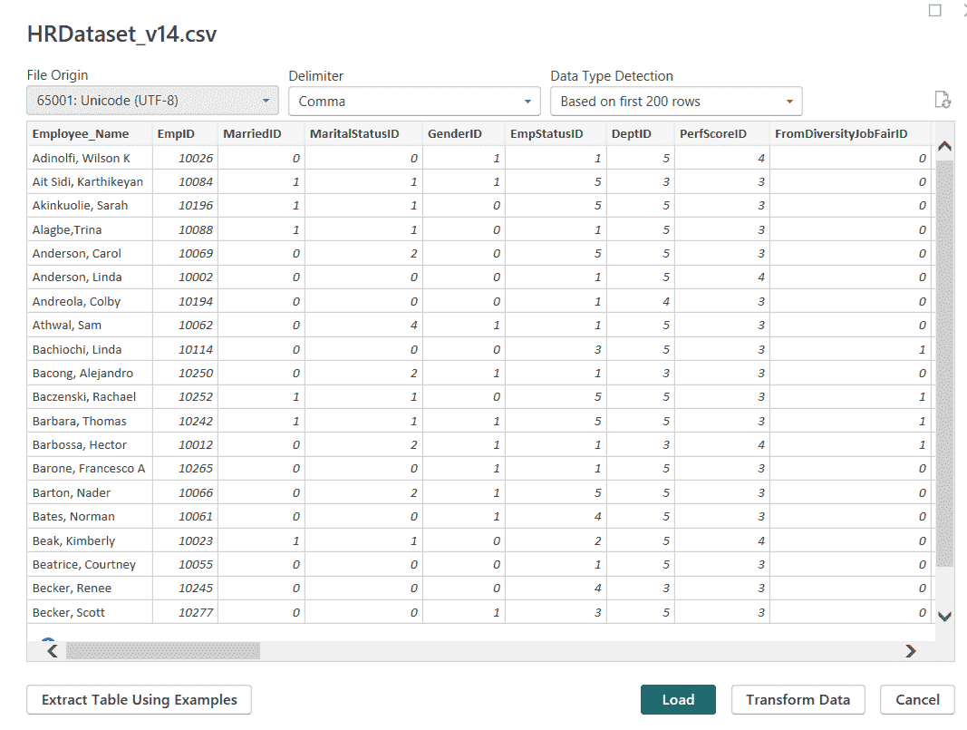
Loading Data
Step 2: Explore Your Data
From the Data tab you can view the tabular form of data. On the right you’ll find a list of fields within those tables.

Exploring Data
Select a table or field and use the Modeling tab to change its datatype or format, such as date, time, currency or percentage.
Step 3: Choose the Right Chart
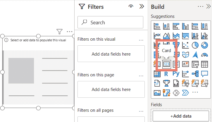
1. Select Card from the visualizations pane.
Card
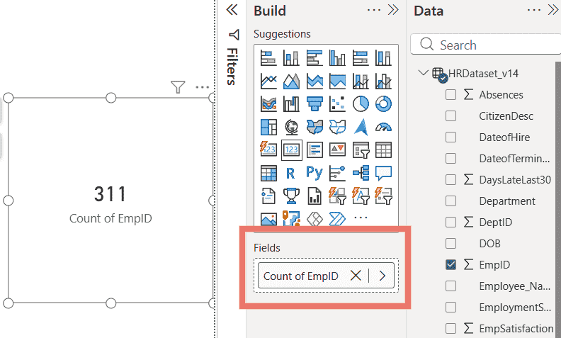
2. Select the columns you want to add to the visual from the Fields section. You can also drag and drop the fields into respective columns indicated by the image below.
Fields Section
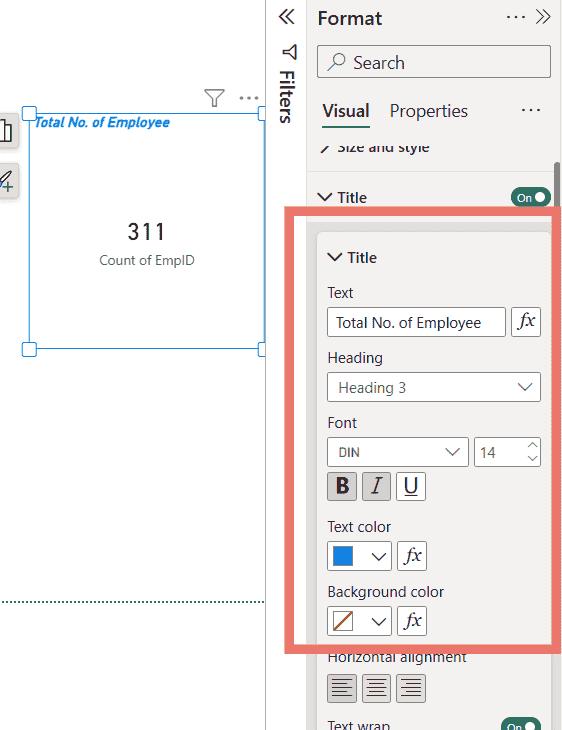
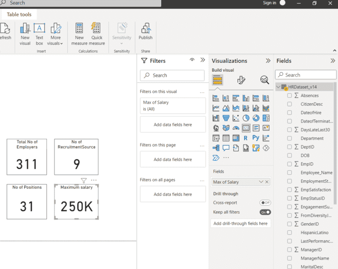
3. You can select columns, apply filters and format the visual from the Format icon. The first card we prepared shows the Total number of Employers.
Applying Filter and Formatting
4. The Same procedures were followed for the remaining cards. The second, third and fourth cards show the Number of Recruitment Sources, Positions and Maximum Salary respectively.
Applying Filter and Formatting
5. Next we’ll create a Pie Chart and a Donut chart which is going to show the Count of positions and Male - female rate respectively. Add this chart from the Visualizations.

Pie and Donut Chart
6. Add a Funnel and Stacked Bar Chart to display yearly hires and recruitment sources, then format titles, labels, legends, axes and colors.

Funnel and Stacked Bar Chart
**Note: You can also add some interactive colors to make it more attractive.
Power BI Dashboards vs Reports
Here we compare reports and dashboard in Power BI
| Feature | Dashboard | Report |
|---|---|---|
| Function | Effective business data view from where navigation to reports originates | Built from datasets view data from multiple perspectives |
| Pages | Single page summary | Multi-page report |
| Availability | Power BI Service only | Power BI Desktop and Service |
| Data Sources | Can use one or more datasets/reports | Uses a single dataset |
| Alerts | Email data alerts supported | Email alerts not supported |
| Interactivity | Supports only Bookmarks | Supports Bookmarks, Filters and Slicers |
Both dashboards and reports are effective; dashboards provide a high-level view, while reports allow in-depth exploration.
Dashboard Design Strategies
- **Know your Audience: Understand who will use the dashboard. Show only the data they care about in a way they can easily understand.
- **Tell the Story at First Glance: Your dashboard should give a quick summary of what’s happening without needing to deep dive into details. The key message should be clear right away.
- **Make Use of Full Screen: Use the full screen space wisely. Spread out your visuals so the dashboard looks clean and easy to read.
- **Highlight the Most Relevant Information: Make the most important numbers or charts stand out using bold text, colors or size. This helps users focus on what really matters.
- **Use the Right Visualization: Pick the right chart for your data. For example, use a line chart for trends, bar chart for comparisons and pie chart for parts of a whole.
Advantages
- Dashboards can be embedded into websites, apps or other tools, eliminating the need to open Power BI separately.
- Offers built-in charts, maps, slicers, and AI visuals to help users analyze data effectively.
- Easy to set up and use without technical expertise.
- Drag-and-drop interface allows building visuals quickly without coding.
- Free basic version makes it accessible and budget-friendly.
- Enables real-time collaboration by sharing dashboards with team members.