Matplotlib Pyplot (original) (raw)
Last Updated : 21 Dec, 2024
Pyplot is a submodule of the Matplotlib library in python and beginner-friendly tool for creating visualizations providing a MATLAB-like interface, to generate plots with minimal code.
How to Use Pyplot for Plotting?
To use Pyplot we must first download the Matplotlib module. For this write the following command: **pip install matplotlib
The plot() method is one of the most essential functions in Pyplot used to create line graphs, which are the foundation of most visualizations. This method takes at least two arguments: the x-values and the y-values. **Syntax:
**matplotlib.pyplot.plot()
1. Using plot() for Line Graphs
Let’s creating a basic line plot using plot(): **plot function marks the x-coordinates(1, 2, 3, 4) and y-coordinates(1, 4, 9, 16) in a linear graph with specified scales.
Python `
import matplotlib.pyplot as plt x=[1, 2, 3, 4] y=[1, 4, 9, 16] plt.plot(x,y) plt.show()
`
**Output:
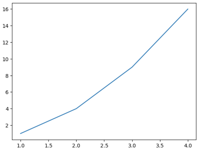
Plotting a line using Matplotlib
2. **Using pie() for Pie Charts
Use plt.pie() instead of plt.plot().
Python `
import matplotlib.pyplot as plt labels = ['Python', 'Java', 'C++', 'JavaScript'] sizes = [40, 30, 20, 10] plt.pie(sizes, labels=labels, autopct='%1.1f%%') plt.show()
`
**Output:
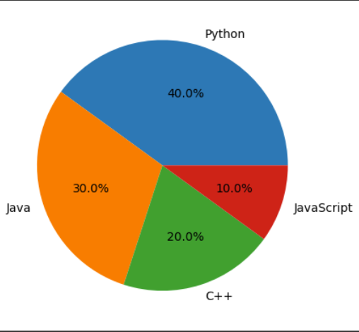
Pie chart using pyplot
3. Plotting Bar Charts Using bar()
Bar charts are useful for comparing quantities. Use the bar() method to create a vertical or horizontal bar chart by specifying the x and y values.
Python `
import matplotlib.pyplot as plt categories = ['A', 'B', 'C', 'D'] values = [3, 7, 2, 5] plt.bar(categories, values) plt.show()
`
**Output:
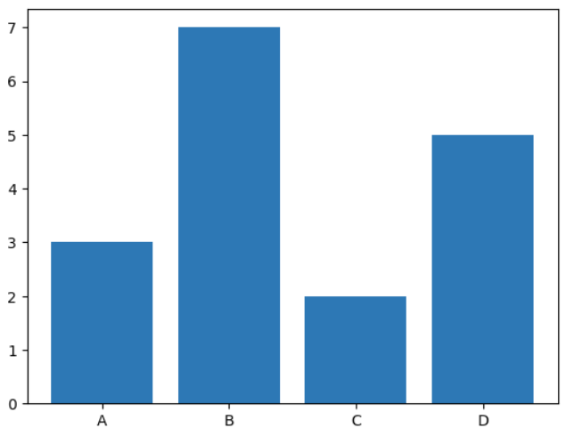
Bar Chart using Pyplot
4. Using scatter() for Scatter Plots
A scatter plot is useful for visualizing individual data points.
Python `
import matplotlib.pyplot as plt x = [1, 2, 3, 4, 5] y = [5, 7, 9, 11, 13] plt.scatter(x, y) plt.show()
`
**Output:
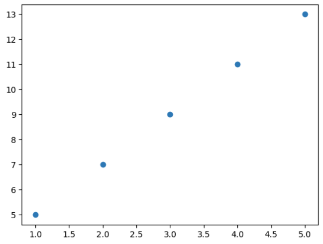
Scatter Plot using Pyplot
5. Working with Histograms Using hist()
Histograms are useful for visualizing the distribution of data.
Python `
import matplotlib.pyplot as plt import numpy as np data = np.random.randn(1000) plt.hist(data, bins=30) plt.show()
`
**Output:
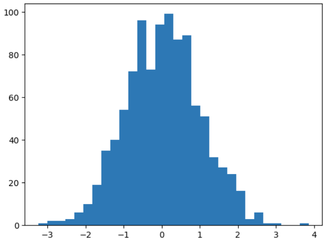
Histogram Using Pyplot
Now here, we have understood how to visualize basic plots using pyplot module. Now the next step is to customize these plots according to specific needs and Creating subplots ( multiple plots within a single figure). Refer to resources below: