Python | Plotting charts in excel sheet using openpyxl module | Set – 2 (original) (raw)
Last Updated : 01 Jul, 2022
Prerequisite: Python | Plotting charts in excel sheet using openpyxl module | Set – 1 Openpyxl is a Python library using which one can perform multiple operations on excel files like reading, writing, arithmetic operations and plotting graphs. Charts are composed of at least one series of one or more data points. Series themselves are comprised of references to cell ranges. Let's see how to plot Scatter, Bubble, Pie, 3D Pie Chart on an excel sheet using openpyxl. For plotting the charts on an excel sheet, firstly, create chart object of specific chart class( i.e ScatterChart, PieChart etc.). After creating chart objects, insert data in it and lastly, add that chart object in the sheet object. Let’s see how to plot different charts using realtime data. Code #1 : Plot the Bubble Chart. Bubble charts are similar to scatter charts but use a third dimension to determine the size of the bubbles. Charts can include multiple series. For plotting the bubble chart on an excel sheet, use BubbleChart class from openpyxl.chart submodule.
Python3 `
import openpyxl module
import openpyxl
import BubbleChart, Reference, Series class
from openpyxl.chart sub_module
from openpyxl.chart import BubbleChart, Reference, Series
Call a Workbook() function of openpyxl
to create a new blank Workbook object
wb = openpyxl.Workbook()
Get workbook active sheet
from the active attribute.
sheet = wb.active
rows = [ ("Number of Products", "Sales in USD", "Market share"), (14, 12200, 15), (20, 60000, 33), (18, 24400, 10), (22, 32000, 42), ]
write content of each row in 1st, 2nd and 3rd
column of the active sheet respectively.
for row in rows: sheet.append(row)
Create object of BubbleChart class
chart = BubbleChart()
create data for plotting
xvalues = Reference(sheet, min_col = 1, min_row = 2, max_row = 5)
yvalues = Reference(sheet, min_col = 2, min_row = 2, max_row = 5)
size = Reference(sheet, min_col = 3, min_row = 2, max_row = 5)
create a 1st series of data
series = Series(values = yvalues, xvalues = xvalues, zvalues = size, title ="2013")
add series data to the chart object
chart.series.append(series)
set the title of the chart
chart.title = " BUBBLE-CHART "
set the title of the x-axis
chart.x_axis.title = " X_AXIS "
set the title of the y-axis
chart.y_axis.title = " Y_AXIS "
add chart to the sheet
the top-left corner of a chart
is anchored to cell E2 .
sheet.add_chart(chart, "E2")
save the file
wb.save("bubbleChart.xlsx")
`
Output: 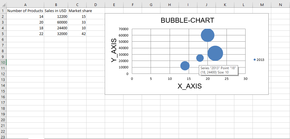 Code #2 : Plot the Scatter Chart Scatter, or xy charts are similar to some line charts. For plotting the Scatter chart on an excel sheet, use ScatterChart class from openpyxl.chart submodule.
Python3 `
import openpyxl module
import openpyxl
import ScatterChart, Reference, Series
class from openpyxl.chart sub_module
from openpyxl.chart import ScatterChart, Reference, Series
Call a Workbook() function of openpyxl
to create a new blank Workbook object
wb = openpyxl.Workbook()
Get workbook active sheet
from the active attribute.
sheet = wb.active
rows = [ ("Number of Products", "Sales in USD", "Market share"), (14, 12200, 15), (20, 60000, 33), (18, 24400, 10), (22, 32000, 42), ]
write content of each row in 1st, 2nd and 3rd
column of the active sheet respectively .
for row in rows: sheet.append(row)
Create object of ScatterChart class
chart = ScatterChart()
create data for plotting
xvalues = Reference(sheet, min_col = 1, min_row = 2, max_row = 5)
yvalues = Reference(sheet, min_col = 2, min_row = 2, max_row = 5)
size = Reference(sheet, min_col = 3, min_row = 2, max_row = 5)
create a 1st series of data
series = Series(values = yvalues, xvalues = xvalues, zvalues = size, title ="2013")
add series data to the chart object
chart.series.append(series)
set the title of the chart
chart.title = " SCATTER-CHART "
set the title of the x-axis
chart.x_axis.title = " X_AXIS "
set the title of the y-axis
chart.y_axis.title = " Y_AXIS "
add chart to the sheet
the top-left corner of a chart
is anchored to cell E2 .
sheet.add_chart(chart, "E2")
save the file
wb.save(" ScatterChart.xlsx")
`
Output: 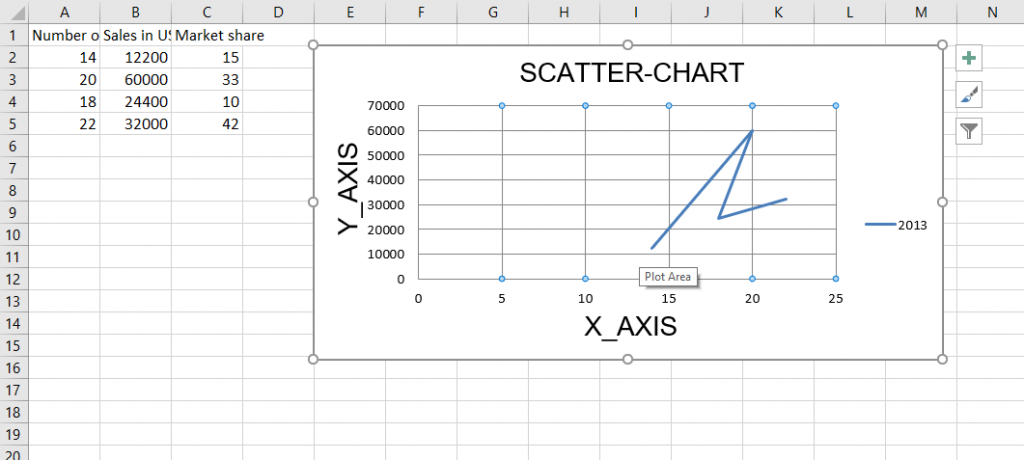 Code #3 : Plot the Pie Chart Pie charts plot data as slices of a circle with each slice representing the percentage of the whole. Slices are plotted in a clockwise direction with 0° being at the top of the circle. Pie charts can only take a single series of data. For plotting the Pie chart on an excel sheet, use PieChart class from openpyxl.chart submodule.
Python `
import openpyxl module
import openpyxl
import PieChart, Reference class
from openpyxl.chart sub_module
from openpyxl.chart import PieChart, Reference
Call a Workbook() function of openpyxl
to create a new blank Workbook object
wb = openpyxl.Workbook()
Get workbook active sheet
from the active attribute.
sheet = wb.active
datas = [ ['Pie', 'Sold'], ['Apple', 50], ['Cherry', 30], ['Pumpkin', 10], ['Chocolate', 40], ]
write content of each row in 1st, 2nd and 3rd
column of the active sheet respectively .
for row in datas: sheet.append(row)
Create object of PieChart class
chart = PieChart()
create data for plotting
labels = Reference(sheet, min_col = 1, min_row = 2, max_row = 5)
data = Reference(sheet, min_col = 2, min_row = 1, max_row = 5)
adding data to the Pie chart object
chart.add_data(data, titles_from_data = True)
set labels in the chart object
chart.set_categories(labels)
set the title of the chart
chart.title = " PIE-CHART "
add chart to the sheet
the top-left corner of a chart
is anchored to cell E2 .
sheet.add_chart(chart, "E2")
save the file
wb.save(" PieChart.xlsx")
`
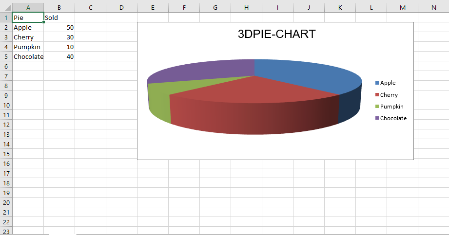
Output: 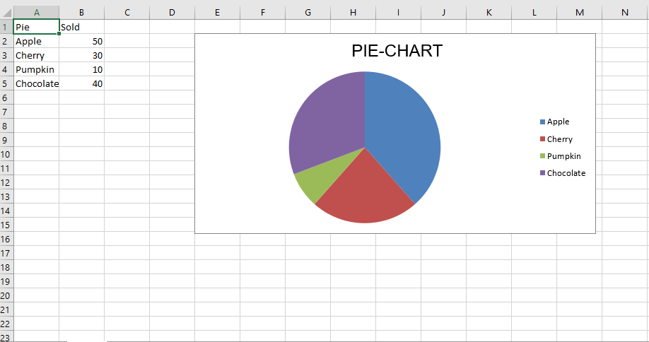 Code #4: Plot the Bar Chart For plotting the 3D pie chart on an excel sheet, use PieChart3D class from openpyxl.chart submodule.
Python3 `
import openpyxl module
import openpyxl
import PieChart3D, Reference class
from openpyxl.chart sub_module
from openpyxl.chart import PieChart3D, Reference
Call a Workbook() function of openpyxl
to create a new blank Workbook object
wb = openpyxl.Workbook()
Get workbook active sheet
from the active attribute.
sheet = wb.active
datas = [ ['Pie', 'Sold'], ['Apple', 50], ['Cherry', 30], ['Pumpkin', 10], ['Chocolate', 40], ]
write content of each row in 1st, 2nd and 3rd
column of the active sheet respectively .
for row in datas: sheet.append(row)
Create object of PiChart3D class
chart = PieChart3D()
create data for plotting
labels = Reference(sheet, min_col = 1, min_row = 2, max_row = 5) data = Reference(sheet, min_col = 2, min_row = 1, max_row = 5)
adding data to the Pie chart object
chart.add_data(data, titles_from_data = True)
set labels in the chart object
chart.set_categories(labels)
set the title of the chart
chart.title = " 3DPIE-CHART "
add chart to the sheet
the top-left corner of a chart
is anchored to cell E2 .
sheet.add_chart(chart, "E2")
save the file
wb.save(" 3DPieChart.xlsx")
`
Output: